
How accessibility got us a seat at the Hungarian Parliament (temporarily)
A personal tale of how a meaningful passion project evolved over time and took us to unexpected places.
Written by: Júlia Borsi

Slicing odd colors - non-linear gradients in Tableau
A case study of discovering a surprisingly useful hidden feature of gradient coloring in Tableau.
Written by: András Szepesi
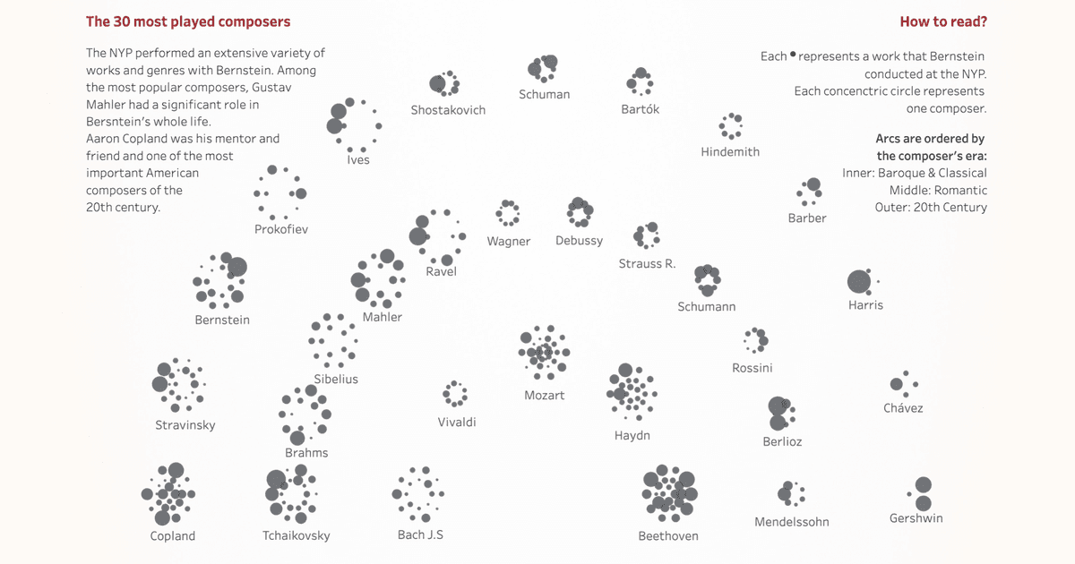
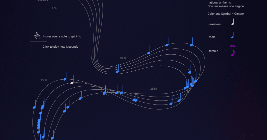
Concerto of Data Points - a personal Iron Viz journey
Explore a personal Iron Viz journey from having the 1st draft until the implementation and final touches. This year's topic is to visualize something you love - for me, as a classical music enthusiast, it is about the concerts of one of the most talented musicians of the 20th century: Leonard Bernstein.
Written by: Zsófia Nika, András Szepesi
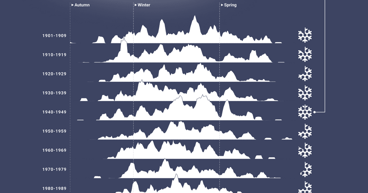
Snow days gone by
On a quest to use cold hard meteorogical data in order to update our nostalgia into evidence-based childhood memories - and of course visualize them.
Written by: Zsófia Nika, András Szepesi
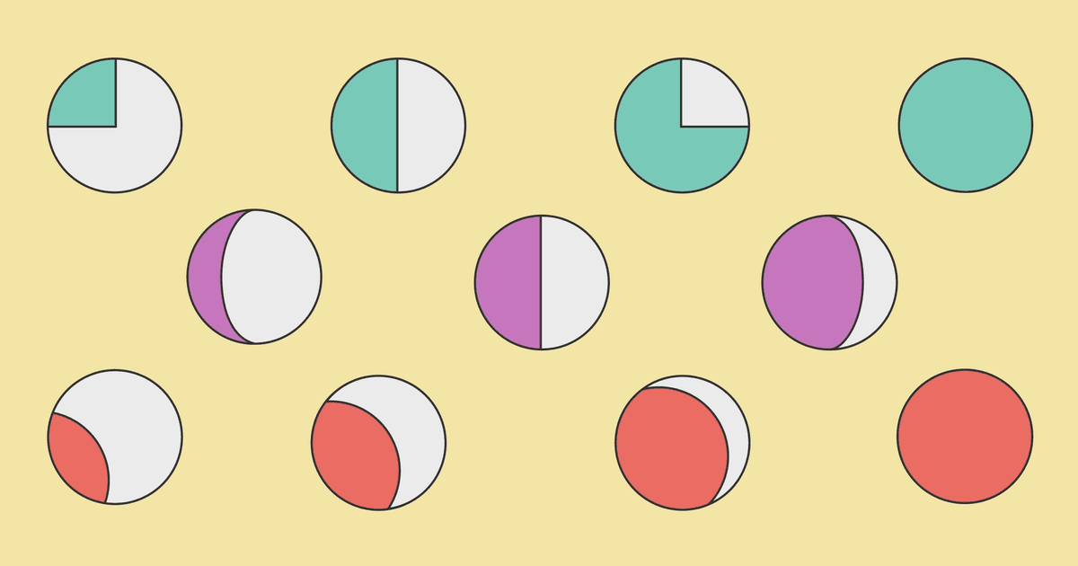
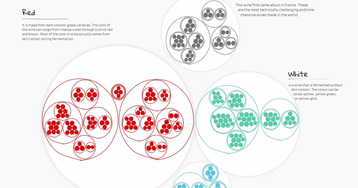
An ode to pies and pie alternatives
An in-depth article discussing all things pie, including an appealing alternative which is faster to read, intriguing to look at, and best of all: does not earn you the wrath of the internet. Drum roll: it’s called the moonpie chart. Additionally, there's a surprise gift waiting for you at the end of the article — scroll all the way down for a Tableau template and tutorial!
Written by: Júlia Borsi, István Korompai

Turning adventures into dataviz stories pt. 2 — Japanese Edition
A dataviz expert’s personal way of preserving memories by transforming them into data visualization stories. Click to learn more about the latest Japanese experience and discover the meaning behind the red dots!
Written by: Júlia Borsi

Steal like an artist
Explore the building blocks of music that created the hip hop of the 2020s by sampling legendary rappers, video games, space music and SpongeBob Squarepants.
Written by: Zsófia Nika, Hanna Bekefi, Béla Petrik, Márton Balla, Gergő Farkas, András Szepesi
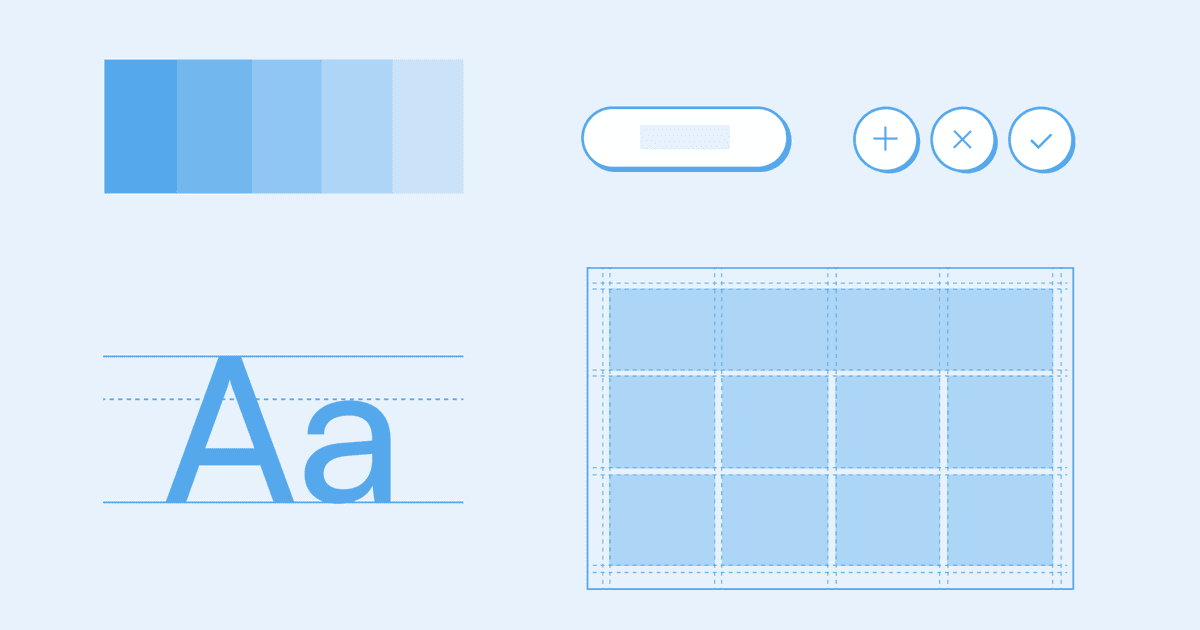
How a Fortune 10 company builds great Tableau dashboards faster than you
I’m going to give it away right at the top: they do it by using something called a “design system.” And not just any hodge-podge of nebulous and lofty principles, but “a complete set of standards intended to manage design at scale using reusable components and patterns” (kudos to the Nielsen Norman Group for a great definition).
Written by: Hanna Bekefi
Investing in dataviz accessibility pays off
Accessibility in all digital products is important, but a business must weigh costs against benefits when investing into a particular area. Here’s why it makes sense for any organization to invest in accessibility in data visualization.
Written by: István Korompai, Hanna Bekefi
A practical guide for accessibility in business intelligence tools
Accessibility is rarely at the forefront of developers minds when they are creating business dashboards in Power BI and Tableau. We believe that is mostly because people do not know where to start engaging with this often daunting topic. Well, this how-to style article is the remedy for that headache. Tag along with us on this long and winding road!
Written by: Júlia Borsi, Boglárka Göttli, Bianka Csuzdi, István Korompai
Accessibility and data visualization
When it comes to designing with data, accessibility is a factor that’s critical to ensuring easy and deep engagement—yet it’s often overlooked. Join us for the first article in a three-part series where we explore accessibility standards as they relate to data visualization in an enterprise context.
Written by: Boglárka Göttli, Hanna Bekefi, István Korompai
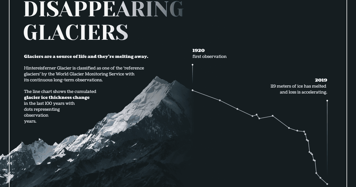
Disappearing glaciers: how bad is it really?
The answer is: very. Join us as we delve into the topic of global glacier retreat through the example of Hintereisferner, explore the vital role of glaciers, and discover actionable ways to help the cause.
Written by: Júlia Borsi, Bianka Csuzdi

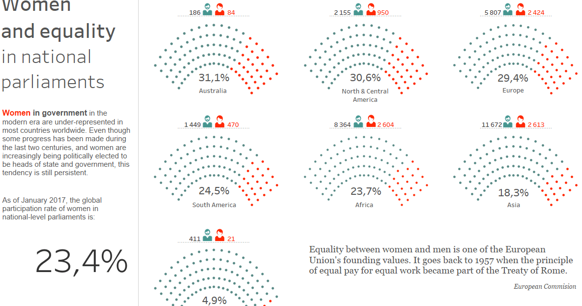
Forgotten women of the Kossuth Prize
Women are often underrepresented when it comes to well known awards, like the Nobel Prize, Academy Awards or a Grammy, but how are women’s achievements recognized on a national level compared to men’s? We explore the intricacies of women's recognition by examining the most established cultural award in Hungary.
Written by: Aliz Gyüre, Boglárka Göttli, András Szepesi, Bea Katona

How to build a guided tour for your Tableau dashboard - Part 2.
Would you like to create a guided tour for your Tableau dashboard to boost user adoption and build trust? In the second episode of the series we provide you a step-by-step guide on the technical implementation of the guided tour in Tableau Desktop - using the visual assets created in Figma, adding calculated fields, dashboard actions and more.
Written by: Tamás Varga

How to build a guided tour for your Tableau dashboard - Part 1.
Would you like to create a guided tour for your Tableau dashboard to boost user adoption and build trust? In the first episode of this two-part series you can learn about the concept and how to create visual assets for your guided tour in Figma.
Written by: Tamás Varga

Visualizing ourselves
Who says portraits have to be conventional? Check out our team's attempt to create our own data portraits by collecting some unusual attributes of our daily routines, orientations and things we are frustrated or inspired by.
Written by: Katalin Szalay, Tamás Varga
Turning adventures into dataviz stories
How it’s made: a behind-the-scenes look at a personal viz that required way more effort than the author anticipated. From the adventure that inspired it, through cumbersome data collection and first design iterations that just didn’t work, it’s all in there!
Written by: Júlia Borsi
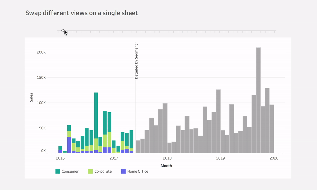
Swap different views on a single sheet
Learn how to reveal and hide different aspects of information on a single sheet using a parameter in Tableau. Follow this step-by-step guide and take your visualization to the next level!
Written by: Ivett Kovács
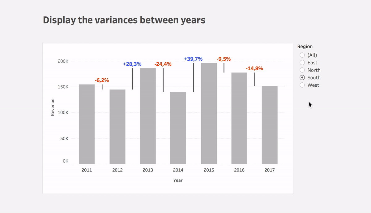
Display variances between dates
Learn how to easily display changes between dates using Tableau in this blog post. With step-by-step instructions and the Superstore dataset, you can replicate this powerful solution quickly. See the surprising results for yourself!
Written by: Ivett Kovács
Analysing gender proportions using Python
Learn how to collect data using web scraping and guess gender using first names in this helpful blog post on studying gender proportions in specific fields.
Written by: Ivett Kovács, Mór Kapronczay
Sketchy style in Tableau
Discover the beauty of hand-drawn style in data visualization! From Du Bois' unique infographics to Nadieh Bremer's artistic style, learn how Ivett Kovacs and Tristan Guillevin used rough.js to create a sketchy effect in their Tableau visualization.
Written by: Ivett Kovács, Tristan Guillevin
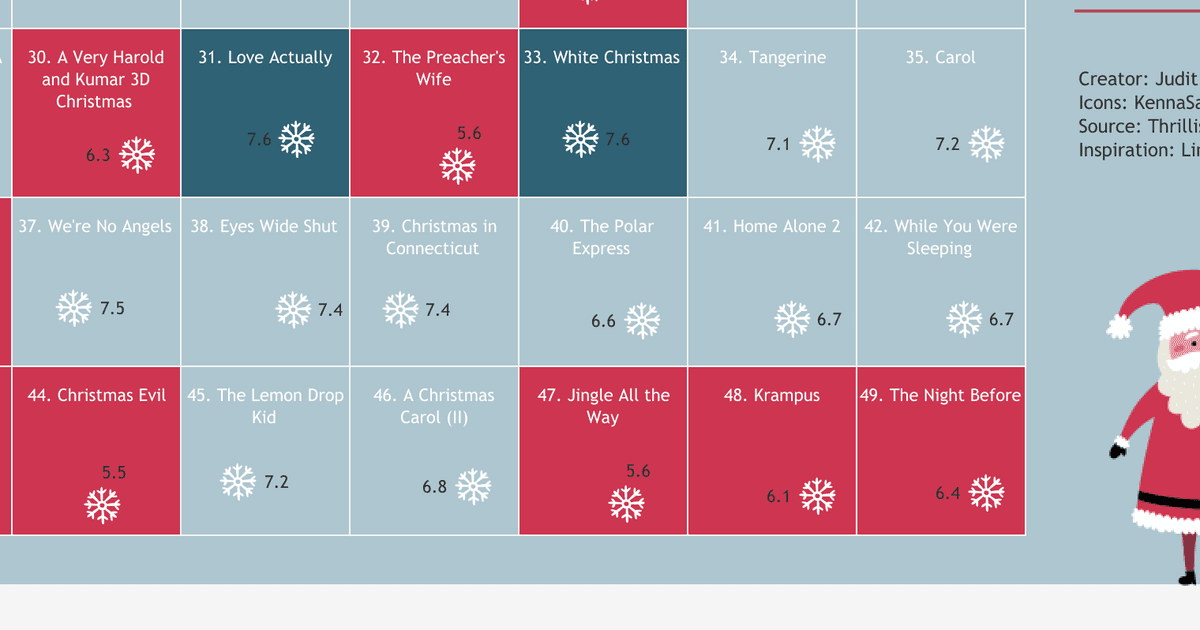
Operation HO HO HO
Take a trip down memory lane with the ultimate Christmas movie list, featuring Home Alone 2 and other classics. Check out this cool small multiple chart highlighting top holiday films by budget, score or runtime. Get into the festive spirit now!
Written by: Judit Bekker
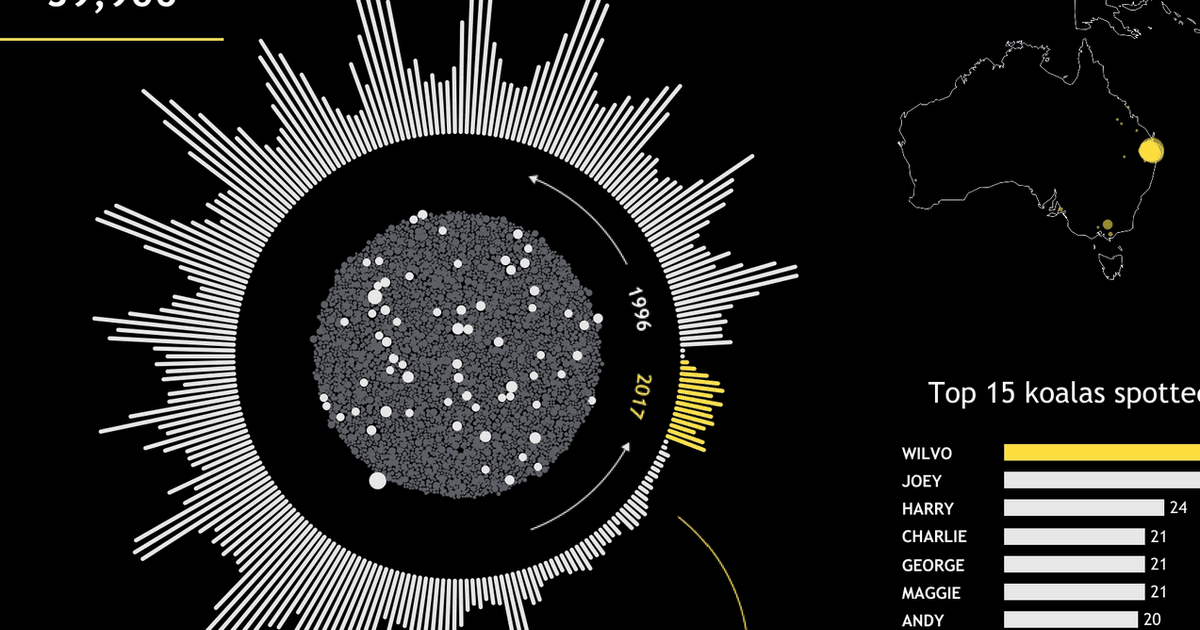
Koalas are getting extinct
Koalas are functionally extinct due to climate change and habitat destruction. A custom Tableau dashboard using KoalaBASE shows their sightings by year and highlights their plight.
Written by: Judit Bekker
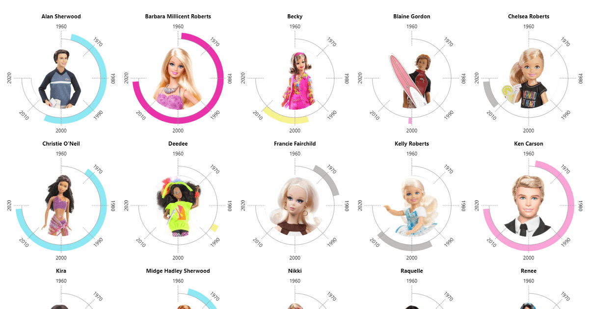
The Barbie universe
A team of our dataviz experts created a project analyzing Barbie dolls through data, including Twitter analysis, doll releases, and Barbie’s social network.
Written by: Ivett Kovács, Judit Bekker, Júlia Borsi
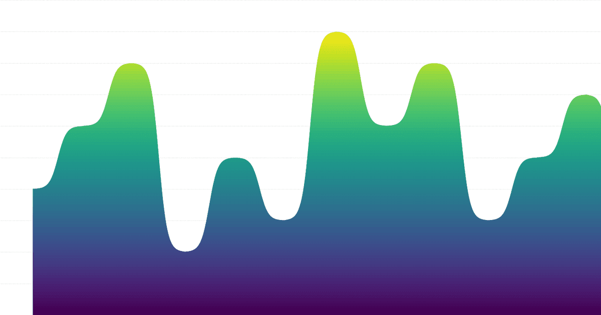
Gradients are on the rise again
Colors are one of the most important and powerful parts in design. Let's see how we could use gradients within Tableau.
Written by: Ivett Kovács

Employee turnover dashboard for your HR department
In our new series of blog posts, we will tackle reporting and dashboarding challenges in different business functions through examples, starting with an HR report in Tableau, more specifically employee fluctuation (turnover).
Written by: Ivett Kovács
Alternative chart types for pie chart
Pie charts have many alternatives that can visualize data potentially much better. We present a few examples on which ones might be the best ones (in our opinion).
Written by: Ivett Kovács