Gradients are on the rise again
Written by: Ivett Kovács

Colors are one of the most important and powerful parts in design. Let's see how we could use gradients within Tableau.
A quick note: This post was originally published some time ago on DataViz.Love, our old blog. We have moved it here for preservation with the approval of the author(s).
In technology, web design trends have changed quickly. At the beginning of 2010s everything was all about minimalist flat design. Over time we got bored with all the existing colors. Brands wanted to create their unique identity but they did not want to use the same color as other brands already did. Because the flat colors are limited we started to create new tones with fading and blending multiple colors. Gradient makes objects stand out and adds a new dimension to the design of our work. Don’t think that this a new visual thing for us. Life is not made of flat colors. Consider the fruits or vegetables in the world, or even the ocean and the sky always has a gradient.
So why they are so trendy?
Gradient colors open the door to an eye catching and memorable world. They look unique, attract attention, they are modern and playful elements.
Let’s see how we can create different gradient designs in Tableau.
Linear Gradient
A linear gradient is defined by an axis called the gradient line what determines how the gradient is laid out inside the element
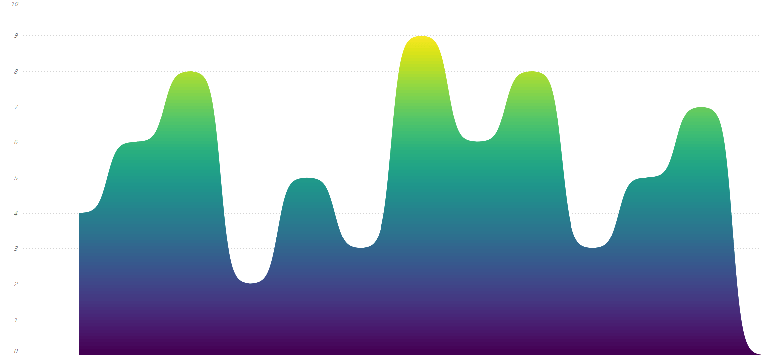
Strongly recommend Ludovic's blogpost for anyone interested in how you can build gradient curve area chart in Tableau.
Look at this example from Ken Flerlage showing a inear gradient Sankey chart:
You can use angles to define the direction of your linear-gradients like I did it on the Sorry Sweetie report.
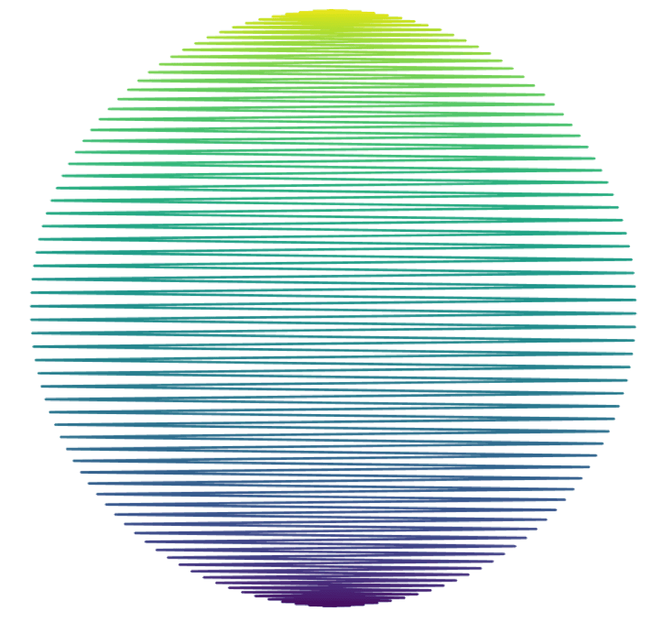
Ludovic Tavernier lets you walk through how you can build gradient circles in Tableau.
Ludovic is a Tableau and Data Visualization Specialist. He was one of the three IronViz contestants at New Orleans Tableau Conference 2018 and produced the weather memories dashboard in 20 minutes in front of the 17.000 attendees. Follow, or get in touch with him on @lttavernier7.
Behind the technique
There are two main techniques we can use to build a gradient on a custom viz in Tableau. You can use polygons, or you can go with lines.
Yes, lines.
Just imagine your gradient picture as multiple lines of different colors on top of each other. So many lines you can't even see there are lines. That is the technique we will develop here to build a circle filled with gradient color.
Modeling your data
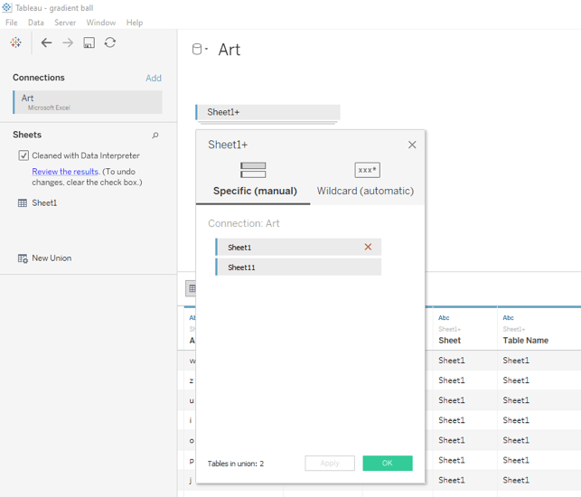
To build our gradient circle, we have to use some extra points. As many you need to build the lines we introduced before. We will use the data densification technique to add those extra points. Let’s duplicate our data by first unioning your data source with itself.
And then fix our range of points by using the sheet field in a calculated field called Padding.
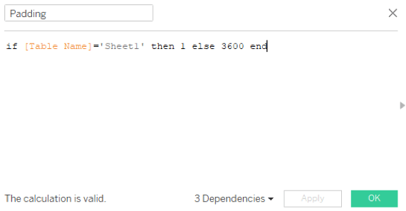
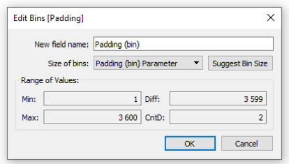
To densify our data (duplicate between the range we fixed earlier), we will use Bins on our Padding field. You can either use 1 as size of bins or a Padding (bin) Parameter number to change the number of points you want to display.
Our data is ready to work with!
Calculate the coordinates
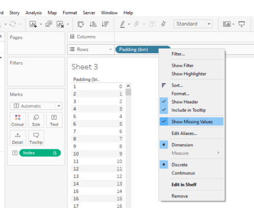
We first need to calculate a unique auto-increment value to use for each of our points. Index function will be useful for that.
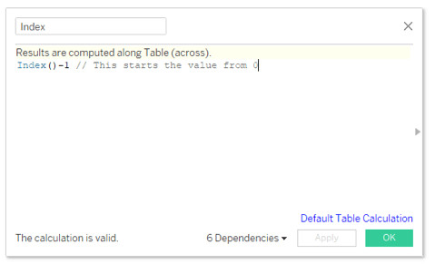
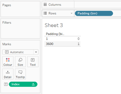
Index also allows us to perform the data densification technique. Let us show you, this is the result of Padding in a table. Only two values, not what we want.
Now with selecting Show Missing Values from the Padding (bin) field, we are able to use as many points as we want. Here with my Padding (bin) Parameter at 1, we can now use 3600 extra points to build our gradient.
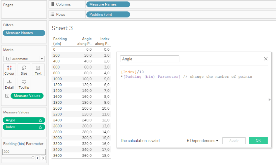
Let’s find the coordinates of those points.
1. Find out the right angle
To simplify, points are distributed between a 0 and 360 angle around a circle. We have to change the range of our 0 … 3600 extra points to fit in. We will do it by calculate a new field Angle. The new field also need to use the Padding (bin) Parameter.
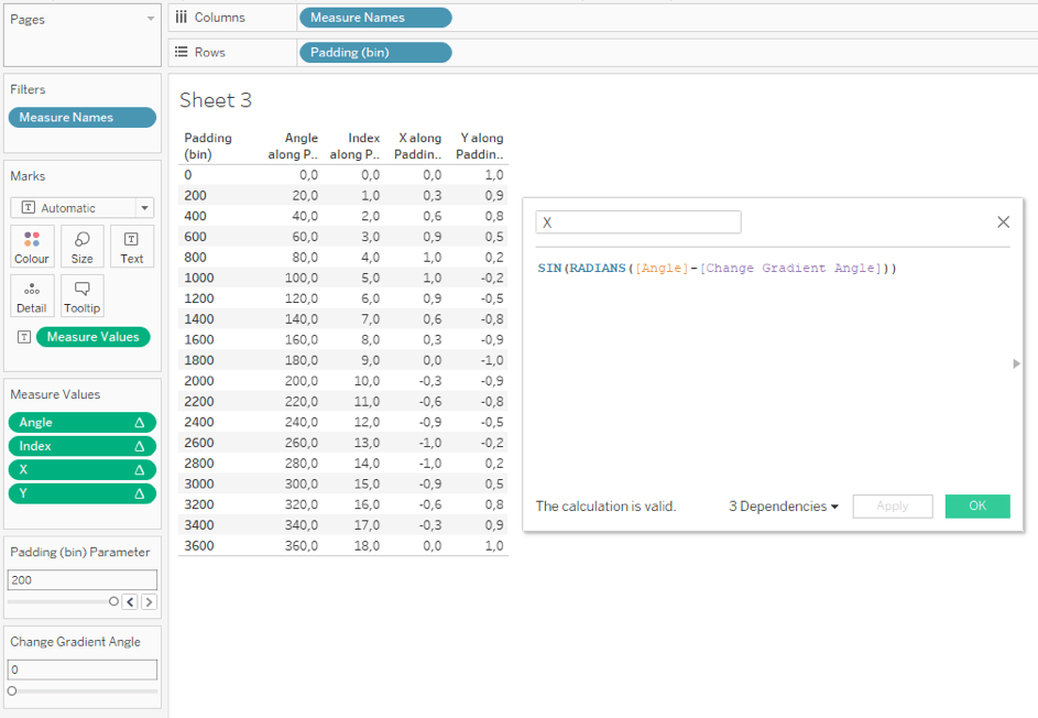
2. Calculate the X and Y
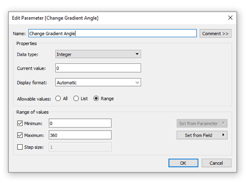
X and Y positions of our points will be calculated thanks to sin and cos functions. We add an other parameter to vary to change the angle of our gradient to make it radial ! Actually, Change Gradient Angle will just rotate the points around our circle.
3. Calculate the right path
We can now turn our table into a visualisation. By moving X and Y to columns and rows and using Padding (bin) in Detail, a circle appears.
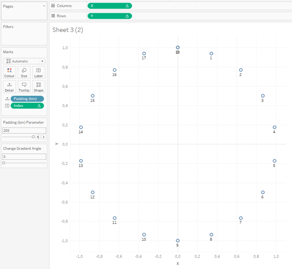
We want to display lines, let’s change the mark type to Line. By default the lines are drawn from left to right (with the X value I guess).
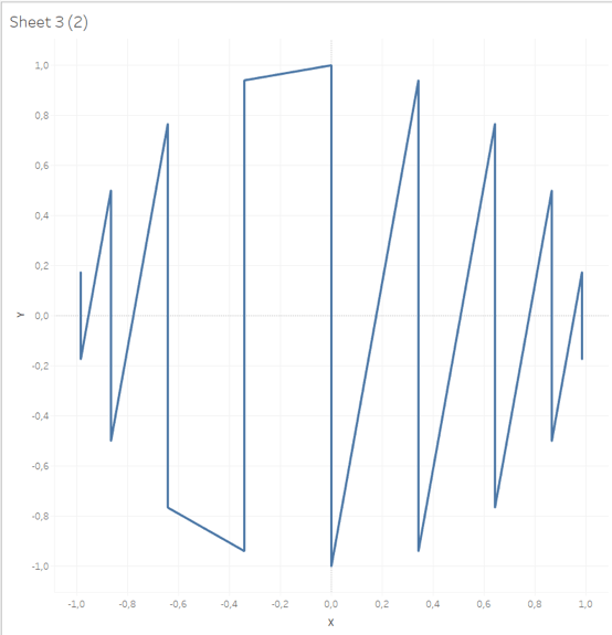
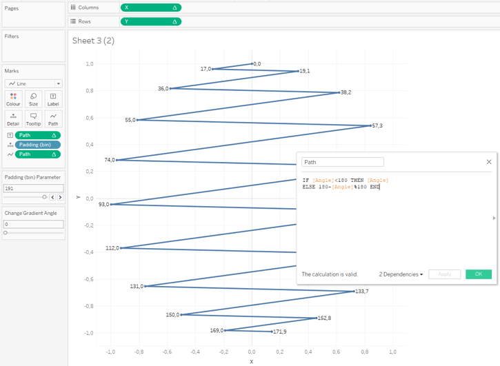
We won’t use the default path. Let’s build a Path value that will also be used for coloring the lines. We want our line to zig-zag from top to bottom. So every angle between 0 and 180 stay the same, and every angle between 180 and 360 we will have a new value between 0 and 180. Let’s use the Path field into path.
We are almost there ! We can reuse the Path field into colour. Let’s change the Gradient Angle parameter with 45 degrees and the Padding (bin) Parameter with 1. By sliding the Size value of your line, you can make your circle plain. And we have our radial gradient circle!

Angle gradient
An angle gradient sweeps counterclockwise rotation around the starting point. The angle is defined by the line between the start and end points in the element.
When will the Gradient trend be outdated? When Instagram changes their logo again 😆😆😆
I hope after read this article you can’t think of anything else only for gradients. Feedback is very much appreciated in the comments below or reach out to me on Twitter @IvettAlexa