Forgotten women of the Kossuth Prize
Written by: Aliz Gyüre, Boglárka Göttli, András Szepesi, Bea Katona
Women are often underrepresented when it comes to well known awards, like the Nobel Prize, Academy Awards or a Grammy, but how are women’s achievements recognized on a national level compared to men’s? We explore the intricacies of women's recognition by examining the most established cultural award in Hungary.
Notes: Kossuth Prize, named after one of the main figures in the Hungarian Revolution of 1848, Lajos Kossuth, and established 100 years after the revolution in 1948, is the most famous “general purpose” award given to Hungarians for their contributions to culture. It is still awarded every year to this day. The authors of this post are from Hungary, and the visualization was first published in Hungarian.
Storytelling without leading your audience
After a thorough data exploration, the gist of the dataset was pretty clear to us: women are noticeably underrepresented in the history of the Kossuth Prize. However, we did not want to force any specific message around it to the reader, rather let everyone arrive at their own conclusions, without pushing our own views on the findings too much.
We tried finding the most underrepresented ones among the already underrepresented, in other words, we tried to showcase the stories of women who were the outliers in the data. As seen in the visualization, women actors, musicians and dancers are more likely to get awarded than writers, directors or scientists for example, so we tried showcasing a lyricist, a film director, a mathematician and a biologist - all unlikely candidates for the Kossuth Prize, especially for women.
The data was not clearly organized in the sources we found, so we had some choices to make when preparing it for analysis, especially regarding the winners’ exact professions and art forms. The Kossuth Prize is a lifetime achievement award and as such, it’s not specified what it is for exactly. In most cases we could easily identify the occupation of the recipient, but had some hiccups as well, since some winners were prominent in more than one occupation or art form. For example, actors were all condensed in the “actor” category, regardless of being a movie or theater actor and omitted from the “film” category, where all the non-actors who worked in film were categorized to, for example directors or screenwriters.
One bite sized sentence says it all
Looking at all the first names of the award recipients, we noticed that women’s names are much more likely to be nicknames or to be shortened to child-like versions than men do. But an even more surprising revelation was that a few men’s first names are so common in our dataset, that their numbers are comparable to the number of all the women awardees. If we take a subset of men’s awardees containing just a few men’s first names, how many do we need to have as many as all the women? We only had to count to two.
The count of winners named László and István (201 total), two very common men’s names in Hungary, were more than all the women recipients (198). This was just a fun sad fact for us, but as we tested our visualization on multiple people, this fact was the one that caught the most attention and eventually became the title of the press release accompanying the visualization. It summarizes so much about our chart and it’s an easy to remember dinner party fact as well.
As all one-sentence summaries usually do, ours have its drawbacks too. Men’s names diversity might be low, especially a hundred or more years ago, and surely there is an upward trend of women being awarded as the decades progress, so we are getting closer and closer to a more equal representation for women. As it turned out, getting closer to a more equal representation is not as smooth as we expected. There was a slow upward trend until the 2010’s of more and more women receiving the Kossuth Prize, but in the last decade, the share of women has reached a plateau and even started declining.
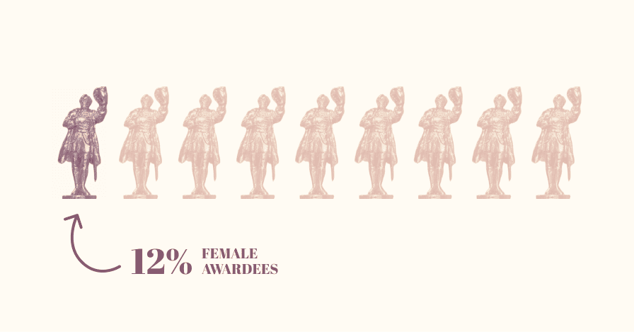
Zero percent is still meaningful
Sifting through women’s data only would paint an incomplete picture. By going over all the men as well, we could find the categories where women were not awarded at all. Architecture was the most obvious example we came by, where no women were ever recognized with the Kossuth Prize. By showing an empty category rather than omitting it entirely, we can still convey information about the gender distribution.
We tried not going overboard with showing too much emptiness and negative space in the charts. We did have some feedback that we should show the maximum 100% in the chart showcasing the percentage of women awardees over the years, since the shown percentages are very low even at their maximum, but eventually went with a more compact version in order to avoid making women awardees being a minority the main focus of all the charts.
We were hoping to give new insights to Hungarian readers as well whether they are intimately familiar with the award itself or not, while also making sure that our visuals are accessible for people who are not experts in interpreting data visualizations. We also suspected that most online publications struggle with embedding Tableau visualizations, therefore we had to make sure that (almost) everything works in a non-interactive version as well. Because of this, we ended up with a more poster-like visualization, which, in the worst case scenario, can be used as a static image.
Modern visuals for a decadent institution
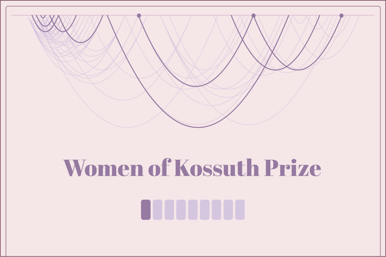
No major visual change took place in the last 75 years of the Kossuth Prize, therefore there is a more or less decadent visual style accompanying it that goes back to the first time it was awarded. The yellowish old newspapers, a mid-century staple, were a huge inspiration for us, with some specific text boxes and images that (for us) resembles textbooks from elementary school, the time where most of us first got acquainted with history. Our curtain-like top chart about the multi-award winners was a conscious choice from our part and represents the theater-like, celebration atmosphere, a typical place where the award would be presented.


Our goal was however, to infuse the sepia look with modern elements, since the Kossuth Prize is still awarded to this day. We went through numerous iterations of colors, texts and layouts to find a balance between old and new, yet still keep the familiarity. More importantly, the crucial aspect of the visual style was making the difference between men and women recipients. We didn’t want to use the outdated, stereotypical pink/blue distinction, and also wanted to emphasize with color that in this visualization men take a step back to give way to the underrepresented group: women.
about the authors
Aliz Gyüre
I am passionate about all things data, including shaping data and reveal interesting patterns, but I find data visualization truly powerful as it has the most potential to communicate those complex insights to others - and it can even be pretty! Recently I am tinkering with web based data viz to bring data to life in a more engaging and interactive way.
Boglárka Göttli
Bogi is strongly committed to understanding her clients' needs and transforming them into impressive and meaningful data visualizations. She is a believer in continuous learning and loves trying her hand at new things.
András Szepesi
Bea Katona
Bea is a data visualization expert at Starschema. With a background including dataviz tools, web design and some data engineering, she is dedicated to delivering visually impactful and data-driven solutions for clients across diverse industries.