How to build a guided tour for your Tableau dashboard - Part 1.
Written by: Tamás Varga

Would you like to create a guided tour for your Tableau dashboard to boost user adoption and build trust? In the first episode of this two-part series you can learn about the concept and how to create visual assets for your guided tour in Figma.
In this two part series I would like to provide a step-by-step guide on how Tableau developers could implement a scalable, user-friendly solution that would help user adoption and enhance the overall user experience of a given dashboard.
For this, I will use a Tableau demo dashboard based on the well-known Superstore dataset to showcase how the guided tour works. For graphic design, I will use Figma as my go-to tool - available with a free plan - to create the necessary visual elements.
In this episode we will take a look at how to conceptualize the content for the guided tour based on the dashboard and how we can create the visual assets in Figma by taking the right measurements and techniques to create clean, readable and engaging design for our future users.
What’s a guided tour and why do you need it?
A dashboard guided tour is a structured collection of textual and visual elements that help users to understand and learn about the given dashboard’s structure, content, functions and available interactions that will help them to gather all the necessary information and insights for their analysis and answer their questions. As dashboard developers, we can use the guided tour to improve user experience and - by that - have happy, engaged dashboard users who trust what we’ve built.
What we’re aiming to achieve by this exercise is to create a guided tour that is a part of the dashboard itself. Of course, it’s not the only way to have a guided tour and in many cases it’s not necessarily the best or only way to help users to see the full picture. I’ve seen many cases when such supporting content was made available via a link to an external web page, or even a whole wiki page that would explain users the mechanisms of the dashboard and even define all the metrics, calculations etc. We will talk about this later on but all possible solutions come with some kind of a trade-off and limitations. There’s no snake oil here and we’re not looking for the Holy Grail either.
Quick side note here before we move forward: While in this article series I will mainly focus on the technical aspects and the to-do’s to create a guided tour, I also have to emphasize the necessity of constant communication with end users to gather feedback on what should be part of the build. Therefore you should plan for an iterative process till the content reaches its final form. No worries, you should have already gone through this while you’ve built the dashboard itself.
Dashboard content
Okay, so here we go! First, let’s take a look at our dashboard and talk a bit about the content:
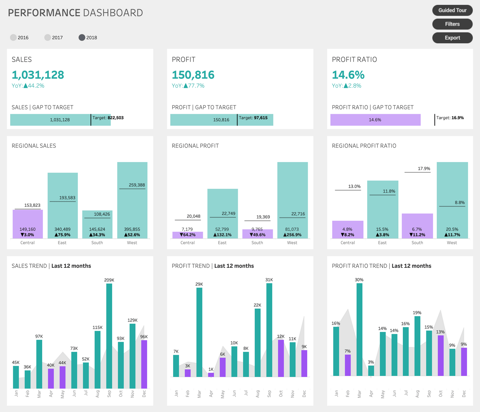
What do we have here? This is a high-level strategic dashboard that looks at the annual performance of our imaginary company. Horizontally, we have three columns for the main metrics: sales, profit and profit ratio - nothing really fancy. Vertically we have BANs for aggregated metrics together with a target defined, highlighting the gap to target for each metric as well. In the second row we look at our metrics on regional level with some year on year comparison included. Current year visualized as a bar chart, previous year added as Gantt chart. The third row shows the last 12 months trend for each metric: bars represent the current year, area chart represents the previous year.
Colors tell the story of the examined differences’ direction: teal colors indicate positive difference eg. sales already exceeded the target, or the current year’s performance is better than in the previous year. Purple is the opposite, it indicates a negative difference.
There are some additional functionalities available on the dashboard: users can switch between years, access and additional filters pane, export the dashboard in .pdf format or open up a guide tour. (Surprise!)
The importance of planning
You may ask why do we care about all this stuff, while we could jump directly to that part where we start drawing all the assets? Great question. And here’s the answer: guided tours are only useful when we have a clear concept on what we would like to include for our users to see and how we can segment it properly to effectively communicate its content. Therefore we need to come up with a plan:
- First of all, let’s list all the possible features of the dashboard and group them such as chart contents, buttons, interactions etc.
- Then let’s decide on what it is that we can explicitly add to the dashboard. For example we can add a subtitle to our chart, explaining the possible interactions.
- Also there are some pre-attentive attributes and conventional visual concepts that won’t need explicit explanation eg. if it looks like a button, it is a button. On the other hand, it may come in handy for the users to know what that button does so we may say a few words about that.
- Let’s segment our content into multiple pages! This way we can avoid the pitfall where we create an overcrowded, visually overwhelming layer of information that would scare users away instead of encouraging them to start using the dashboard.
We could surely add some additional points to the list. With proper preparation we will - more or less - end up with an extensive set of elements and a well-defined flow for our solution.
Quick side note here: Balance is key. There’s a certain chance that creating a guided tour with too many segments will intimidate users by providing an overwhelming amount of information. Therefore - when you’re finished assessing the content for your guided tour - make sure to trim it to end up with a distilled, useful collection of information for your users. Aim for 6-8 segments maximum to make sure that users won’t just close the whole stuff looking at the number of segments to browse through in the dashboard.
Sneak peek into the technical concept
Okay. We got it. The dashboard is there, we know what we would like to include in our guided tour. But what is it that we would like to implement here technically speaking?
In our concept our goal is to create an overlay on top of the dashboard that could be opened or closed by our users. Pro tip: You can consider having it open by default, especially if it is a new dashboard and users are not yet well-adapted to use Tableau - later on you can switch it off.
To achieve this, we will add a floating container on top of the dashboard with a show/hide button that will include the visual elements of the guided tour and the mechanism that enables users to browse through the paginated content.
And that’s the concept in a nutshell. Of course, it won’t be this simple, there will be some trick and well-hidden functionalities in Tableau - and that’s going to be the topic for the second part of this series -, but for now let’s stick to plan and see how we can effectively create the visual contents needed in Figma.
Creating assets in Figma
Figma is a graphic design tool that’s accessible through your browser and there’s a desktop version as well. I’m not here to promote Figma, you could also use Adobe Illustrator, Sketch or even PowerPoint to work with. It’s absolutely your choice. I chose Figma as there’s a free plan that includes all the necessary functions that a graphic design newbie - as I am - could easily learn how to use and there are lots of online tutorials available.
Disclaimer: I will use the visual elements of the guided tour’s welcome page to showcase all the things that need to be done in order to end up with eye-catching results. After that we will be in possession of all the necessary tools to create all the additional contents for the dashboard.
Let’s do a bit of reverse engineering here as a start and look at the final result when our guided tour is added to the dashboard.
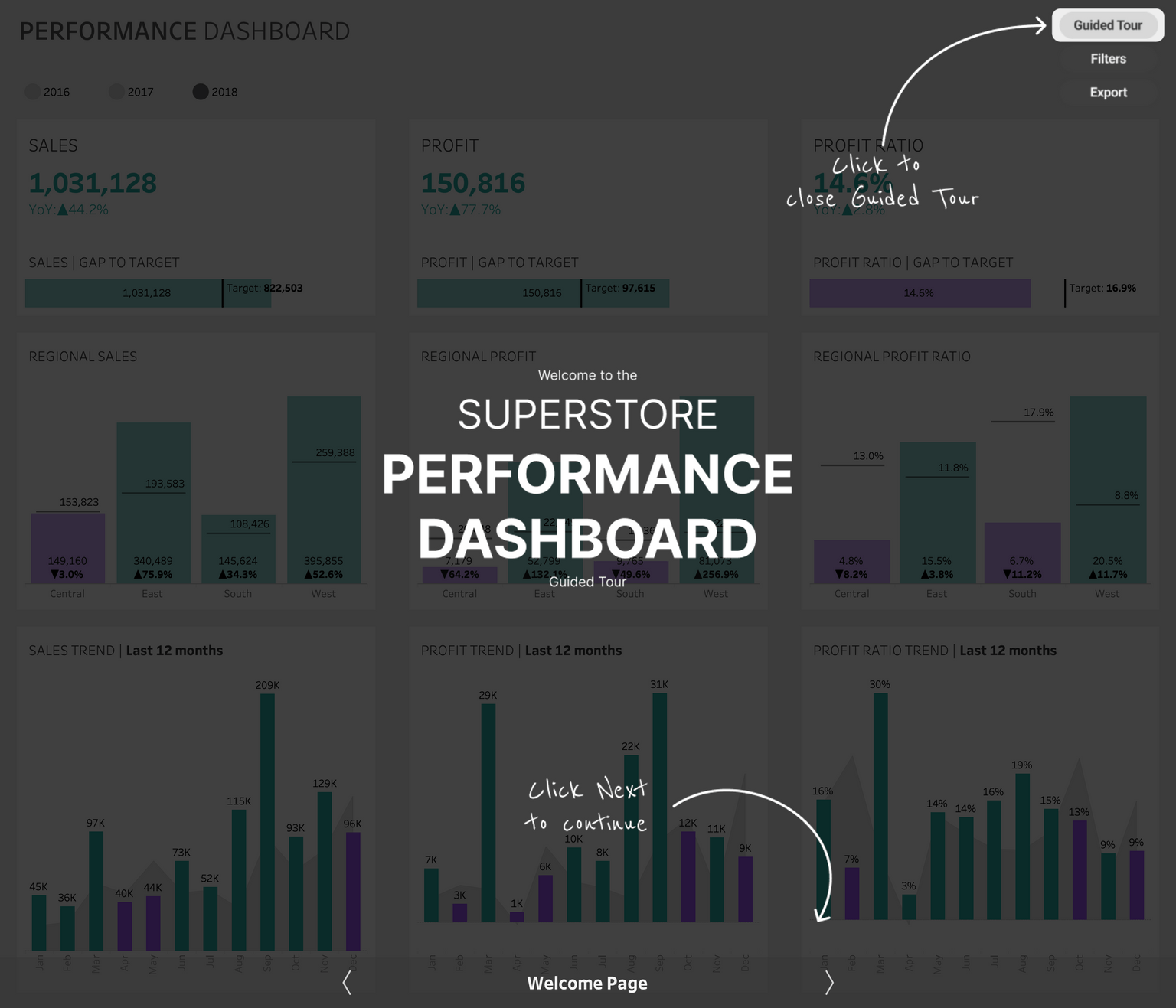
As you can see we have a semi-transparent overlay on top of our dashboard. The bottom section with the “Welcome Page” title and the navigation arrows are built within Tableau and take care of the navigation function. Everything above that is designed in Figma and you just need to do some measurements and use some simple functions to get it done.
“What measurements?” You may ask. Well, one thing to keep in mind is we need to make sure that all visual elements fit perfectly into our top layer for the dashboard. In our case the dashboard is 1400 pixels wide and 1200 pixels high. So we will need something to fit the size, right? Not exactly. Just as I mentioned above, we’ll have the navigation section built in Tableau, so we will need to reserve some space for that section. For this dashboard we will need 60 pixels reserved in height. That’s plenty enough to add some interactive elements for navigation. Doing the math, we will end up with a 1400 x 1140 pixels size for our visual asset

Technically it’s not too over-complicated to put together such an overlay. In this case, the following steps are needed:
- Add a screenshot of the original Tableau dashboard to Figma - you can just export / copy it as an image from Tableau Desktop directly.
- Create a Frame in Figma with the size of 1400x1140 pixels and position the dashboard image in that aligning the top and the sides. The bottom won’t fit, but that’s expected because of the 60 pixel gap we need for the Tableau navigation
- Add a rectangle with the same size, give it a black color and change opacity to 75% - now we have our base for the overlay.
- On top of the rectangle you can add the title, the additional texts and arrows using the dashboard image as your guide to position things.
- The cutoffs to highlight sections of the dashboard are just a bit trickier. Add an additional rectangle on top, and make it rounded - just a bit.
- Select both the base rectangle and the newly added one and create a subtract out of it. The function for that is located at the top-middle section of Figma. (See image below)
- We’re nearly done. When we’re done with editing, let’s just hide the Tableau dashboard image we used as a reference, so it’s our overlay that remains as part of the frame.
- Last step is to export our frame all together and we’re finished with our first image we would like to use in our guided tour.

All these steps should be repeated and adjusted for the remaining pages of the guided tour.
When all graphics are created and exported, we can consider our work done in Figma.
In the next blog post we will get back to Tableau Desktop and start to get our hands dirty to implement our guided tour - using the assets we created in Figma.
about the author
Tamás Varga