How a Fortune 10 company builds great Tableau dashboards faster than you
Written by: Hanna Bekefi

I’m going to give it away right at the top: they do it by using something called a “design system.” And not just any hodge-podge of nebulous and lofty principles, but “a complete set of standards intended to manage design at scale using reusable components and patterns” (kudos to the Nielsen Norman Group for a great definition).
Design systems have been generating serious buzz at more innovative large organizations, and our data visualization team actually got to build and implement one recently at an especially forward-thinking Fortune 10 tech company. Based on that project’s impact and our earlier work on dataviz design guides— somewhat of a basis for design systems —this seems like a great time to be an early adopter of this concept. While such systems encompass much more than just Tableau dashboards, I’ll be paying special attention them in this piece because
- any design system that ignores reporting is far less effective for it, and
- Tableau provides a tangibly specific and familiar starting point for understanding and generalizing the core concepts of design systems.
So, let me show you what makes design systems so effective and why it might be just what your users need to easily build high-quality dashboards in Tableau—and much more.
Why Design Systems Are Getting Popular
A good design systems provides a comprehensive and flexible solution to fundamental problems that large organizations are struggling with at intersections of design and development. Among these issues, here are the three most prominent ones we’ve been seeing:
- Technical debt: the constant demand for new dashboards and updates to existing ones have resulted in companies building for the short term with tight deadlines. These band-aid solutions often cut corners and ignore best practices — only to come back and haunt technical staff with time-consuming tasks that could’ve been avoided, like repeatedly debugging and iterating on subpar technical solutions.
- Inconsistency: as teams scale, design — and the way business-critical data is communicated — becomes increasingly fragmented. At larger companies, there are often different teams responsible for the design of different brand touch points and interfaces, including dashboards, which hinders understanding and cooperation between users, teams, departments, etc.
- Redundancy: stakeholders like developers and designers often rebuild the same components in different ways — this is true for internal reporting too, where developers tend to start from scratch, introducing massive inefficiencies into workflows.
A design system will, of course, be tailored to the unique ways in which the above issues take shape at a company but provide benefits beyond a sum of fixes. Simply solving these problems will already
- drive efficiency by preventing people from building the same things over and over again,
- boost productivity by increase the output for design and development and
- ensure consistency in user experience for all products and brand touch points — including dashboards — via a shared vision standardized components.
On top of these benefits, a design system will also promote knowledge sharing and effective onboarding by making in-house design techniques easy to apply, ensure higher quality dashboards faster — e.g. by baking in accessibility and other best practices — and tighten cooperation between designers and developers by aligning the two sides and creating a common language.
What’s In A Design System

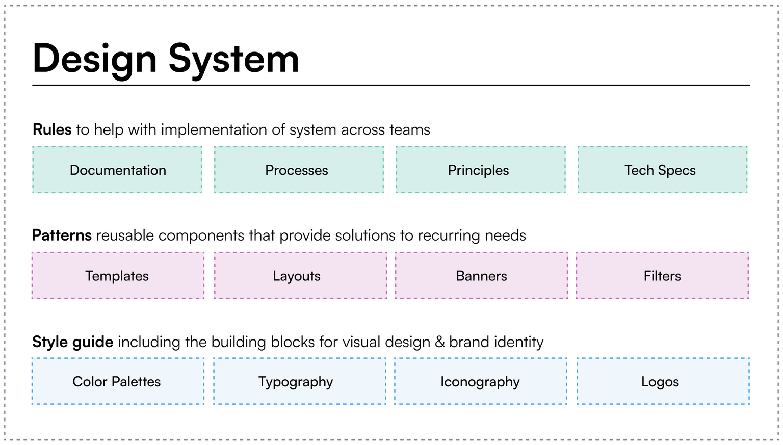
A design system will normally be made up of three layers:
- A style guide at the core, which governs stylistic elements such as colors and iconography and helps ensure adherence to brand guidelines
- A pattern library with tangible assets, such as templates, pre-built layouts and even code snippets
- A design system as the “big box” that contains the above two layers and adds things like tech specs, documentation and principles (despite what the intro might have suggested, they absolutely have their place)
With this general structure in mind, let’s look at some key elements of design systems where you should expect to see Tableau-specific best practices.
Style Guide
A style guide will contain guidelines on key design elements that will help establish a common language for, among others, internal reporting.
Colors
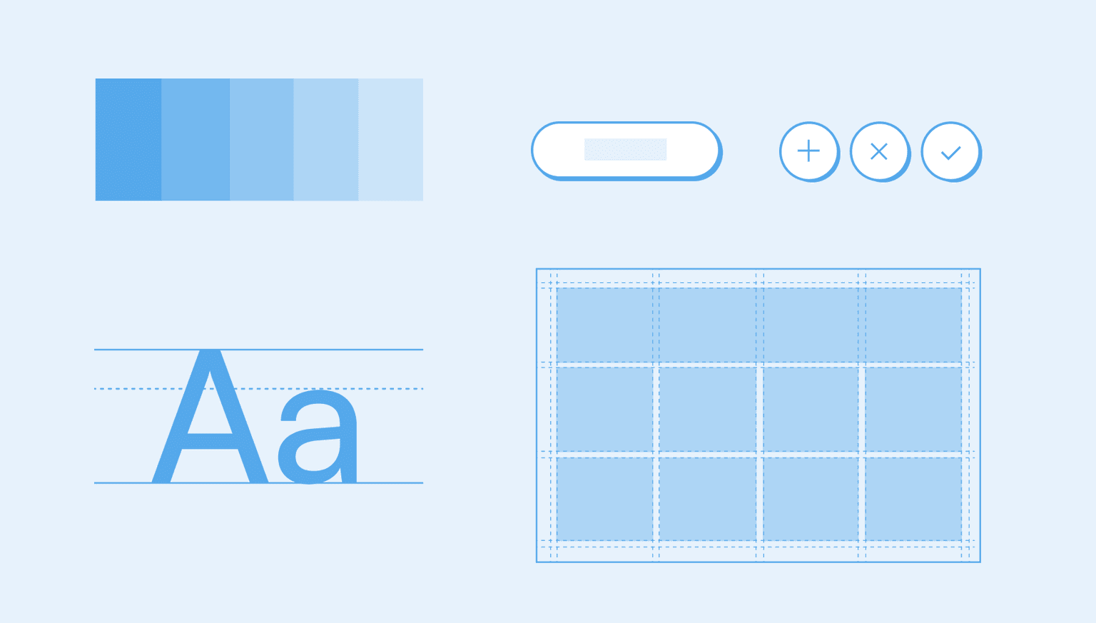
The colors element will include categorical colors, diverging color schemes, a sequential palette as well as palettes that consider color blindness. For Tableau, incorporating a .tps file that developers can set up on their computers will make a design system especially easy to apply to real-world use cases.
Typography
Guidelines for titles, headings, mark labels and axes are a staple of a good design system, and should be defined to help create a clear information hierarchy across dashboards. If your organization heavily relies on Tableau, you’ll want to ensure that custom fonts are avoided in the tool to ensure proper rendering on Tableau Server. Tableau’s default font is the most reliable and available in a wide range of weights to help communicate hierarchies within the information users want to present—to ensure that all elements of a design system actually work for users, it’s absolutely crucial to customize it with such level of granularity.
Iconography
A design system will define a standard range of icons to ensure that actions, objects and ideas are communicated consistently across your BI products. This way, users will know what to expect when they click on a specific icon and have an easier time interacting easier with dashboards.In Tableau, adding icons to the Shapes folder of “My Tableau Repository” on developers’ local computer will make them usable as either images or shapes.
Pattern library
Layouts
Layouts help designers and developers to ensure consistency and improve the user experience across user interfaces. Your design system should include a separate a set of layouts for reporting and define spacing for the various elements of the dashboard to ensure it remains legible and doesn’t become over crammed. These layouts should be created right inside Tableau and as part of your templates for developers and business analysts so they can use them as a starting point for their own dashboard builds.
Templates
A design system needs to include pre-built elements such as banners with logos and titles, report bodies in a variety of layouts, typography presets and even guidelines on how logo usage fits into your reporting, going so far as assigning a place for it in dashboards, specifying size and spacing around it and supporting it with dos and don'ts to help developers ensure correct usage. For Tableau, this will involve templates like banners that already have the logo and other elements correctly set up and positioned so developers don’t have to set them up from scratch.
How to Do Design Systems Right
Whether you’re working with an implementation partner on your design system or going it alone, certain fundamental best practices from the world of enterprise-grade data visualization will help avoid common pitfalls that will drain time and money and potentially leave you with a stopgap solution that’ll just add to your list of headaches that you’re trying to get rid of. Here are the most important ones.
Build collaboratively, with a specific purpose in mind. Tailor your design system to your users and their specific needs — for example, creating a component library for Tableau is going to be very different than for an iOS or Android app. As I’ve already discussed above, it’s essential to consider the nuances and requirements of each platform, but it also follows from this rule that you need to involve every stakeholder group in the project and enable them to provide direct feedback based-on hands-on experience with product in development. This will help maximize adoption and create alignment between design and development/engineering.
Communicate the benefits clearly. Often, businesses will fail to recognize the value that a newer concept like a design system can bring to their teams and products. Having a trusted and influential champion for the design system inside the company will go a long way towards establishing a common language with key stakeholders so they’ll grant — and, hopefully, even proactively offer — their support to the project, which is essential to meeting the goals I mentioned in the previous point.
Take your time. Depending on how you look at it, the design system project we recently completed for a Fortune 10 company took somewhere between four and six months from start to go-live — and it was built on roughly four years of preliminary collaborative work on reporting tools and processes. Design systems for digital products like BI reports are fairly new concept and there might be some ambiguity for developers and designers on how to incorporate them into their workflows.
Make sure that you invest in onboarding your teams to the design system and share knowledge on how they can utilize it via workshops, videos, documentation, etc. The rollout of the system is also a great opportunity to invite a larger swath of users to collaborate and share their opinions so they can contribute to eventual updates and ensure that it stays relevant and impactful. Which brings us to our final point.
Treat it as a living entity. Design systems should be constantly evolving alongside the tools and practices to which they’re applied. This means there will inevitably be opportunities to improve and adjust them, and making the most of these opportunities might even entail reviewing and replacing or migrating tools and products. These systems are a long-term investment and should have staff dedicated to them as product owners who will ensure continued and expanded benefits.
Look Ahead
Design systems are about creating foundation for tackling design- and development-related challenges that will hopefully come your way as a result of the growth of your business. While they are “tried and true” in the sense that organizations that have adopted them are already building better Tableau dashboards and other business-critical assets faster, as a dataviz practitioner, I especially look forward to seeing how they will help adopters take advantage of the looming technological paradigm shifts that are already beginning to affect BI tools as well, including generative AI. Every such change will bring an opportunity for companies to distinguish themselves from the competition for external and internal customers alike, and those with a well-designed and - maintained design system will simply be in a better position to provide their users with better experiences.
If the above sounds like something your organization would aspire to and you’d like to talk design systems with someone who’s actually built one for one of the most discerning companies in the world, get in touch— we’d love to talk.


