Visualizing ourselves
Written by: Katalin Szalay, Tamás Varga
Who says portraits have to be conventional? Check out our team's attempt to create our own data portraits by collecting some unusual attributes of our daily routines, orientations and things we are frustrated or inspired by.
Who am I? How do others see me? Profound questions that echo in our being, right? An obvious choice is a simple portrait, but how about creating a new type of portrait that says more about us than a conventional one?
The idea is to draw our own data portraits.
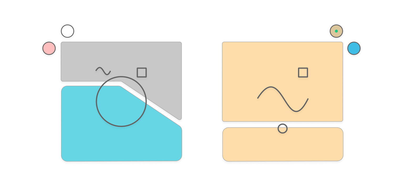
So, what is a data portrait? It is a small graphic that depicts data accumulated about a person but instead of some trivial traits like gender or age it shows something hidden that tells so much more about you. Our example included questions like how you drink your coffee, are you a morning person or prefer to stay up late, what are your professional interests and from where your greatest work-related inspiration and frustration come from, all of which are things a conventional portrait can’t show. This kind of information would become the components to draw the piece of art, that is you.
There have already been some fascinating experiments around this topic. Special credit goes to Giorgia Lupi, whose work inspired our colleague, István Korompai, to suggest creating our own version of data portraits and decorate our team's office space with them.
We had a full day dedicated to experimental data visualization projects in small teams, so that was the perfect day for this idea to come alive.
To start off, we faced the following challenges while creating the framework for our data portraits:
- What kind of data would be relevant to describe a person?
- How can we make it universal and personal at the same time, so it would work for anyone?
- Can it stay simple enough to make it real quick to understand the concept but still allow people to recognize themselves in their data portraits?
So we got our hands dirty.
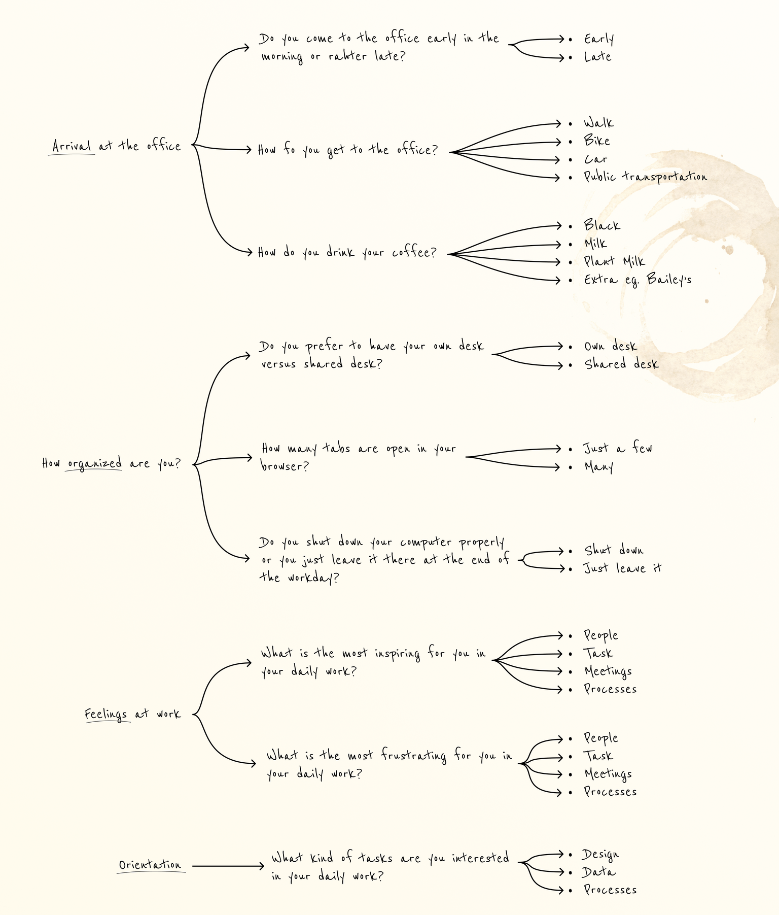
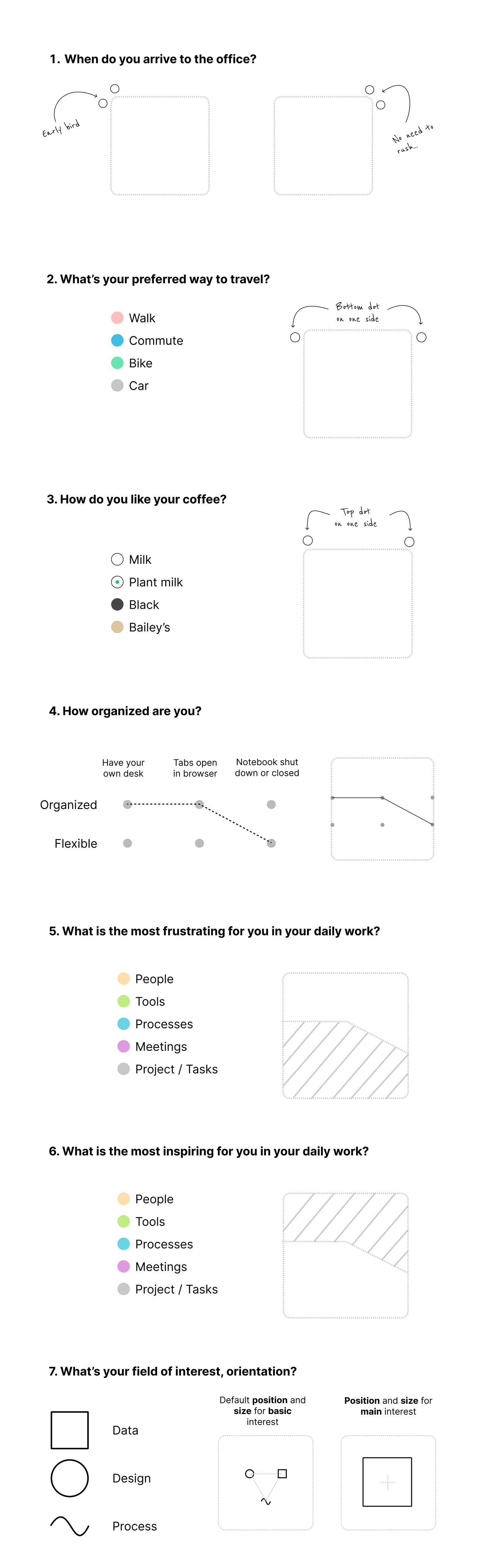
First, we defined the questions we wanted to portrait drawers to answer - these came surprisingly naturally, and we agreed on the list in a few minutes.
Refining, consolidating and arranging the visual ideas were heavier tasks, since their structure should hold the portraits together. In order to have a general framework for the portrait, we needed to define the possible list of answers for each question.
We settled on 9 questions organized into 4 groups with 2-4 possible answers each which will be combined to a unique portrait.
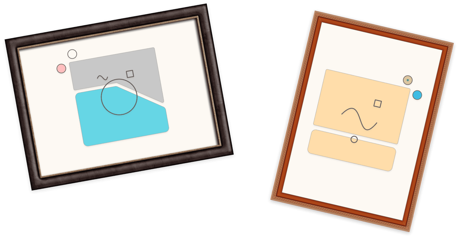
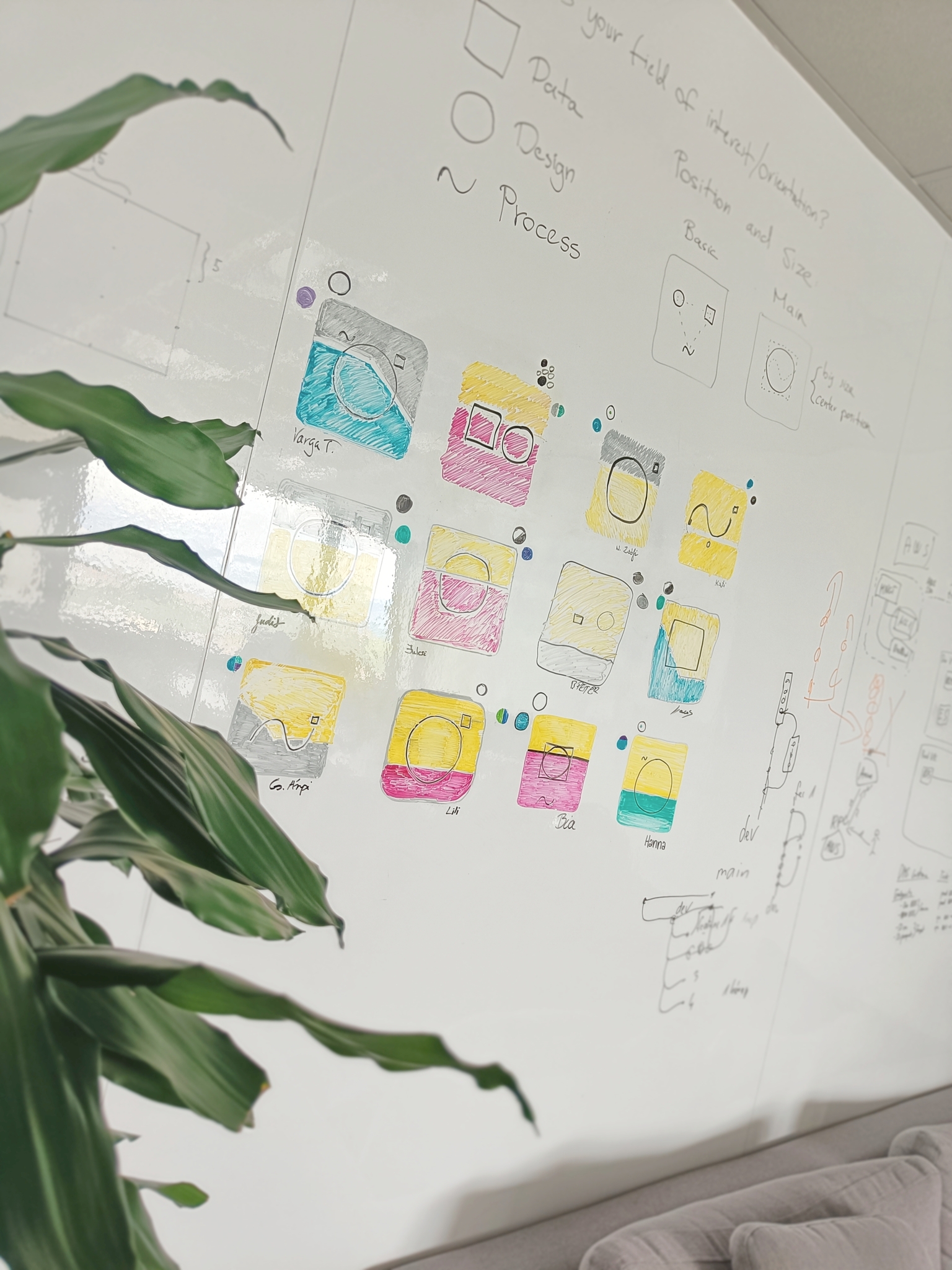
At this point, we already knew what we wanted to visualize on the portrait but didn't know how. We decided that the base shape for the portrait will be a rounded square. Then we have laid out all the possible variations of attributes and their possible visual representations on paper and started combining them. The possibilities seemed endless but we needed to start somewhere so after some pizza, we took a leap of faith - a.k.a. professional opinion - and we pointed at one of the ideas on our sketchbooks, called it ground zero, and started building from there.
This method worked great for a while, but we hit a brick wall soon. Turns out we can't squeeze 9 different visual elements into a small square in a way that it remains simple to draw and easily digestible. So our next challenge was to condense the information somehow.
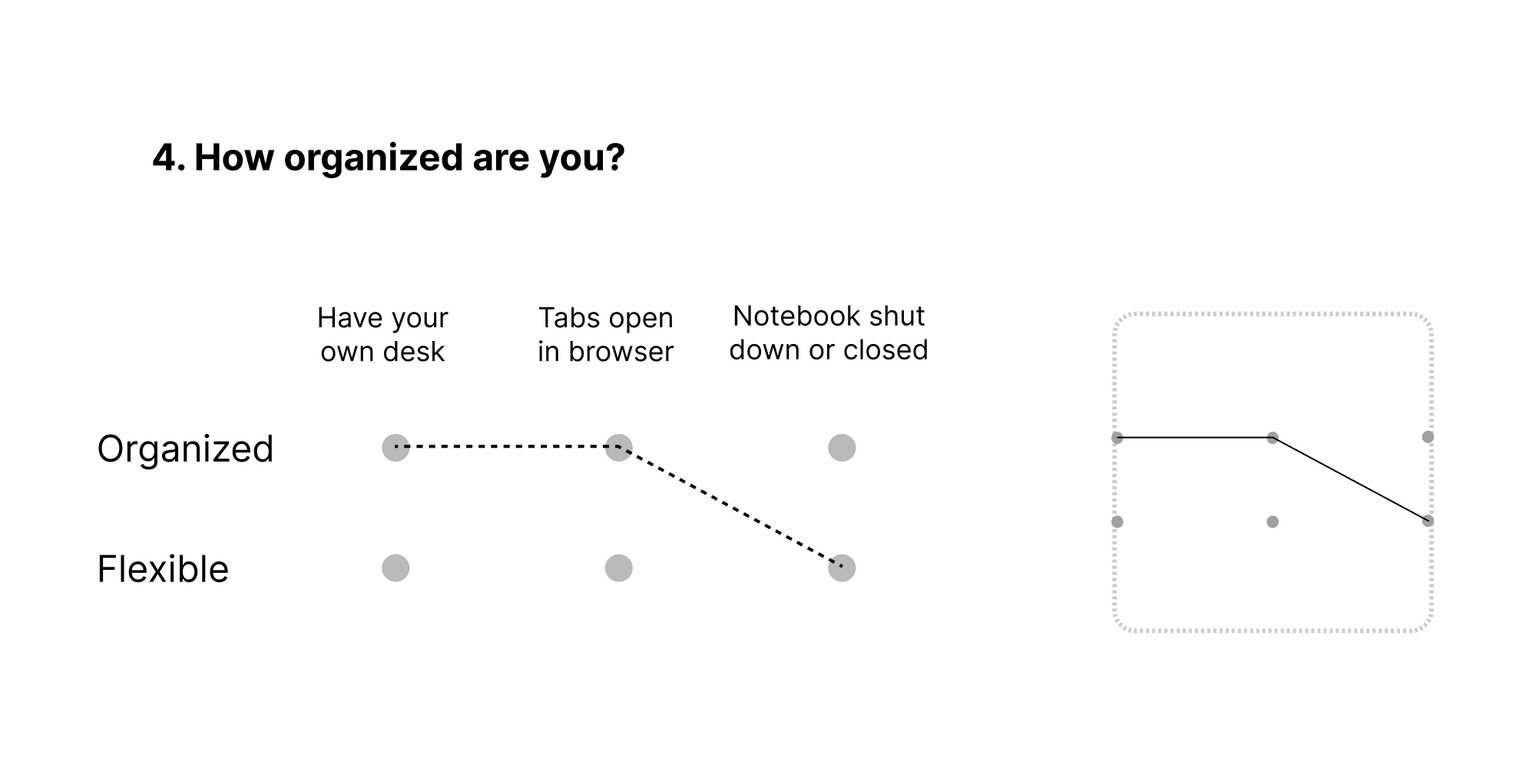
Eventually we realized that all 3 questions in the 'How organized are you' group have only 2 possible answers tending to describe a somewhat similar, slightly redundant characteristic: having a more organized or a more flexible working style. We opted to use a matrix-like visualization to keep the underlying questions separate and cover them all in a single visual component.
As more and more components were defined the easier and easier it got to figure out something for the remaining ones until, eventually, all questions found their place on the portrait, making a set of rules for encoding answers. At this point we finally arrived at the long awaited step of actually drawing our own portraits using the freshly developed framework.
We've also started to add our hand-drawn versions to our room's wall and it's delightful to see how each portrait got its own personality with each stroke made.
So, this is us. How do we look? How would you look? Find out by drawing yourself using our guide below.
about the authors
Katalin Szalay
Katalin is a business analyst and data visualization expert at Starschema with years of experience in building Tableau dashboards and improving the information flow between business and IT. She loves to spend her free time in the mountains.
Tamás Varga