Investing in dataviz accessibility pays off
Written by: István Korompai, Hanna Bekefi

Accessibility in all digital products is important, but a business must weigh costs against benefits when investing into a particular area. Here’s why it makes sense for any organization to invest in accessibility in data visualization.
This post is the third in a three-part series on accessibility in dataviz.
- Accessibility and Data Visualization
A description of disabilities, techniques and standards based on existing guidelines — read it here - A Practical Guide for Accessibility in Business Intelligence Tools
Approaches and possibilities for applying techniques described here in Tableau and Power BI — read it here - Investing in DataViz Accessibility Pays Off
A plea to data leaders to invest in dataviz accessibility — spoiler: it makes total business sense — you are reading it :)
Suppose you’re a decision-maker at an enterprise who’s heard about accessibility in data visualizations and is wondering:
Why would a designer or a team in a corporate setting care about accessibility in data visualizations if they do not seem to have any disabled users?
This article is an attempt to dissect this question, provide answers and lay out a map for navigating the expansive and daunting waters of accessibility — so the next time people ask you this question, you’ll have a place to easily turn to.
The ‘Why’

In an enterprise context, any conversation about allocating time, money and attention ultimately becomes a financial calculation. There are numerous decisions made along more subjective lines, but most discussions treat profit as the main goal. People weigh costs against benefits and go with the most profitable option.
Let’s see what considerations could make it into that equation if we were discussing investing a bit more into accessibility in our data visualization practice.
Morality
Simply put, caring about disabled users, colleagues and decision-makers is the right thing to do. Equal access to services is a human right and a principle underpinning modern democracy. The digital world is an inequal space in many respects and ,although people with disabilities are excluded, there’s very little moral outcry, since exclusion is the norm.
It might sound strange to argue about morals in a text that promises help in a cost-benefit calculation, but we know that political and social issues permeate business life, and so, if most companies cared about accessibility, you wouldn’t be reading this text, as there would be no need for it.
That said, “should” and hypothetical morals have convinced very few businesses in the past.
Legality
Many companies in the world are subjects to a legal prohibition of discrimination based on disability. The most famous of such laws is the Americans with Disabilities Act (ADA), which triggered a lot of investment into accessibility when it required non-profits and government entities to make their digital services “fully accessible.” Even if a business does not reside in a country with a similar law, anti-discrimination lawsuits can still be very costly if they materialize.
Luckily, our profitability calculation has a lot going on on the benefit side as well.
Business Logic
While it’s true that, depending on the lengths a given organisation wants to go to for accessibility, the investment might be considerable, there are also several benefits with very real monetary value.
Firstly, by including people with disabilities in the group that your product can serve, you greatly increase the market size for that solution. This is true if we’re talking about external customers or internal groups of users.
Since these communities are currently so severely underserved, being an early adopter will greatly improve brand loyalty, and you’ll be ****tapping into a market that most competitors are probably ignorant about. While thinking about accessibility in these exploitative terms is not helpful in the long term, it might be the push a business needs to get started now versus once everybody else is doing it.
Designing with accessibility in mind will also improve overall product quality, not just for those with disabilities. A number of the accessible design techniques will directly improve the experience for users to the point where it’s difficult to separate these practices from just good, usable design.
Looking internally, we already know that diversity and inclusion benefit productivity, and including people with disabilities is a clear win on this front.
Lastly, since it’s certain that accessibility is going to continue being an important topic in the digital space, you’ll have to invest sooner or later. We know that making an existing solution accessible is much more difficult than keeping accessibility in mind from the get-go, so starting now will save your business money in the long term.
Any Drawbacks?
Is there something a team desigining for accessibility has to sacrifice? Is there a cost beyond the opportunity cost of the investment that went into it?
In our — admittedly limited — practice, we found that we had to weigh aesthetic choices and freedom to do things differently against making accessible choices. For example, there’s a recent design trend for using low-contrast pastel colors to create a soft feeling, but this is very difficult to square with the contrast required for users with low vision.
While giving up this freedom was initially frustrating, we realized that, after solving the accessibility challenges, we ended up with an overall better-looking and more understandable design. This just reinforces what we already knew:
Creativity thrives within constraints.
Hopefully, we’ve convinced you by now that accessibility is worth investing in. So how does one get started on a team level, what can we do beyond our own, individual practice?
A Map to Your Journey
Accessibility is a daunting topic because it has many facets and in certain areas we don’t even have good standards yet, much less the know-how to achieve the desired result. That is why we want to give you a map to help navigate this path.
Our advice? Don’t try and do everything at once. Try a bit today, dip your toes in, see if you like it, and do more tomorrow. Yes, the digital world is largely inaccessible, and it would be nice if things changed overnight, but dropping everything to learn all there is to know about accessibility at once is not going to help anyone even if you can afford it.
Instead, we want to help you plan your and your team’s journey towards a more accessible future, but do it in steps that build on each other and are easy to take. These steps are going to be largely the same as those of our previous post about making dashboards more accessible but, instead of focusing on a single visualization, we’ll take a look at the organizational level.
So, where do we start?
Unfamiliarity

It’s important that we do not forget that not everyone is familiar with even what accessibility is. Since you’re reading this article, you probably already have at least a vague idea, but you probably have friends and coworkers who are probably still at this early stage. If you want to ask them to accompany you on your journey, we recommend our first post in the series as a starting point — it will hopefully pique their curiosity.
What direction do most people continue in?
Color Vision Deficiencies

When talking about accessibility in data visualization, there’s one topic that always gets mentioned: color blindness or, more broadly, color vision deficiencies (CVD). While it’s by no means the end of this journey, it’s an important stop nonetheless.
We think this is a great starting point, even if it’s a tiny subset of accessibility problems. Firstly, there are a LOT of resources and tools available, so the cost of solving these challenges is fairly low.
On the other hand, a big portion of the population is impacted, and most of us know someone who has some kind of CVD, so even if cannot experience the problems ourselves, it’s easier to understand the fundamental issues. It’s also something that we have consensus about: CVD-inaccessible products must be corrected to be accessible.
They are, however, a tiny subset of accessibility problems, so let’s see what we could tackle next.
Poor Vision - Low Vision

Staying on the subject of vision problems, there’s low vision, i.e. people who can see but might have blind spots, blurry vision or other problems that severely limit the visual information they can receive. It’s important to note that, in this step, we refer to all issues that can be solved without relying on screen readers, since, as we will see later, screen readers introduce a complexity that’s very difficult to handle for novices in data visualization accessibility.
So, what does our cost-benefit calculation look like here? We’d say this is a pretty easy win because, while the techniques we need to use might be lesser-known than those for color vision deficiencies, the benefits extend to all users, not just ones with low-vision.
The two most important considerations we need to be aware of here are contrast and text size requirements. Having readably-sized, sufficiently contrastful text will not only help people with low vision but lso fully sighted people who are outside in a sunny environment or are viewing the product on a poor-quality screen.
The difficulty compared to CVD problems comes from the fact that fewer people even know about these problems, so when one points out an accessibility “design failure” in someone else’s work, they might not agree that there’s even a problem and even less so about the solution.
Luckily, the problems here are easy to demonstrate, so even reading a couple guides online might be enough to educate designers and developers. Naturally, we recommend the relevant part of our first and second posts.
There’s another area where accessible design benefits all users.
Cognitive Disabilities

Cognitive disabilities have a wide spectrum with a diverse challenges, so here we’re going to focus on problems with memory and attention. The general benefit of making solutions more accessible comes from the fact that even neurotypical users have very clear limits in both of these areas. If we force a user to keep too much in their short-term memory or have unclear instructions on what they need to pay attention to, they will be frustrated too. The difference is that, for neurodivergent audiences, the point of inaccessibility comes much earlier.
The difficulty at this stage and why we put this area later in our journey is that the solutions to the design challenges are no longer self-evident. There’s no easy formula to calculate whether, for example, you have enough text to be sufficiently informative. You largely have to make those decisions yourself, either by relying on expert opinion or the result of user testing.
What’s more, the familiarity with the problems is even lower — how one designs for ADHD is a question that few specialists in the world know the answers to — but this can be partially circumvented by arguing for the benefit of neurotypical users. We tend to design data products that are more complex than even the average neurotypical user is comfortable with, so simpler visualizations, more consistency, a better structure and more instructional text will improve their experience as well.
It’s important to note here that usability should not be confused with accessibility, and cognitive accessibility requires specialized knowledge, quite often about the specific disability you want to design for. That’s also the point when we start to design specifically and only for the disabled, and that’s much more difficult to justify through cost-benefit calculations alone.
Assistive Technologies, Screen Readers

If on the previous leg of our journey we started to require additional, specialized knowledge about disabilities and coping strategies, this is where that will become the whole ballgame. Designing for the users of assistive technologies requires us to know how these devices work, common challenges with accessing services, and often we even need to have experience using or simulating them.
The cost-benefit calculation shifts here and the cost becomes much, much higher. Not only is the cost of screen reader customization in most visualization software incredibly high, the cost of figuring out what we even need to achieve is even higher. This unfortunately means that most people cannot afford to venture beyond this ridge.
Arguing for universal benefits here is also problematic, because a fully sighted user will barely benefit anything from better screen reader accessibility. Solving screen reader accessibility problems will often result in better visual and cognitive accessibility too, as screen readers build on these, but nothing prevents designers and developers from solving those independently in earlier steps. For example, screen readers benefit from interactions following a conventional structure, but for sighted users that will present itself as a cognitive benefit.
If you do want to venture this far, our advice is to pick up the skills needed to test with screen readers. This is a fairly “cheap” skill to pick up, requiring no more than an hour to get started. This will help understand the problems that users of screen readers and other assistive technologies face when accessing modern data products.
Using this knowledge, we can hold toolmakers to account for poor support of these technologies and push them to do better, thus shifting those cost-benefit calculations and enabling more people to make a reasonable investment. That said, it’s important to note that some toolmakers are doing much better here than others. In the BI space, we want to recognize Microsoft and Power BI for having put a lot of effort into keyboard and screen reader accessibility. See? There’s brand value in accessibility!
A deeper investment here would be to hold training sessions by screen reader users or advocates to lay out a map of this practice area. Going it alone is going to require much more effort than most businesses can justify, whereas almost anyone can afford a couple hours of paid training and education by an appropriate advocate or activist.
What could be next, seeing that the cost-benefit calculation is tipping more and more towards the latter as we continue our journey? Is there an inflection point?
User Testing
Who would think that the ultimate best practice of accessibility design is going to be the same as for most of product design: testing with users.
The benefits here are simply too numerous to describe in this limited space, and not only for accessibility but for solutions in general — nothing will ever replace proper user testing. It allows you to know your users, figure out what it’s they think to be important and then solve those challenges.
When it comes to accessibility, a fully able user will never be able to understand exactly how disabled people use the products. They might have a good hunch, they might be able to do a decent job without talking to any disabled users, but the chances are very slim.
Of course, in most large organizations, there are structural barriers to real user testing. from budgeting to corporate politics, but we cannot pretend that we’ll be able to “expert away” the usefulness of asking the actual users of our products.
As such, truly inclusive design requires user testing.
Conclusion
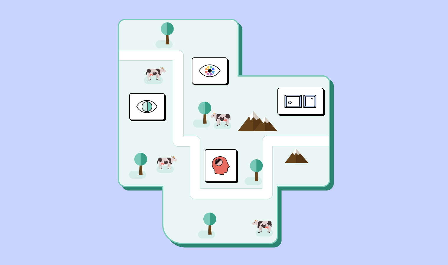
We hope you have a better image in your mind about what the journey towards accessibility looks like, and that wherever you’re on this exciting journey, this series of posts has been helpful in planning your next step. It’s dangerous to go alone, so take this small interactive in case you or someone else ever needs a reminder.
You can also open it in full screen via this link.
The Accessibility Journey
Thank you for coming along on this accessibility journey with us, and if at any point you find yourself lost or simply with a story to tell, definitely reach out.
about the authors
István Korompai
Hanna Bekefi