Alternative chart types for pie chart
Written by: Ivett Kovács
Pie charts have many alternatives that can visualize data potentially much better. We present a few examples on which ones might be the best ones (in our opinion).
A quick note: This post was originally published some time ago on DataViz.Love, our old blog. We have moved it here for preservation with the approval of the author(s).
Pie charts are not enemies, but we should accept that our brain is poor at comparing angles.
Humans are much better at decoding numbers in the form of length or position than they are it comparing angles or areas. Pie charts invite viewers to try anyway, which increases the cognitive load on the user.
Edward Tufte writes (1983) – "A table is nearly always better than a dumb pie chart."
William Cleveland is one of the world’s foremost authorities on how information is extracted from a graph (1996) – "Pie charts have several perceptual problems. Pie charts do not provide efficient detection of geometric objects that convey information about differences in values."
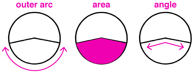
Naomi Robbins writes: "We make angle judgments when we read a pie chart, but we don’t judge angles very well. These judgments are biased; we underestimate acute angles (angles less than 90°) and overestimate obtuse angles (angles greater than 90°). Also, angles with horizontal bisectors (when the line dividing the angle in two is horizontal) appear larger than angles with vertical bisectors."
Pie charts only make it easy to judge the magnitude of a slice when it is close to 0%, 25%, 50%, 75% or 100%.
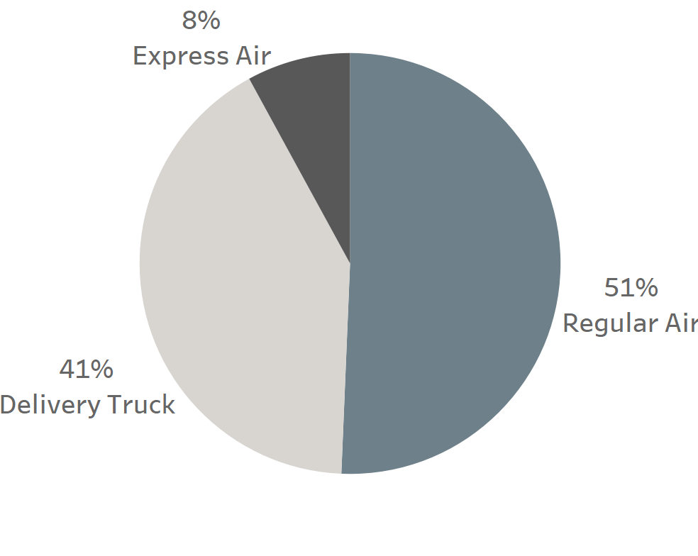
They are really useful when:
- Comparing a small number of categories (2-3 different data points).
- Emphasizing percentage of whole relationships.
Variants of pie charts
DONUT CHART
The previous statements are true for the brother of the pie chart type, the donut chart as well. We already criticized pie charts due to the angle of each piece of the pie. The donut type has a cut-out center so we don’t have to struggle with the angles problem. Instead, we get the new challenge to estimate the values of the arc lengths. Unfortunately, we can’t easily understand and see data displayed in this form.
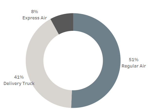
Walter Crosby Eells conducted an experiment about how we judge the pie charts: He found in his study that we judge pies by arc length, area or central angle and just a few people by chord length.
If you are interested in this topic I really recommended his study: The Relative Merits of Circles and Bars for Representing Component Parts.
What other chart types we can use to show the proportion?
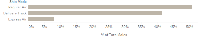
SIMPLE BAR CHART OR STACKED BAR CHART
Definitely, the best alternative for a pie chart/donut chart is a simple bar graph because in that case we only have to compare one dimension, length with more clarity and less clutter.

Treemap
Ben Shneiderman, the inventor of the treemap chart, that shows the hierarchical data in areas of rectangles.

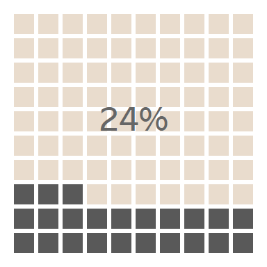
’WAFFLE’ CHART
Nowadays I see more and more square pies, also known as waffle charts. Since it does not involve angles, it’s easier for the reader to compare data accurately compared to pie charts.
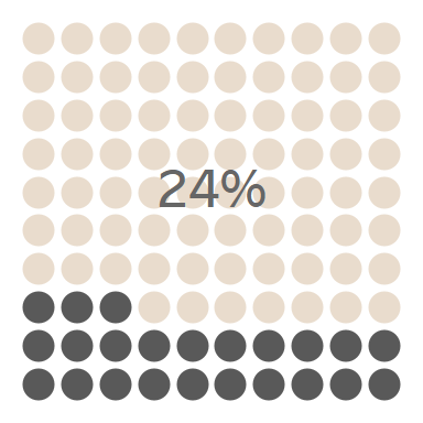
The waffle chart’s sister is the Dot Matrix Chart. It gives a quick overview of the distribution and proportion of the categories.
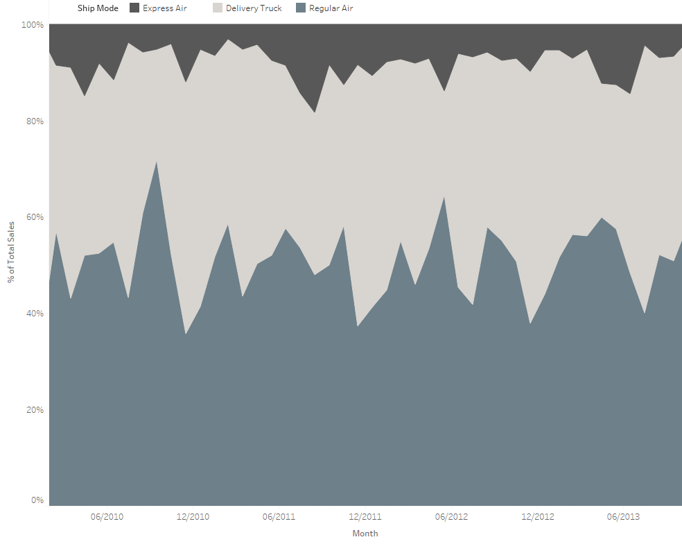
STACKED AREA CHART
It is useful if you want to show the changes over time for many variables
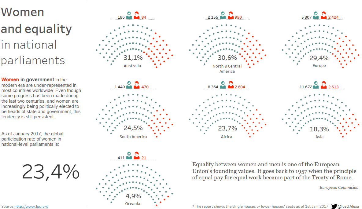
In the “Women and equality” report, I used the waffle chart method to show the gender proportion arranged in semi circles.
See Andy's tutorial about how you can build easily waffle matrixes here.

You can see the full report below, or alternatively under this link.