How to build a guided tour for your Tableau dashboard - Part 2.
Written by: Tamás Varga
Would you like to create a guided tour for your Tableau dashboard to boost user adoption and build trust? In the second episode of the series we provide you a step-by-step guide on the technical implementation of the guided tour in Tableau Desktop - using the visual assets created in Figma, adding calculated fields, dashboard actions and more.
A quick recap: In this two part series I would like to provide a step-by-step guide on how Tableau developers could implement a scalable, user-friendly solution that would help user adoption and enhance the overall user experience of a given dashboard.
In the previous episode we’ve discussed the concept and purpose of the guided tour - how it can help users on their journey to learn about metrics, functions and the overall content of a given dashboard. We’ve also gone through the process of creating the visual assets needed in our chosen graphic design tool, Figma.
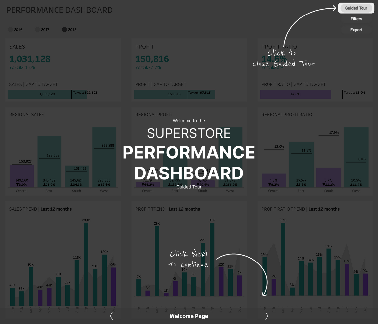
Now that we’re done with preparations let’s take a look at how we can put together our guided tour in Tableau - what objects, calculations, actions etc. are needed to get the work done.
The dashboard objects
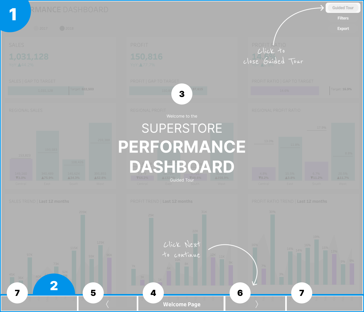
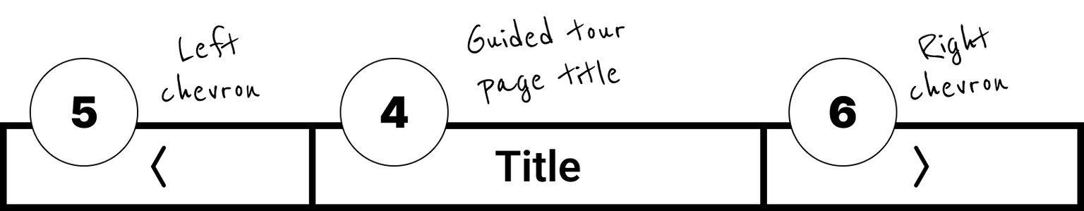
First of all we need a vertical container (1) as our foundation for all the other objects. Within this we will nest two objects: a horizontal container (2) for the guided tour navigation elements and the worksheet (3) that contains the guided tour images we created in Figma previously. Within the horizontal container we will need to nest the title (4), the left (5) and right chevron (6). We will also add two blank objects (7) here to help sizing and positioning the chevrons and the title. Later on we will dig deeper into the concept of navigation that will explain why we need all these elements to make our guided tour work.
As a start let’s add the main vertical container with a fixed height of 1140 pixels and the horizontal container inside that with 60 pixels height.
We also need to add a show / hide button for our main vertical container (1) and have it as our top layer on the dashboard. This will allow users to open and close the guided tour anytime while they’re using the dashboard.
Creating the guided tour worksheet
And now arrived at the most tricky part of our build, the worksheet that will show our images we’ve created in Figma. As a start, let’s create a new worksheet.
Before adding anything on our new worksheet, we should create a parameter called P. Guided Tour Pagination. This should be an integer parameter. We could leave its value set blank or - if you prefer - you can create a list of values based on how many pages you plan to have in the guided tour.
After that we need a calculated field as well, let’s call it C. Guided Tour Pagination and the calculation should be simply [P. Guided Tour Pagination]. The only purpose of this calculated field is to “materialize” our parameter value. You’ll see shortly why we need it - spoiler: that’s a major trick here.
The next two calculated fields that we will need to create will help us to position our images within the worksheet.
C. Guided Tour Axis X
AVG(1400)
C. Guided Tour Axis Y
AVG(1140)
Let’s add C. Guided Tour Axis X to the Columns shelf, C. Guided Tour Axis Y to the Rows shelf and fix axis accordingly: X axis from 0 to 1400, Y axis from 0 to 1140. When it’s done, let’s hide both, we won’t need them anymore.
We also need to add C. Guided Tour pagination to Marks and set it to discrete. Set our visualization type to polygons. Now the worksheet should be blank and that’s the goal here.
And that’s the point where things will get even trickier. In Tableau we can add background images to worksheets and there are a couple of ways we can customize how those will appear.
We can add such an image by navigating to the Maps menu where there’s an option for background images. Within this option we can choose any of the data sources that we would like to use as our base. In this case it doesn’t really matter as our logic is based on a parameter so it’s not in direct relation with any of the data sources. In the pop-up menu there’s an option to add an image (or edit an already added one), let’s do that.
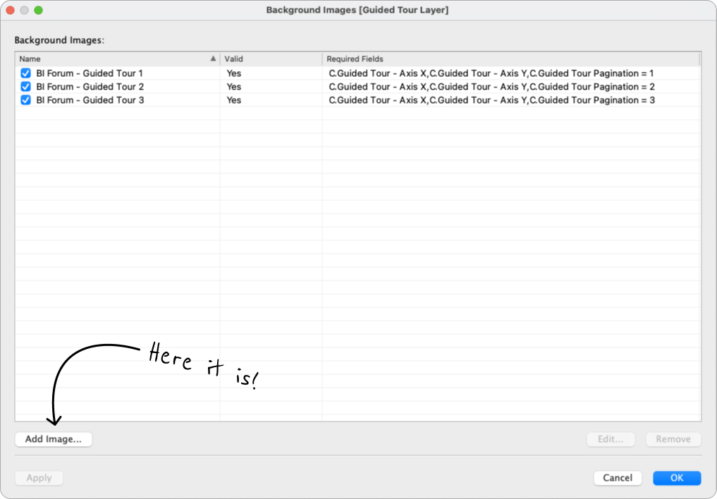
In the Edit Background Image menu we can add our first image to the worksheet. For that, let’s click on Browse to locate and add the image. After that we need to name it and then Set the X Field and the Y Field to set the position of the image:
X field
Field to use: C. Guided Tour - Axis XLeft: 0
Right: 1400
Y field
Field to use: C. Guided Tour - Axis Y
Bottom: 0
Top: 1140
Now let’s go to Options, where the magic happens.
At the Options menu we can add conditions to define when the given image should appear. Ok, but where’s the trick? In this menu you can only select discrete dimension fields only. No parameters and no continuous measures. That’s the exact reason why we had to materialize our parameter value and why we had to set the relevant calculated field to discrete! And there’s an additional constraint here as we work with parameter based logic: The settings menu will only show the exact value that the C. Guided Tour Pagination field inherits from the parameter, therefore each time we would like to set an image condition, we need to change the parameter value manually. But that’s a minor trade-off in exchange to have only one worksheet to work with.
The good news is that from here, we only need to do the same steps for each image that we would like to add. We just need to change the parameter value each time when we set the condition for an image. That’s it, we added our guided tour images, now let’s head onto our next challenge: create a user friendly interaction to enable users to browse through the guided tour pages.
Guided tour navigation worksheets
Let’s talk a bit about the concept of navigation first. From a user's perspective we would like to create buttons that users can click on to turn a page - browse back and forth in the guided tour. Unfortunately there’s no such magic button available in Tableau that we could just drag and drop and tell it to change the page number. For this we will need to mimic the behavior of navigation buttons by creating worksheets with interactive marks that users can click on to trigger page turn. We will also need to set the interactions themselves - we will cover that in the dashboard actions section of the article.
We need to start by setting up our navigation buttons a.k.a. chevrons to switch between pages and our guided tour page title. For that we need to create three separate worksheets for left and right navigation - or back and forth if it sounds better for you - and the title section. Let’s start with the navigation buttons.
What are the building blocks? We can use a dummy calculated field - preferably a discrete dimension - to define the color and shape of the mark. It’s totally up to you what color and shape you would like to use, possibilities are endless, just make sure it’s visible for the users. We will also need to add three additional calculated fields as details for the worksheet:
C. Guided Tour - Chevron LeftIF [P. Guided Tour Pagination]=1 THEN 1
ELSE [P. Guided Tour Pagination]-1
END
We will use this one as with a parameter action to turn back a page in the guided tour and stop at the first page.
We will also need to add to additional fields:
C. True
TRUE
C. False
FALSE
If you’re already familiar with the concept on how to automatically deselect a mark after selection in Tableau, you already know why we need these. If it does not ring a bell yet, here one of the articles that tell a bit more about this concept:https://www.phdata.io/blog/automatically-deselect-marks/
(In my opinion the “Highlight All” step is not needed when you set the filter actions on the dashboard.)
Let’s see what we have to move forward in the guided tour. Again, let’s add the dummy field for color and shape and then we need a bit different calculation to control navigation and move forward.
C. Guided Tour - Chevron Right
IF [P. Guided Tour Pagination]=4 THEN 4
ELSE [P. Guided Tour Pagination]+1
END
This calculation will do the job - again, with a parameter action. As we have only four pages in our use case, we stop when the parameter equals four. We should add the C. True and C. False calculated fields as details here as well.
Last, but not least we need to create our guided tour worksheet. This one is crazy simple. Let’s set our mark type to text, then create a calculated field called C. Guided Tour Title with the following calculation as an example:
C. Guided Tour TitleCASE [P. Guided Tour Pagination]
WHEN 1 THEN "Welcome Page"
WHEN 2 THEN "Main KPIs"
WHEN 3 THEN "Filters and Parameters"
WHEN 4 THEN “Select Year and Export”
END
We need to add this as a label and do some formatting. After that we’re done with all the worksheets we need to add, so let’s move onto adding our worksheets to the dashboard and setting up all dashboard actions needed.
Setting up the parameter actions
Positioning our new worksheets is relatively easy. We need to add our guided tour worksheet to the parent vertical container (1). All other worksheets have to be nested into the horizontal container (2) at the bottom with two additional blank objects on the left and right side to help position the two navigation buttons and the title worksheet.An important step when adding worksheet background images: let’s make sure to switch off all map interactions in the Map menu / Map Options section, especially pan and zoom. With this we won’t allow users to accidentally zoom in and out the image when scrolling through the dashboard.
Ok, now that we added all worksheets and objects, how can we make them work? The answer is: dashboard actions!
Dashboard actions are the gist of interactions in Tableau. With dashboard actions we are able create a kind of connection between the worksheets we add to a dashboard. There are different types of interaction available, in our case we will use two commonly used ones: parameter actions and filter actions. Parameter actions allow users to select a data mark in a worksheet and assign a selected attribute to the relevant parameter, changing its value from eg. A to B. Filter actions usually do a different job: By selecting a single mark or multiple marks we filter the underlying data of the relevant worksheets, allowing users to focus their analysis in these worksheets. In our case we will use filter actions to do a special trick: to automatically deselect a selected mark. We will cover why it is important later on.
Let’s begin with parameter actions. We need to set up two parameter actions and two filter actions to make user interactions smooth and seamless. Dashboard action can be added in the Dashboard / Actions… menu. First, let’s talk about the parameter actions:
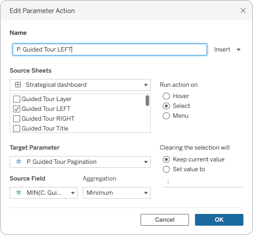
Let’s add our left navigation button interaction as a parameter action:
As the source sheet we will use the Guided Tour LEFT worksheet. The targeted parameter is the P. Guided Tour parameter and the source field to get the value that we would like to assign to this parameter is the C. Guided Tour - Chevron Left calculated field. Aggregation can be set to MIN, MAX our None as well. We would like to run the action selection and clearing the selection will keep the currently assigned value.
We need to repeat the same steps for our P. Guided Tour RIGHT parameter action, but we should use the Guided Tour RIGHT worksheet as our source sheet and the C. Guided Tour - Chevron Right calculated field as our source field.
With these actions set up now we’re able to navigate back and forth between the guided tour pages. The only inconvenience that we’re left with is that when we click on any of the shapes for navigation, they stay selected. So next time we click on it, first we will deselect it but won’t trigger the navigation interaction. We need to do a second click for that. To solve this issue, we have to create filter actions as well - one for each navigation button.
Setting up the filter actions
The following actions use a very simple logic to automatically deselect any selected marks during an interaction and go pretty well hand in hand with parameter actions.
Let’s go to the Dashboard menu / Actions… section and add a filter action.
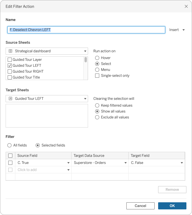
Let’s take a look at the setup of the filter action: as Source Sheets we would like to use our dashboard as a source and from that the Guided Tour LEFT worksheet - just as we did for the parameter action previously. We would like to run our action select and the target sheet should be the same exact worksheet, but not selected from the dashboard, but the worksheet itself. Clearing the selection will let the worksheet show all values - we do not want anything to disappear, right?
And here comes another magic trick, where we define the selected fields for the filter action. By using the C. True calculation as our source field targeting the C. False field, we basically trigger resetting the selection on our worksheet, so next time the user clicks on the navigation button it will act as a non-selected mark and will trigger the parameter action instantly.
We need to repeat this by setting up another filter action for the other worksheet / navigation button as well, but after that we’re done.
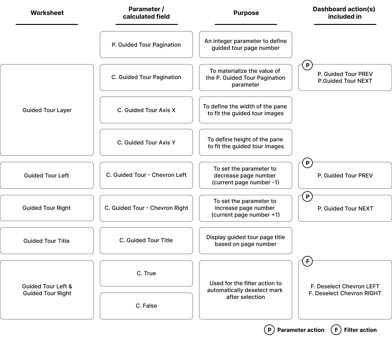
A quick recap on what worksheets, calculated fields and actions have been added to the dashboard:
We can do some additional formatting for the navigation and title worksheets and the blank objects as well to match the guided tour images’ opaque dark background, but structurally and function-wise we’ve just finished putting together our in-dashboard guided tour. Congratulations!
Here's the link to the Tableau Public version.
As closing words, please keep in mind that this is just one possible use case or format how you can set up such a thing. Feel free to experiment, refine and fine-tune this solution.
about the author
Tamás Varga