Disappearing glaciers: how bad is it really?
Written by: Júlia Borsi, Bianka Csuzdi
The answer is: very. Join us as we delve into the topic of global glacier retreat through the example of Hintereisferner, explore the vital role of glaciers, and discover actionable ways to help the cause.
A Slippery Subject for a Hackathon
In Hungary, there’s a unique practice where certain Saturdays are designated as working days nationwide, with the benefit of an additional bank holiday granted in exchange. On these working Saturdays, we gather in the office for a Hackathon where we’re free to work on anything we’re passionate about – as long as it’s at least tangentially related to our jobs. This is the story of a data visualization speedrun done by two members of the Starschema Dataviz Team while others delivered the impressive Data Portraits project.
This time, the idea came from Julia, who’s a dataviz expert and a snowboard instructor. While her passion for the sport remains strong, whenever a new snow season is on the horizon, her mind inevitably wanders to the future of the world's glaciers. While these are stunning places for winter sports, even more importantly, our future depends on their survival. To quote the Meltdown Flags Project, a climate data initiative Julia adores, ”Glaciers are a source of life—they provide vital drinking water, help generate power for millions of homes, and are our most valuable indicators in understanding the future of global climate change.”
Bianka, another data visualization expert within our team, found herself deeply moved by the seriousness of the situation and was motivated to delve deeper into the subject – and so she and Julia took to reading in-depth articles about glacier observations and analyzing endless Excel sheets and README files about the global glacier retreat.
Creating the Viz
The dataset for the project came from the world glacier monitoring service, an organization that has been collecting standardized data on glacier fluctuations for over a century. The database is open-access and can be downloaded from here. It’s a gold mine of information, with multiple sheets describing the world’s glaciers in detail and thorough README files explaining the data.
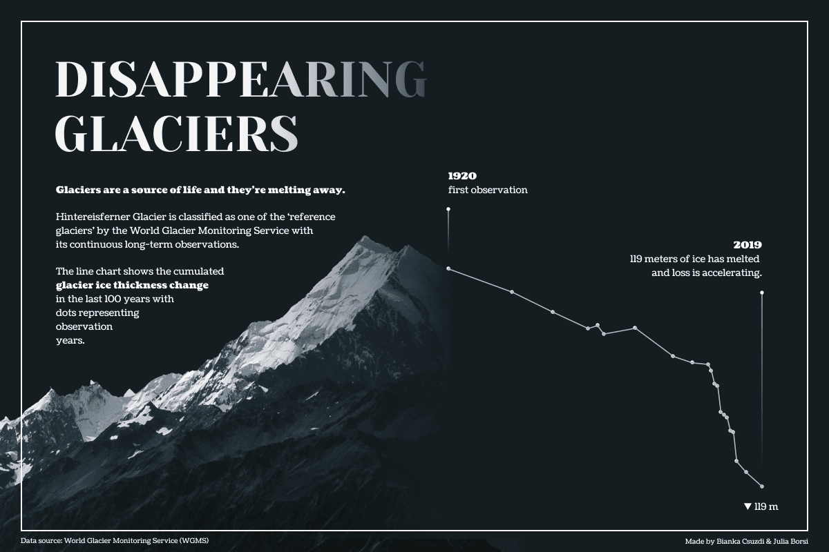
After careful consideration, they ultimately decided to utilize data from Hintereisferner. This particular glacier is situated in the Eastern Alps of Austria and has been classified as a 'reference glacier' by the world glacier monitoring service due to its continuous long-term observations dating back to the year 1952/53.
Fast forward to the end of an exhausting day, here’s the result that shows how dire the situation is for the Hintereisferner Glacier. Feel free to download the workbook from Tableau Public to access the calculations or check the dataset!
Find Out More
If you are interested in the fate of our glaciers, their profound impact on our future and how you can help the cause, check out the links below:
about the authors
Júlia Borsi
Bianka Csuzdi
Bianka Csuzdi is a Data Visualization Expert at Starschema, who builds dashboards in Tableau. She is curious about anything that includes data or travelling.