A practical guide for accessibility in business intelligence tools
Written by: Júlia Borsi, Boglárka Göttli, Bianka Csuzdi, István Korompai
Accessibility is rarely at the forefront of developers minds when they are creating business dashboards in Power BI and Tableau. We believe that is mostly because people do not know where to start engaging with this often daunting topic. Well, this how-to style article is the remedy for that headache. Tag along with us on this long and winding road!
This post is second in a three-part series on accessibility in dataviz.
- Accessibility and Data Visualization
A description of disabilities, techniques and standards based on existing guidelines — read it here - A Practical Guide for Accessibility in Business Intelligence Tools
Approaches and possibilities for applying techniques described here in Tableau and Power BI — you are reading this one - Investing in DataViz Accessibility Pays Off
A plea to data leaders to invest in dataviz accessibility — spoiler: it makes total business sense — out now in this post
Our first post in this series about accessibility focused on the key principles of designing data visualizations that are easy to understand for all audiences regardless of their abilities.
Now we’re going to tackle the crucial question: How do I actually do it? Where do I start?
There are multiple standards and guidelines aiming to make digital products more accessible that we discussed in-depth here. We recognize that implementing many of these guidelines might appear challenging or even overwhelming at first, particularly in the realm of business intelligence and strict deadlines, changing requirements and somewhat constrained tools.
If you’re just beginning to explore the world of accessibility: we’ve got you. This post is about demonstrating best practices and readily available features that anyone can immediately use in the two industry-leading BI tools: Power BI and Tableau.
To achieve this, we’ll use Chartability’s five principles to assess the possibilities within each data visualization software. Chartability is a collection of principles with testable criteria collected by Frank Elavsky for accessible data experiences, and it’s the most hands-on, practical guideline we’ve encountered. We’ll be delving into built-in accessibility features, exploring common design techniques that could hinder dashboard accessibility, and addressing the limitations of each software in this regard.
Chartability is a tool meant to identify design failures. We’ll walk you through its five main criteria: Visual Testing, Keyboard Probing, Screenreader Inspecting, Checking Cognitive Barriers and Evaluating Context. Chartability views accessibility as a scale, not a state. A data design’s accessibility is determined by its number of failures. Some tests have been marked as ‘critical’ due to their high cost of correction, frequency, significant impact on data experience design or development, or the creation of significant barriers. In this discussion, we’ll cover all critical tests and highlight those that may be relevant in the context of BI tools.
Demo Examples
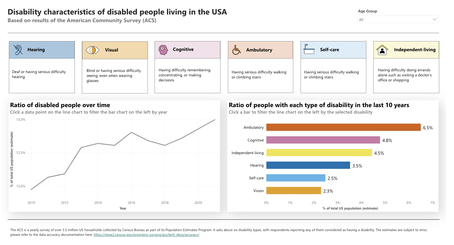
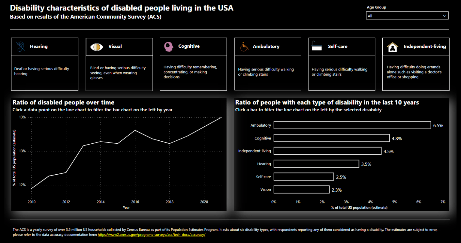
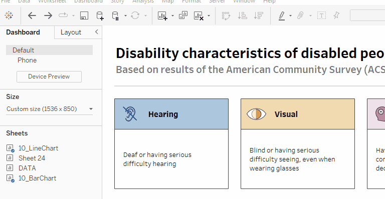
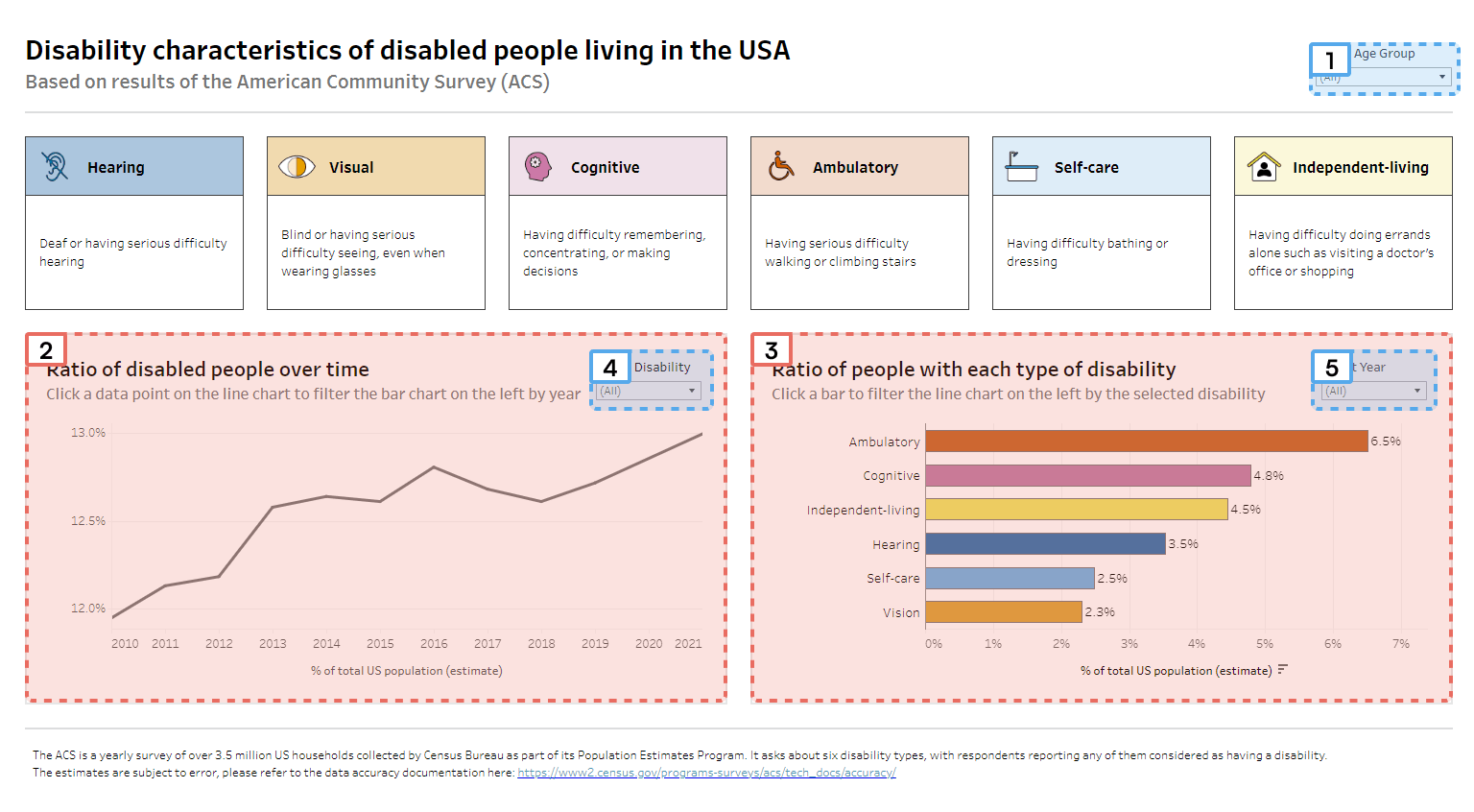
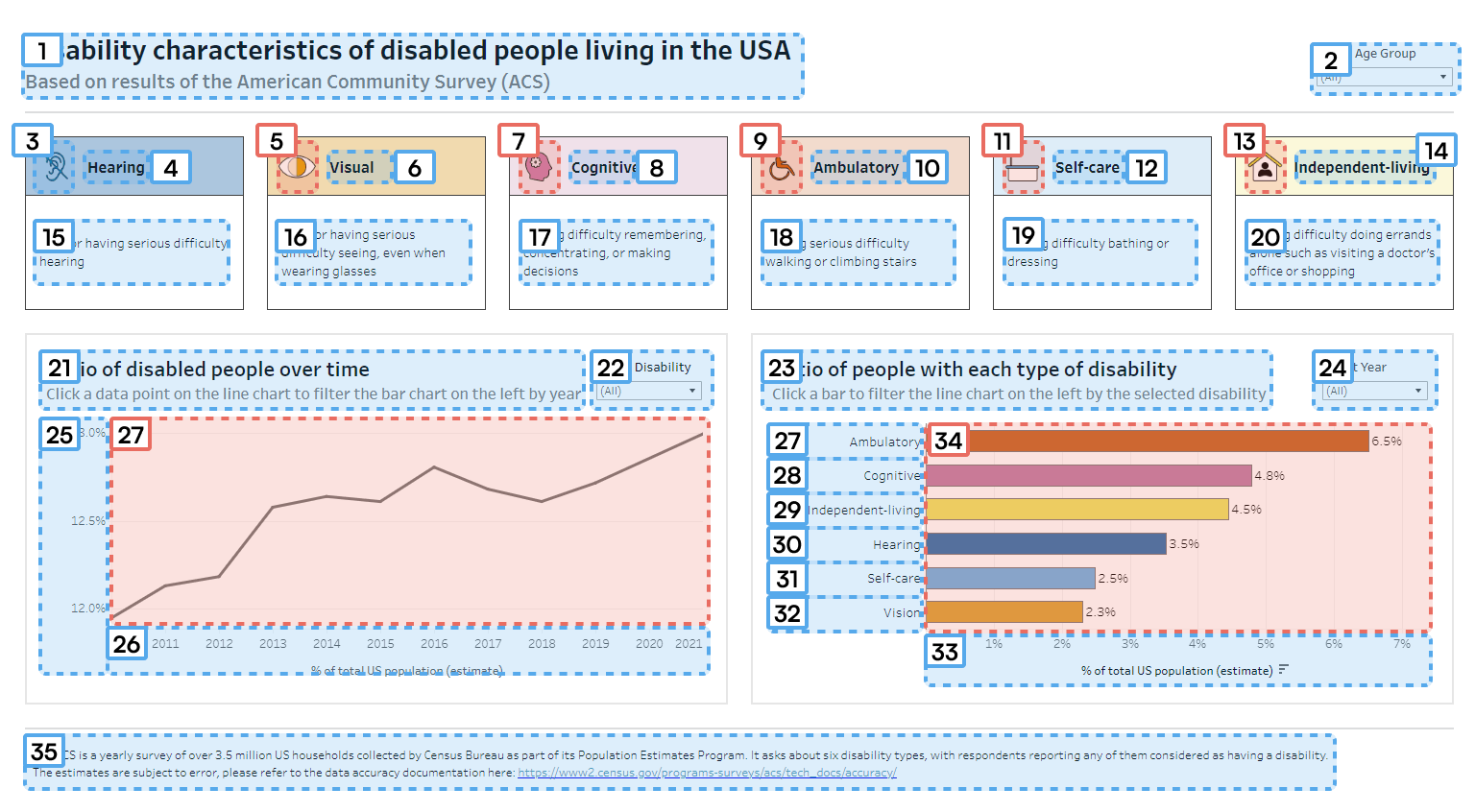
Throughout this post, we’ll be using a single dashboard example that examines the disability characteristics of disabled people living in the USA. The same dashboard has been created in both tools. We aim to provide as many practical tips as possible and, as we work through Chartability's tests, the dashboard will become increasingly accessible.
- Tool-specific settings will always be displayed in both tools or when there is a significant difference between the available options.
- Some visual and cognitive tests are relatively easy to perform with both tools. However, in some cases, third-party tools may be necessary to achieve optimal results. In such cases, we’ll provide examples using either Power BI or Tableau.
You can check the most accessible version of the Tableau dashboard here:
Unfortunately, no public Power BI Service is available for uploading the Power BI dashboard. However, it’s similar to the Tableau dashboard, and all formatting and tool-specific settings will be explained in detail.
Let’s dive in!
Visual Testing

Visual impairments refer to a range of conditions that affect a person's ability to see, including blindness, low vision and color blindness. We’ve talked about the importance of designing with the visually impaired in mind, so now let’s see how our tools can help!
This step includes contrast checks, text size validation, ensuring that the color is used in an accessible way and other visual checks.
Contrast and CVD Considerations
People with color vision deficiencies (CVD) are unable to perceive color the same way as those with normal vision, while those with low or reduced vision might see blurry or have blind spots.
Built-In Color Palettes
Color vision deficiencies are the single most documented dataviz accessibility concern with a great depth of knowledge. As such, we’re only giving you a couple of starting points in this article. If you want a deep dive into the topic, we recommend Lisa Muth’s series on the topic over at the Datawrapper blog.
Let’s see how these two leading BI tools consider color vision problems in their built-in palettes.
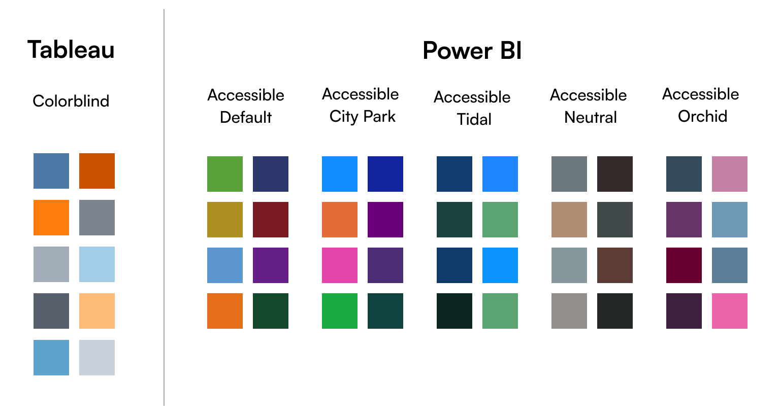
Tableau offers multiple color palettes, but only one of them is designed specifically for individuals with color vision deficiencies. If you're not a fan of this specific theme, don't worry: you can always override it or create your own custom palette and make it CVD-accessible! Our favorite tool for this is Viz Palette, which has built-in color simulations that enable you to test your color scheme right as you’re tweaking it. Once that’s done, you can refer to an easy-to-follow documentation about adding custom color palettes to Tableau, available here.
If you want to understand how someone with a color vision deficiency would see your dashboard, you can turn to third-party tools like Color Simulation for Windows or Color Oracle for Mac and Windows.
Contrast
Color and contrast are interrelated topics, but they’re frequently discussed separately. This section will refer to contrast ratios extensively, so if you don’t yet know what they are, we recommend you check out our explainer in the first post.
When designing your color palette, you can break down contrast considerations into the following four areas.
Text-to-background
Any good data visualization will have a lot of textual content for readability and accessibility purposes. Making sure that the color of that text is visible to everyone is fairly straightforward:
- First of all, make your own life easier! Simplify the list of colors used for text to just two: a primary and a secondary. The primary will be used for titles and more important information, while the secondary is used for smaller stuff, e.g. axis ticks. This way, you only have to check two colors and, as a bonus, your design will look more consistent.
- On a white/light background, the primary should be black or close to black, and the secondary should be a contrasting dark gray with a minimum 4.5 contrast ratio against your background. Remember: the higher the contrast, the more readable your text.
- On a black/dark background, the primary should be white and the secondary should be a minimally contrasting light gray with a 4.5 contrast ratio against the background.
Controls and interactive elements
The relevant standards dictate that interactive elements should be easily distinguished from the background which, frankly, does not sound like a bad idea. That said, these are usually handled by the tool itself, but in case there are customization options, the 3:1 contrast ratio for graphical elements needs to be respected.
Marks against the background
The 3:1 contrast ratio is still the key to look out for here. Ideally, all colors of a palette must achieve this whether it’s a categorical palette or sequential. Naturally, achieving this on the lighter end of a sequential palette is very difficult, so if the colors are lighter, adding a border to your marks is the easiest way to achieve this effect.

Marks against other marks
We’ll be honest, this is rather difficult to solve in a way that will still produce a beautiful end product with a distinct style.
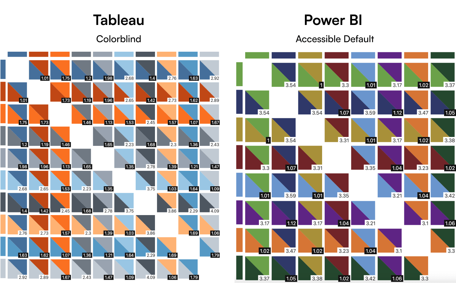
Adding more and more colors to a palette makes it increasingly difficult to ensure that each color pairing is distinct enough, as each color must meet the 3:1 contrast ratio criterion with all other colors. The example below displays ten Tableau colors (from its Colorblind Palette) paired with one another, along with their contrast ratio, created with the tool ‘Cassy’ from this Nightingale article. After that, you can see the same exercise for one of Power BI's accessible palettes and its eight colors. Tableau isn’t doing that good, only some of them match the 3:1 criteria, but even a lowered 2:1 is a fail for most pairings. In Power BI, some pairings are performing well, while others are not doing so great in terms of contrast. Sigh.
An easier solution is to add space between the marks so the issue is reduced to the “marks against the background” problem. Since most tools don’t actually support adding space between the marks, an easy solution is adding a border to the marks that has the same color as the background.
Built-in high-contrast color mode in Power BI
High-contrast mode is an accessibility feature that alters the colors to make text and graphics easier to see. Power BI Desktop has a built-in feature where, if you enable high-contrast mode in Windows, Power BI Desktop adopts the theme from Windows and uses it in the reports. The colors are also retained in the report when it’s published to the Power BI Service or elsewhere.
Additional Color Considerations
Color by itself is not a reliable way to convey information. As we mentioned in our previous post, it’s important to use additional visual cues like shapes, size, and/or supporting text. A good rule of thumb is to ask yourself if your user could still read the chart and understand the meaning if the color was removed. Besides adding visual cues in addition to color, a best practice is to label marks directly to help understand your charts.
Color considerations in Tableau
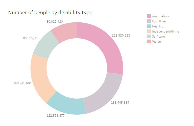
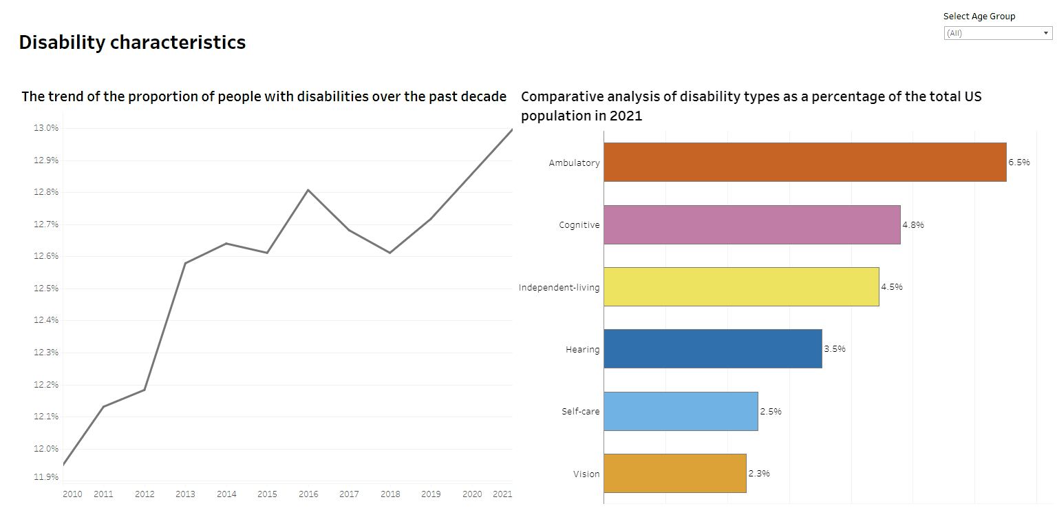
The donut chart displays the number of disabled people categorized by disability type. However, the chart's color scheme and text colors are too light and rely solely on color to convey meaning.
Readable Text
Any text on a dashboard or data visualization shouldn’t be smaller than 9pt/12px in size. Ideally, only minor text is rendered at 9pt (e.g. axis labels) while all other text is larger.
Typography should have a clear and consistent hierarchy, and text color should meet the color and contrast standards mentioned above.
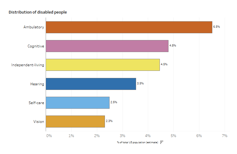
The contrast and color of text objects are adequate. However, the axis and bar chart labels are too small, and the hierarchy between the chart title and labels is not adequate.
Avoid Seizure Risk
In Chartability, a critical test states that the visual must not pose a seizure risk when static or active. Certain individuals may experience seizures when exposed to flashing lights at certain intensities or certain visual patterns. To avoid this, it’s recommended to avoid:
- using red flashes;
- animating with red or having a significant portion of the display area using the color red
Luckily, neither of these are a huge risk in our daily corporate practice.
Checking Cognitive Barriers

There is an elephant in the room, so let’s address it. One could argue that many of the techniques we described under cognitive features are technically usability features — which is true since accessibility and usability are closely related aspects of creating a data experience that works for everyone. It’s important to note the difference between the two before diving into this section.
According to the Web Accessibility Initiative:
- Accessibility: addresses discriminatory aspects related to equivalent user experience for people with disabilities. Web accessibility means that people with disabilities can equally perceive, understand, navigate and interact with websites and tools.
- Usability: is about designing products to be effective, efficient and satisfying. Usability includes user experience design. This may include general aspects that impact everyone and don’t disproportionally impact people with disabilities. Usability practice and research often does not sufficiently address the needs of people with disabilities.
Checking cognitive barriers is the area where accessibility and usability intersect in the most apparent way. This phase of Chartability focuses on ensuring that our dashboards are clear, understandable and usable for all audiences. The practices mentioned here make visualizations better for everyone, but they’re crucial for individuals with cognitive disabilities. You can imagine it as your users having a fixed cognitive budget and, if they run out, the product becomes unusable for them. For individuals with intellectual disability, attention disorders, or memory problems, these cognitive budgets are lower.
In this section, we check for basic textual descriptions of charts and look for explanations on how to read and use the dashboard so you can be sure that users will know how to interact with and navigate your viz.
Keep your Design Consistent
Data visualization is the practice of presenting information in a visual context. By creating a visual representation of the data, we can communicate complex information in a more intuitive and compelling way.
Inconsistent design can significantly hinder these efforts. To avoid this, make sure to:
- Use a clear typographic hierarchy with a clear distinction between titles, headers, and other typographic elements.
- Use the same font, color and style for visual elements across your report.
- If you have multiple tabs or visualizations, keep a similar structure across them — for example, filters and interactions should be in the same spot.
- Use the same colors for the same things — especially if you’re using a categorical color palette in multiple charts.
This is also important from a usability perspective, as users are more likely to engage with and gain insights from visualizations that are easy to process and understand.
The example below demonstrates an unclear and a clear typography hierarchy.
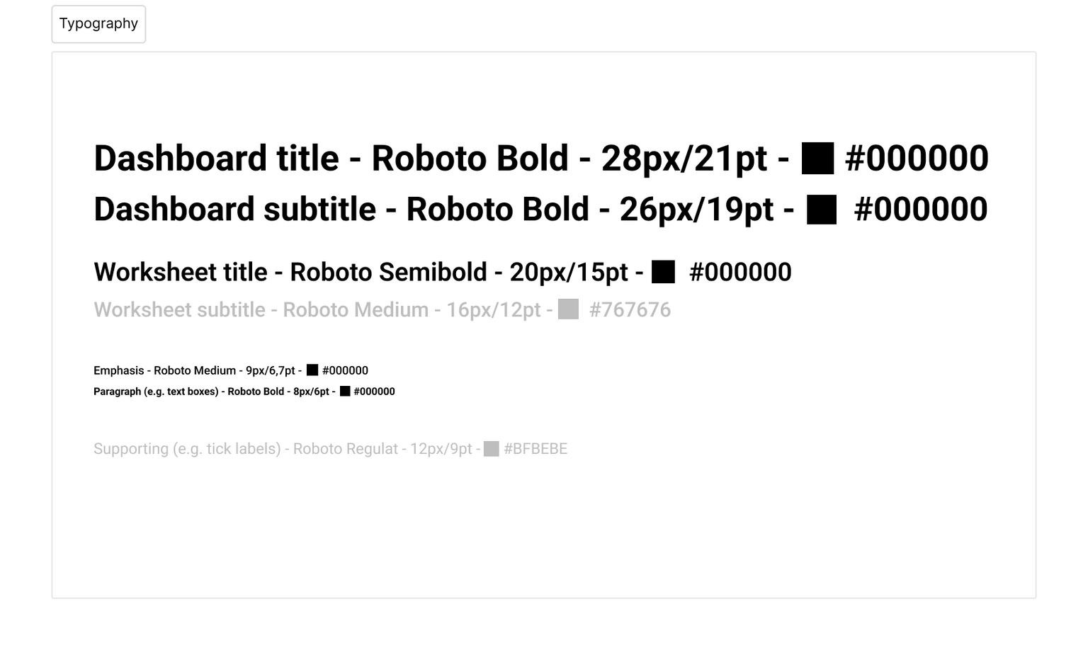
It’s difficult to distinguish between titles and subtitles, and supporting text is too small and light. As a result, it’s harder to read and comprehend the information presented on the dashboard.
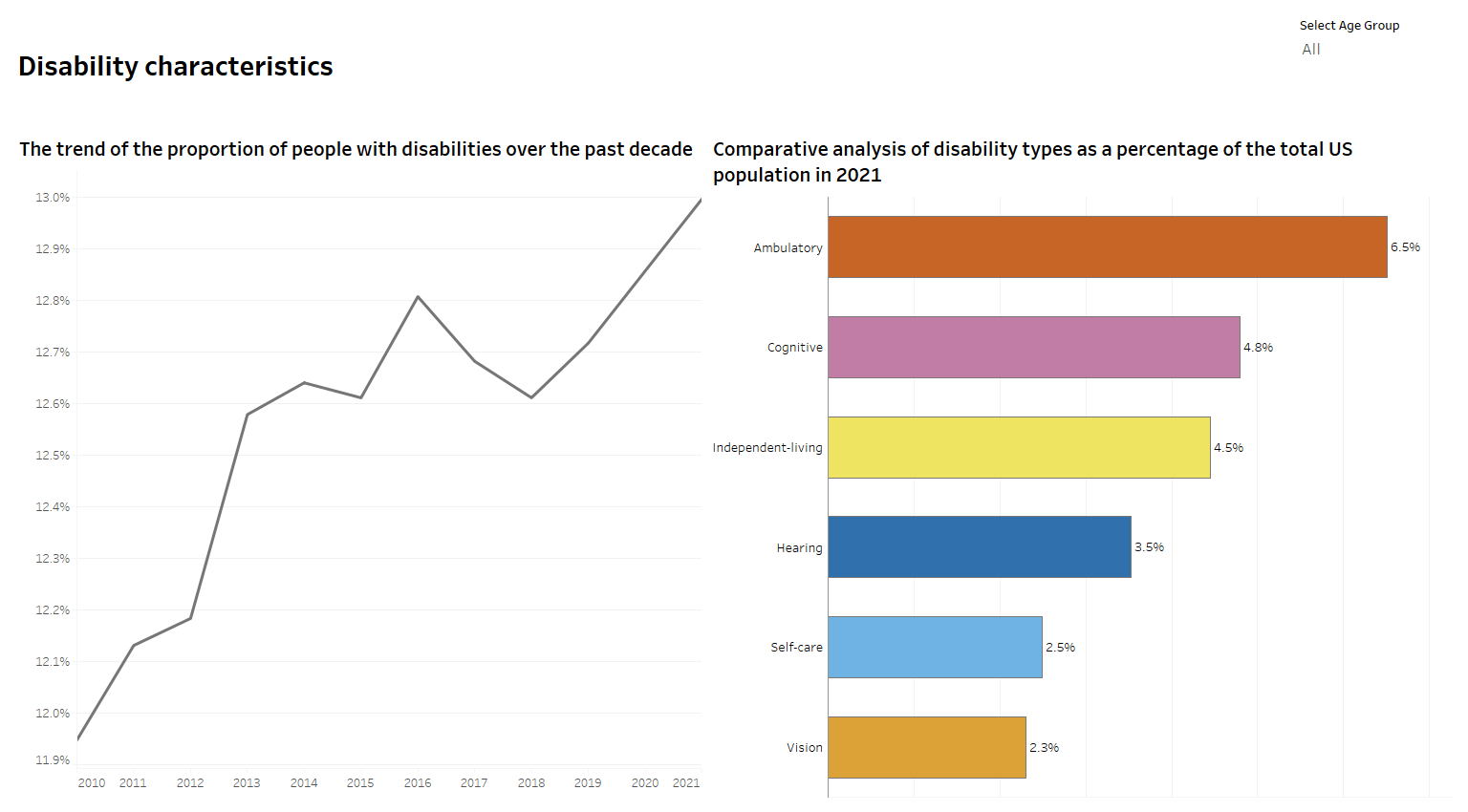
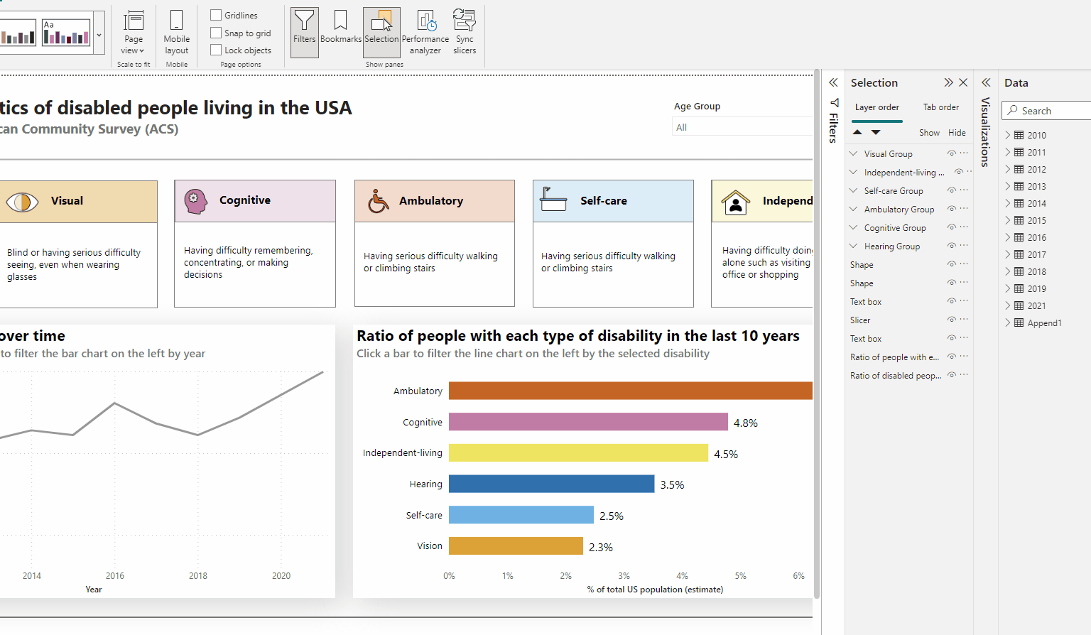
We are now combining multiple charts into our dashboard. These include a line chart displaying the ratio of disabled people over time, and the previously created bar chart showing the breakdown by disability type. It is important to maintain a consistent style across the dashboard when there are multiple charts to ease the cognitive load.
A good example would be to keep the same colors for the line chart when filtering by visualization type as in the bar chart. See below:
Creating a Decent Visualization
Ensuring that your visualization is clear, informative and easy to navigate for all audiences is crucial. Chartability includes the following criteria for achieving this goal:
- Add informative titles, summaries and captions.
- Write a clear explanation and describe the purpose of the visualization.
- Include interaction cues and instructions on how to use the visualization for example how to read.
- Make sure axis labels are clear and present.
- Design navigation and interaction to be quick and easy to use, as cognitive load increases throughout long and tedious interaction patterns.
- Use accessible language for all audiences: avoid jargon or technical terms that may be difficult to understand.
- Avoid using too much text, as it can be overwhelming for people with cognitive disabilities.
- Reduce visual complexity and provide proper content structure by breaking down complex information into smaller, more manageable pieces.
- Define metrics and variables and make sure calculations are correct and insights are not misleading.
To sum up: strive for clarity and simplicity in content! The good news is that achieving these goals with both Tableau and Power BI is relatively easy, but it requires a conscious effort and a focus on user experience. Luckily, UX is a highly researched and well-documented topic. Meanwhile, for tool-specific information, you can refer to the official accessibility documentation for Tableau or Power BI.
Let’s add these to our own dashboard!
What has changed?
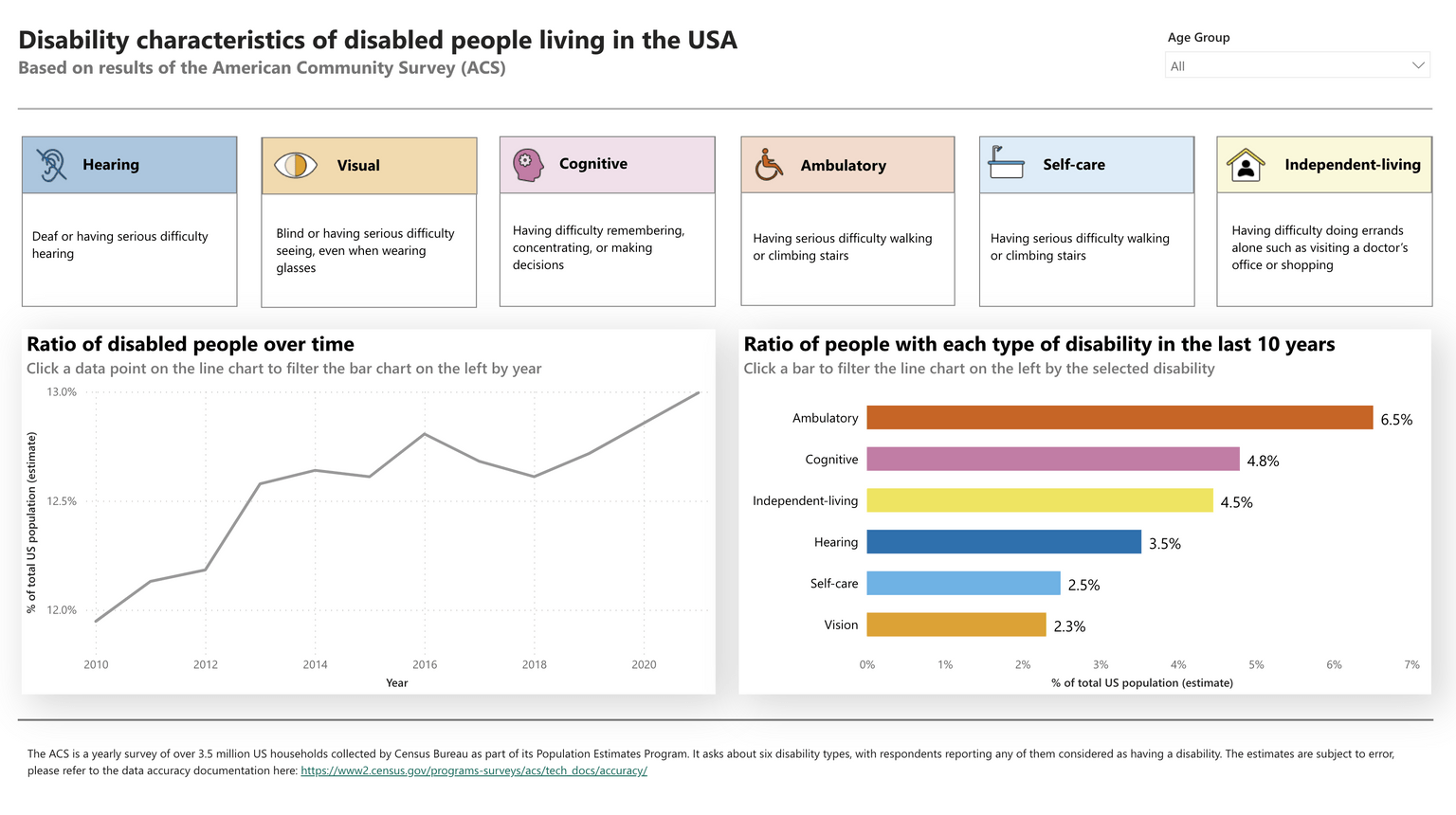
- Informative captions, titles, and context have been added to help readers understand the topic. The information bar under the title demonstrates that accessible design can also be beautiful, and we are proud of the way we presented this information.
- Interaction cues and axis labels have also been added for clarity.
- The language has been revised to be more clear and understandable.
Visual Testing - Again
In Chartability, these features fall under Visual Testing, which we discussed earlier. However, from our dashboard development perspective, it makes the most sense to add the whitespace setting and responsiveness (especially for phone layout) after integrating all the cognitive features into the dashboard.
Let's give another round of applause for Visual Testing.
Effective Whitespace
Chartability mentions this test as “spacing is inappropriate.” It refers to the blank or negative space between design elements which reduces clutter, separates and unifies elements of the design and shows how they are related. Effective use of it can enhance the visual appeal, accessibility, and overall usability of a dashboard.
Whitespace can be added:
- Between dashboard objects such as charts, static text blocks, interactive elements, etc.
- In charts — we mentioned a use case for this in our Contrast Best Practices.
- Line height in text objects
The use of whitespace is a critical aspect of design that can significantly impact the user experience, especially for individuals with visual or cognitive impairments.
- For users with visual impairments, whitespace can help improve readability by providing a clear separation between text and other design elements.
- It can also help users with cognitive impairments by reducing visual clutter and making it easier to focus on key information.
- For visually impaired individuals, it is important to maintain a line height of at least 1.5 times the font size, letter spacing of at least 0.12 times the font size, and word spacing of at least 0.16 times the font size. Unfortunately, this setting is automatically configured in our tools and cannot be modified.
- Furthermore, proper use of whitespace can create a balanced design, making it more aesthetically pleasing and engaging for all users. It can also help guide the user's eye to important information and calls to action.
To sum up, don’t think of whitespace as wasted space — let your viz breathe!
Tableau automatically sets a 4px outer padding on all dashboard objects, but we recommend adding a bigger one in almost all cases. Power BI also adds a fixed amount of whitespace that can be modified by resizing the item, although the options are more limited.
Let's add some whitespace to our dashboard! In the ‘Before’ stage, most of the paddings are set to the default Tableau 4px on all sides. In the ‘After’ stage, we set the paddings ourselves. The difference is quite clear, isn't it?

Similar results can be achieved in Power BI:
Responsivity - Zoom and Reflow
Many people with poor eyesight rely on setting very high zoom levels on their devices to magnify the content of web pages and apps. When this happens, the tools we use to create data visualizations perceive it as if we were using a lower-resolution screen. For example, a user on a 1920-pixel wide laptop screen with a zoom of 300% would “register” as a 640-pixel wide screen.
Therefore, it’s crucial to create data experiences that are readable on smaller screen sizes — which is is easier said than done. To achieve this, we can borrow techniques from the web design industry to address the challenge of presenting the same content on both desktop and mobile devices. One of the main techniques is what we refer to as reflow.
Reflow refers to the change in the layout of the page's content in response to different screen sizes. The most trivial example of this is text wrapping to whatever the allowed width on the screen is. A slightly more advanced technique is when a grid of content that’s laid out horizontally on a desktop page reflows into a single-column, vertical layout on mobile.
In an ideal world, our visualizations would always reflow so they match the screen width, doing away with horizontal scrolling when zoomed. Unfortunately, in the context of Power BI and Tableau, especially in the practice of most organizations, we design for a single desktop screen size and then forget about any other likely screen sizes. This, unfortunately, means that, when someone visits our work with high zoom settings, they have to scroll the page in both directions.
Even if we tried our best, the relative lack of layout tools compared to what’s available in browsers means that we can’t achieve responsivity to the same degree that web design practices would dictate. Nevertheless, here are a couple of techniques to help our users.
- Both Tableau and Power BI support a specific mobile layout, which is a rearranged version of the initial layout. This is very useful, but many developers turn it off out of habit since they’re not used to designing with responsiveness in mind. (Even we’ve been guilty of this one). Next time you’re creating a dashboard, try leaving the mobile layout on and actually implementing it.
- We should aim for flexibility regarding the dashboard's width and support a range of different screen sizes as long as they don’t disrupt our layout.
Let's see how Tableau's automatic phone layout works!
In most cases, Tableau's default phone layout is not sufficient, as you can see below:
Power BI does not have an auto-generated mobile layout, but all the visual elements used in the desktop view are listed under the mobile layout view.
You can easily create your mobile-optimized layout by dragging and dropping these visuals onto the canvas, as shown in the example below:
Keyboard Probing
Keyboard probing refers to using a keyboard to navigate and operate any provided functionality and it’s a crucial feature for people with different types of disabilities, e.g. permanent physical (motor) disabilities. Other assistive technologies, such as screen readers, also rely on good keyboard navigability as a prerequisite.
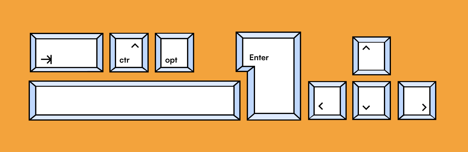
Try to navigate with a keyboard using the Tab and arrow keys only to make sure the visualization is fully keyboard-compatible. If your interactive features require very precise mouse movements or cursor placement, the aforementioned users will have a difficult time.
Tab Order
When using keyboard navigation, users rely on keyboard shortcuts to move to the next item by pressing the Tab key. This is why the so-called “tab order” of your digital product matters: it's basically the sequence a user of keyboard navigation will experience the parts of your visualization. Imagine reading a book where you read the second page first, then the title, and finally, the first page. That's how an inconsistent tab order can feel for users who rely on keyboard navigation.
Setting the tab order helps keyboard users navigate your report in a way that matches the visual processing of the report visuals. Let's take a look at what the tab order looks like in our tools.
In Power BI, the default tab order is top-to-bottom and left-to-right. If it doesn’t fit you, Power BI offers a convenient way to modify the tab order of your dashboard. To do so, create your visualization and navigate to Selection > Tab Order. From there, you can check and modify your tab order. It also gives you the option to remove any decorative elements and to only add tab index to the interactive elements on the screen which matter, e.g. slicers. Easy-peasy lemon squeezy!
Based on our keyboard probing, this is the order in which keyboard navigation functions in Power BI after the tab order has been set up correctly in our demo dashboard:
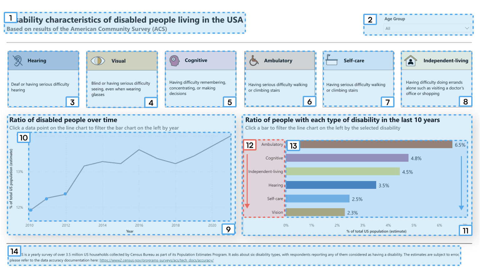
This dashboard is navigable using only a keyboard in Power BI. The only issue is that the data labels are read before the bars, which is illogical. They should be read together for better accessibility. Power BI also gets a bit overzealous and focuses all of the text boxes on the top of the page individually for no good reason, but, hey, we will take it over Tableau’s approach.
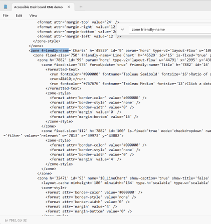
Tableau’s keyboard navigation is a different story altogether. Its default tab order is also top-to-bottom and left-to-right, but the software doesn’t offer a convenient way to change it. The only way to modify tab order is by some XML black magic that most developers won’t attempt. Essentially, you have to name all of your dashboard objects so you’ll remember each and every one of them, then go into the XML of the Tableau workbook and assign an order to your dashboard zones based on each zone’s ID attribute. All we can say is: difficult-difficult lemon difficult!
Furthermore, Tableau does not allow the selection of individual marks via the keyboard, you can only open the View Data window. This basically cuts off all dashboard action access to keyboard-only users.
What can we do, then?
- Let’s try and encourage Tableau to make it easier for us to accommodate our visually-impaired colleagues and customers. You can do that by upvoting this idea on Tableau Forum.
- You can also keep tab order in mind when developing your dashboard layout. Most notably, floating items tend to have an illogical tab order, and so any object that’s floated on top of otherwise tiled content will be read out of visual order — e.g. how one would often place a legend into the top right corner of a sheet. To maintain a consistent tab order, try to avoid this.
Honestly, who wants to muck around in this?
Accessible Interaction
Modern BI dashboards, whether created in Tableau or Power BI, typically rely on interactivity. In fact, most attempts to define what a dashboard is have interactivity as a central theme. Users enjoy exploring and analyzing data by drilling down, slicing, and dicing it to uncover their own insights. But is that option available to everyone?
The Chartability criterion "Interaction modality only has one input type" is one that most modern dashboards fail to meet.
Mouse users and keyboard-only users have very different experiences on Tableau Public or Tableau Server today. Individuals relying on keyboard navigation can access quick filters, but not any dashboard actions. They’re currently unable to navigate to marks of a viz and trigger events that can be utilized by the mouse. This is a significant issue, as dashboard actions are the norm in day-to-day business operations. Tableau — as one of the leaders in the enterprise data viz space — should do better.
What can we do?
- Make sure all dashboard actions have a quick filter equivalent and, in the meantime, nudge Tableau to improve its experience for keyboard-using dashboard consumers by upvoting this idea.
Challenge Tooltips
Tooltips are absolutely everywhere in dashboards, but we believe it's worth challenging them. Let’s question the practice of putting information in a tooltip when its relevance is uncertain. Instead, ask clients whether the information is crucial and should be displayed on the main page, a nice-to-have in the tooltip or entirely disposable. Make sure that business stakeholders understand that this information may not be available to everyone and, therefore, should be displayed somewhere else.
Semantically Invalid
Interaction semantics are difficult to conceptualize without having seen a screen reader in action which you, our reader, will have an opportunity to do below. In the context of this Chartability criterion, semantics refers to the assigned "role" of interactive elements on the page that screen readers read out, such as "button", "dropdown", "textbox", "tab" and so on. This information is valuable for both the screen reader itself — to ensure it knows which elements are interactive — and its user, because they set an expectation of how each of these interactions will work.
Problems arise when developers want to implement something that has a distinct visual appearance or interactive behavior, different from the options built in for each of these roles. What they do is create custom interactive components — in Tableau via sheets and actions, in Power BI via custom vizzes — but these don’t necessarily have the same roles assigned to them in the background as their standard counterparts. As a result, assistive technologies sometimes skip over them or they’re read incorrectly by screen readers.
Below is an example of such a custom selector in Tableau…

… but it is implemented as a worksheet, so it is not keyboard interactive.
The solution to these problems is simple: if it looks like a dropdown, behaves like a dropdown and is used like a dropdown, then you should probably just use whatever the built-in dropdown feature is.
TLDR: clever workarounds and design hacks almost always make your visualization less accessible!
Screen Reader Inspecting

Individuals with vision impairments may require alternative means of accessing and interacting with charts, such as screen readers or alternative input devices. As mentioned before, these tools rely on good keyboard navigability as a prerequisite, which is why Chartability includes keyboard probing as an early test.
A viz can be keyboard-accessible but a nightmare for users with low or no vision. Trying a screen reader to make sure that all the relevant information is read aloud is the only real way to ensure they’re not excluded from the product. It’s less scary than it sounds, we promise.
A Dashboard Is Not Just Visual Information
Obviously, it’s difficult for screen readers to read something when there’s nothing there. To ensure that your dashboard content is accessible, you need to provide alternative ways of accessing the information beyond relying on visual content only.
This can be achieved in multiple ways:
- You can add a table containing a human-readable version of the data the chart is based on. We’ll discuss this topic in more detail later in this article.
- Appropriate titles, captions, and alt texts for images or charts are crucial here.
What’s an alt text?
Alt text or alternative text is a written description added to images or charts that convey the meaning of the visual content. Assistive technology such as screen readers read the alt text out loud so users can hear and understand the visual content.
How to write good alt text?
Numerous resources are available for learning how to write alt text in general. However, in this post, we’ll focus specifically on alt text for our BI dashboards and data visualizations within them.
- Good alt text helps more people understand the content. Imagine that you’re explaining a chart or an image to a friend over the phone. How would you describe it?
- Keep it short. Screen readers read alt text linearly, making it difficult for users to go back if they missed something.
- Make it informative. Include chart type, type of data and reason for including the chart. Ensure that there is a clear message to every visual and communicate to your audience what they should be looking for.
- If you want to learn more, we highly recommend Amy Cesal’s article in Nightingale about the topic as a starting point.
Now that you’ve written your alt text, let’s add it to your dashboards!
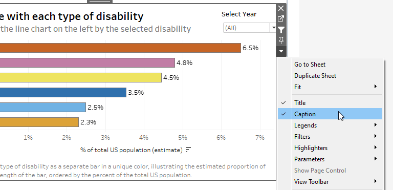
You can add informative titles and captions to your charts in Tableau.
- We initially thought that Tableau exposes the captions of charts to screen readers even if you don’t actually show them on the dashboard. However, this is unfortunately not the case. So, if you don’t provide a visible caption, Tableau’s charts will be barely accessible to screen reader users.
- You can also add alt texts to image objects on the dashboard in the Edit Image dialogue box.
In Power BI the report developer can add alt text to individual charts and can easily make that react to the data via DAX formulas. This makes it more understandable for individuals using screen readers. Meanwhile, Tableau only allows developers to add alt text to image objects and while it can display captions for charts, there is no way to expose that text to screen reader users only.
Explain Your Chart
The Chartability criterion “Visually apparent features and relationships are not described” builds on the previous one. A good alt text should contain information about trends, clusters, patterns, outliers, or significant statistical semantics. Any insights or findings that are visually apparent must be described through text at a minimum.
In the previous section, we discussed how to write a good alt text for static charts. However, it becomes more challenging to write alt text for charts where the data is frequently updated, and the trends and insights may change with each data refresh. In such cases, users are expected to explore the data and find their own insights within the large amount of information provided.
What is possible today?
Chartability mentions that this is an unsolved issue in most cases: “This heuristic is actually a significantly unsolved problem when it comes to the building materials we have available to us.”
While alt texts can be customized by using calculated fields in Tableau and DAX functions in Power BI, it’s simply unfeasible to achieve everything mentioned above. For that, we would need an actual human.
How does the future look?
There are new trends appearing on this front, mostly with large language models. If you’re lucky enough to have missed the recent LLM craze (e.g. ChatGPT), they’re AI models that use deep learning techniques and massive datasets to understand, summarize, generate, and predict new content. This technology will undoubtedly appear and impact accessibility in the near future, especially in the scene of alt texts and automated chart captions.
Cons: Experts point out that LLMs pose a threat to good visualization descriptions since context is primarily determined by the author.
Pros: LLMs can still provide value, particularly for dynamically refreshed charts that continually generate unique insights and takeaways. While the author can add context, the AI model can identify trends, clusters, and visually apparent features.
Table or No Table?
When reading about data visualization accessibility online, one thing that often comes up is data tables, specifically the requirement to provide a data table along with each visualization, containing the same data points as the visualization. This serves two purposes:
- Firstly, if the data points within the chart are not accessible to screen readers - looking at you, Tableau -, it enables visually impaired users to hear the same data points that sighted users can see.
- Second, it allows independent reading and analysis of the same data. This might be useful if the user possesses the necessary data skills and there are so many data points that it would be difficult to keep them in one's short-term memory.
That being said, when we think of most dashboards, it would be highly impractical to provide a separate table that shows the same data next to each individual chart. Doing so would quickly alienate most of our users from our accessibility efforts. Luckily, both Power BI and Tableau have functionality for accessing the data of the chart in a tabular format, which solves this requirement — provided the user knows about them and can access them.
As we mentioned earlier, Tableau does not allow the selection of marks via keyboard or screen reader navigation. It does however have a View Data functionality that enabled exploring the data points on a separate screen.
We agree that, right now, providing a separate data table view is the right direction since the keyboard navigation of charts is usually linear. However, it would be better if these tools innovated on how keyboard navigation works in charts. Could we maybe unify these two requirements — a visual and a table — in a single object? Providing good, intuitive keyboard navigation of visual marks in the charts themselves would eliminate the need for exploring separate data tables and unify these functionalities in a single view, improving the experience for developers and users alike.
What is the screen reader UX like in our dashboard?
We have looked at the bits and pieces of screen reader accessibility but what does going through a dashboard like the example in this post actually feel like? Take a look at these two recordings of the same interactions in each of the tools.
As a summary, here is the order in which Tableau has gone through the dashboard.
You can spot a couple of errors:
- The decorative images in the headings of the info boxes are read out of order. Tableau reads the titles first as a list, and then the contents.
- The marks in the charts are not interactive. One has to open a separate window to hear the individual data points.
Evaluating Context
Context in this sense refers to your user's technical environment and the process they’re involved in when visiting your data viz. During this phase, the auditor — hey, that’s you! — ensures that the data experience does not overrule the user's settings around high contrast mode, custom colors, etc.
While we can acknowledge the existence and importance of these tests in Chartability, when it comes to Tableau and Power BI, there’s little we can do. We can understand the larger technical context, but making more substantial changes is beyond our control and the responsibility falls to the tool-makers.
Power BI has documentation on respecting the user's settings on Windows, such as using high contrast mode within the desktop application and in published reports. Although there may be some examples, we haven’t found any information on the topic in Tableau. If you know more about it, don't hesitate to contact us so that we can all learn more!
Documentation
Accessibility resources need to be more accessible. Currently, many resources are difficult to read. We cannot complain that more people aren’t taking on accessibility when many of the resources are too dense, complicated, technical, or overwhelming for many to even get started. It’s also important for accessibility resources to be accessible themselves so that more people can join the effort to make data visualizations more inclusive.
We want to acknowledge Microsoft for its detailed accessibility documentation, despite it not fitting into any specific category. On Tableau’s website, you can find some tips and best practices on how to create an accessible dashboard, but the accessibility documentation itself mostly just scratches the surface.
Overall, it's inspiring to see big companies like Microsoft taking such active steps toward promoting accessibility and inclusivity in the tech industry. It just makes accessibility, well, more accessible for developers.
The End
Phew. You’ve made it through this article! Thank you for taking this accessibility journey with us.
We hope that we’ve provided you with enough guidance to feel empowered to begin your own journey with these tools and techniques. As Emily Barone mentioned in their Nightingale article:
“Do you feel like you’ve just been handed a trumpet and told to play like Miles Davis? This is the scary part. Maybe you’ve never written alt text before. Maybe you have never heard of an HTML tag. Maybe you’ve never tested your charts for color blindness. So start by taking a breath. Making accessible data visualizations is both a skill and a craft. Like a beginner trumpet player, you’re not going to get it right on the first try, but with practice and exploration, you can improve. The only way to do it is to do it. And everyone has to start somewhere.”
This is exactly how we feel. This series of blog posts has been almost a year in the making, as we wanted to dive deep, test everything and ensure that we created a practical, comprehensive guide rather than something that just scratches the surface. It took a lot of research, testing, and trial and error to produce this post and incorporate these habits into our daily work.
And it’s not like we're fully there yet. There are still question marks, constraints in the tools, and in some areas, a lack of experience. We can keep going and hope that the struggles or difficulties mentioned in this post will be far behind us in just a few years from now on.
Implementing accessibility standards may require practice and effort. However, starting with small steps and continually improving is more important than striving for perfection immediately.
Find out more
Color tools:
- Viz Palette
- Cassy
- Color Simulation for Windows
- Color Oracle for Mac & Windows
- Lisa Muth on Color Considerations
Alt text:
about the authors
Júlia Borsi
Boglárka Göttli
Bogi is strongly committed to understanding her clients' needs and transforming them into impressive and meaningful data visualizations. She is a believer in continuous learning and loves trying her hand at new things.
Bianka Csuzdi
Bianka Csuzdi is a Data Visualization Expert at Starschema, who builds dashboards in Tableau. She is curious about anything that includes data or travelling.
István Korompai