An ode to pies and pie alternatives
Written by: Júlia Borsi, István Korompai
An in-depth article discussing all things pie, including an appealing alternative which is faster to read, intriguing to look at, and best of all: does not earn you the wrath of the internet. Drum roll: it’s called the moonpie chart. Additionally, there's a surprise gift waiting for you at the end of the article — scroll all the way down for a Tableau template and tutorial!
TL;DR: Humans like circles. Humans have always liked circles. There are fundamental issues with pie charts, but they aren’t necessarily evil. Moonpie charts offer a slightly better alternative. Download our Tableau template and create something cool with it.
Our obsession with circles
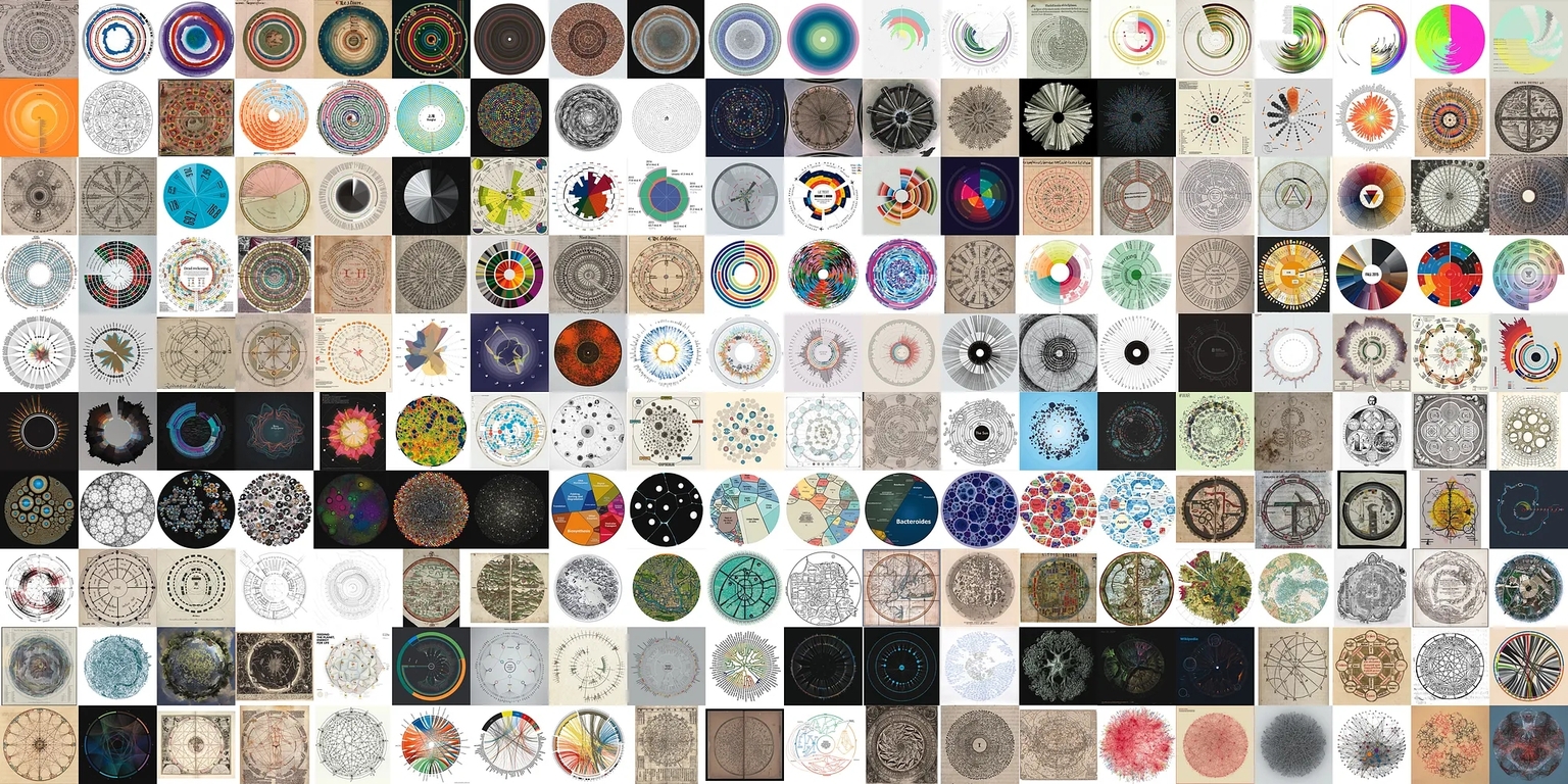
Humans are naturally drawn to circles, and this attraction manifests in the field of data visualization as well. Circular charts, in various forms, are commonly used to represent data and convey information.
But what makes us prefer the circle over other shapes? Manual Lima asks the same question in the preface of his book, The Book of Circles: “Of all possible models and configurations — with endless possibilities for constructing diagrams and charts — why is the circular layout such an exceptionally popular choice for depicting information?”
Throughout the book, he goes into great depth on the reasons why. He concludes that
- the circular shape is universal in all domains of human knowledge;
- we have an innate preference for all things circular;
- there’s great diversity and flexibility in the circular layout.
Research shows that this preference for circular shapes is present in us from birth: “A 2011 eye-tracking study found that at five months of age, before they utter a word or scribble a drawing, infants already show a clear visual preference for contoured lines over straight lines.”
Lima also discusses the emotions associated with circles and circular shapes in a BBC Science Focus article: “Over the last century, researchers on human perception have tried to explain our innate propensity for circular and curvy shapes. In a 1921 study conducted by the Swedish psychologist Helge Lundholm, subjects were asked to draw lines representing a set of emotional adjectives. While angular lines were used to depict adjectives like hard, harsh and cruel, curved lines were the popular choice for adjectives like gentle, quiet and mild. Over the years, other studies trying to associate feelings with types of lines have corroborated Lundholm’s findings.”
A lot of modern data visualization pieces we adore, such as Tiziana Alocci’s data-driven album covers visualizing music or Nadieh Bremer’s Olympic feathers, also use circular layouts. This fascination with circles can explain why the pie chart continues to thrive and remain popular in data visualization, despite its inherent issues and the current downward trend in their popularity. So next time a client asks for it, don’t be mean — a preference for circular shapes is deeply ingrained in all of us from birth.
History of the pie chart
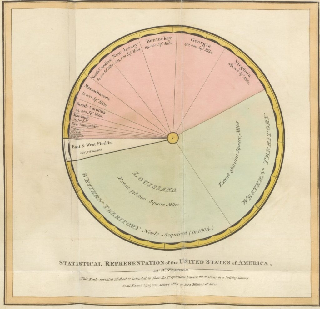
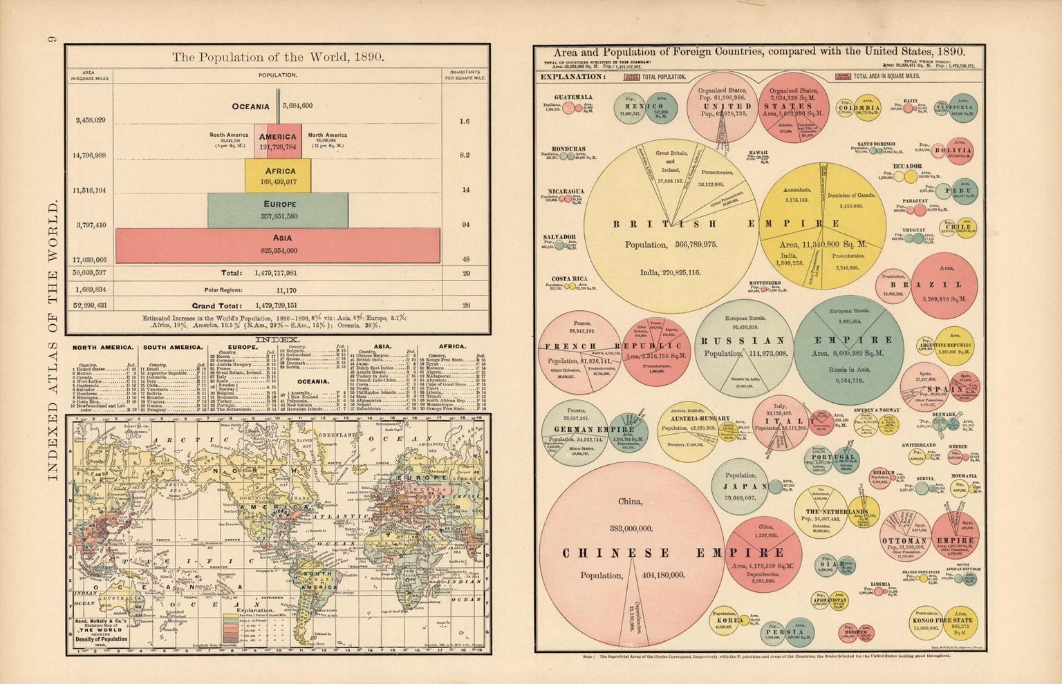
Pie charts have a longer history than we might expect. The concept of a sectioned circle, which originated in Bronze Age Europe between 2300 - 1350 B.C., is closely related to the idea of the wheel. The Scottish engineer William Playfair is credited with inventing the modern pie chart thousands of years later, in 1801 — which is now a standard visualization model that illustrates proportions within a whole.
An interesting detail is that in this pie chart, the author uses a scale around the circle. This approach can help address the criticism that most modern pie charts receive, as they are often considered difficult to read.
There are other examples and visual analyses from around the same time that include pie charts — along with other chart types.
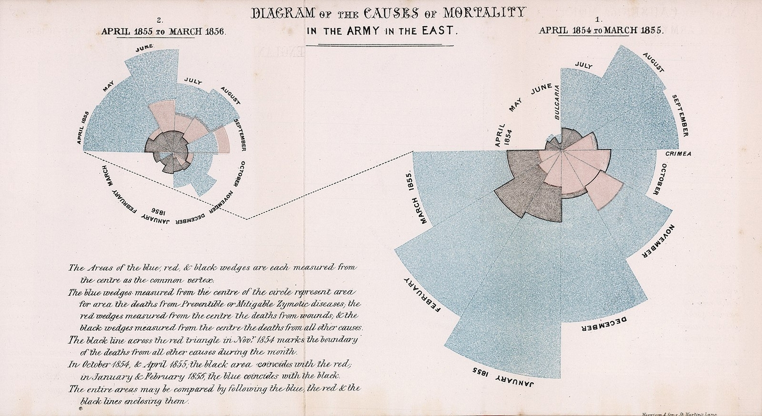
Florence Nightingale's rose chart is one of the most famous works in historical data visualization. As a nurse, statistician, and reformer, she used this chart to illustrate that that epidemic disease, which was responsible for more British deaths in the course of the Crimean War than battlefield wounds, could be controlled by a variety of factors including nutrition, ventilation, and shelter. Although not technically a pie chart, it uses a circular layout. Each section represents a month, giving the visual the resemblance of a clock and symbolizing the passage of time.
The list could go on, but you get the idea.
The big pie debate
Pie charts are used to show a part-to-whole relationship, but the very act of using them is a hot issue recently. They display proportions and percentages between categories by dividing a circle into segments, with each segment representing a category's proportion. The full circle represents the total sum of all the data, equal to 100%.
In the field of data visualization, trends come and go, but criticizing pie charts don’t seem to go out of fashion. Attitudes range from “pie charts are evil,” “death to pie charts” and “save the pies for dessert” to declarations such as “fuck it, let’s use pie charts.” Edward Tufte once also said that “the only worse design than a pie chart is several of them.” This is not a new phenomenon, either: “You may think that the debate over pie charts was a new one, but it has raged on for at least 100 years. Brinton started it in 1914, and great drama unfolded in the pages of the Journal of the American Statistical Association in the 1920s.” You can read more about it in this Ye Olde Pie Chart Debate article by Robert Kosara.
One thing is certain: they are extremely common in business settings and information graphics, and it seems that they are here to stay. One of our colleagues made the analogy that it's like pineapple on pizza. It is often criticized, yet it remains a popular request and can still be found on most restaurant menus.
The pie chart is dead! Long live the pie chart!
So what’s wrong with the pie chart?
Multiple things, but the main argument is always the same: they’re difficult to read.
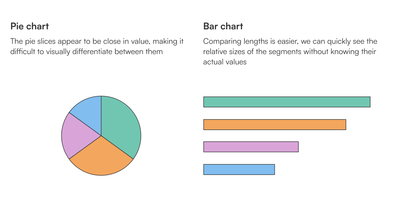
Studies have suggested that people compare angles or arc lengths when reading pie charts. However, new research conducted by Robert Kosara and Drew Skau has shown that it’s actually the area that people focus on. The thing is, human eyes aren’t well equipped to compare areas and when segments are close in size, it can be difficult to determine which is bigger and by how much. Some people refer to pie charts as “pop charts”, because they are commonly found in pop culture media, but much less in science and technology media, for precisely the above reason.
When facing this challenge, a common use case or proposed solution is to use bar charts instead. The human eye and mind are better at comparing length than area, as can be seen in the example below.
If that’s the case though, why don’t we all just use bar charts all the time?
Manual Lima states that circles are usually associated with the concept of unity, wholeness, completeness, inclusion or containment. The unique thing you get with a pie chart that is absent in a bar chart is the concept of there being a whole, and thus, parts of a whole: “Pies are perhaps so commonly used because humans gravitate to circles as the universal symbol of unity, perfection, and infinity. We like things to be whole — and understand how the respective pieces relate to the whole. A pie chart provides us this comfort of a part-to-whole relationship.”
Based on this, there are two primary use cases for a pie chart:
- If you want your audience to have a general sense of the part-to-whole relationship in your data and comparing the precise sizes of the slices is less important.
- To convey that one segment of the total is relatively small or large.
When using a pie chart, it’s important to prioritize readability and avoid misleading your audience. Consider the following DOs and DON'Ts to achieve this.
- Limit the number of categories to 4-5.
- Order the sections clockwise, starting from the 12 o'clock position, from smallest to largest.
- Make sure to use appropriate labeling when knowing the actual values is crucial.
- This might be a no-brainer, but make sure that the percentages add up to 100%.
- Feel free to use donut charts, as they’re no worse than pie charts from a readability perspective.

Trying new pie recipes
The preference for circular layouts mentioned above, the circle's ability to visually represent wholeness but the limited readibility aspect, has prompted research on possible alternatives in the dataviz community. In a paper published by Robert Kosara — Circular Part-to-Whole Charts Using the Area Visual Cue — he explores several variations of part-to-whole charts that use area to represent a fraction within this circle.
The paper presents a number of newly designed chart variations largely centered around three ideas:
- Pie modifications
- Shape overlaps
- Centered shapes
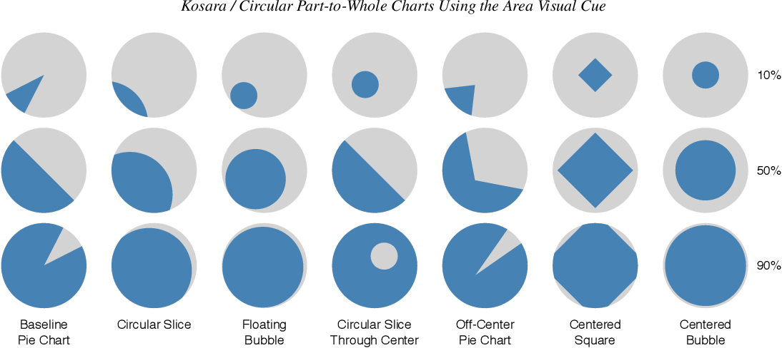
The study participants were instructed to judge the percentage represented by the blue part of the chart. This was done to test whether other circular charts can offer better readability compared to the commonly used and popular pie chart. The study found that, with one exception, all the tested variations performed worse than the classic pie chart. The sole outlier was the circular slice condition, which did not differ significantly in either absolute or signed error, but did better in terms of response time, even though it’s visually more complex than the pie chart.
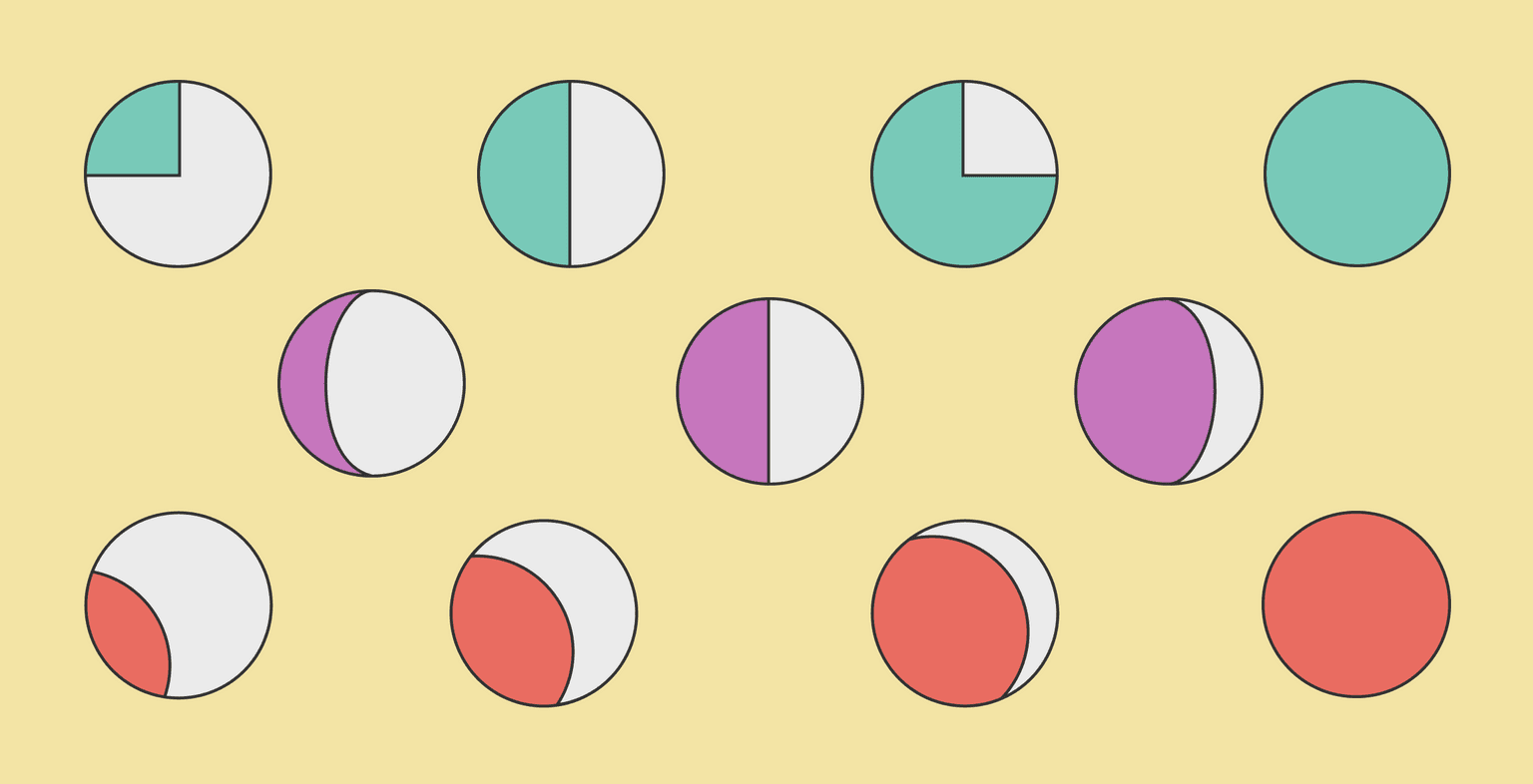
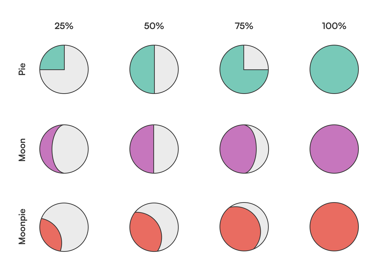
We refer to this chart type as the moonpie chart. Kosara gives it the following definition: “This chart represents the value by sliding a second circle of the same size over the base circle. The edge within the circle is curved at a constant radius (the same as the containing circle). In terms of metaphor, this chart is very similar to the way lunar eclipses occur.”
One limitation of the study is that they only used two-slice charts. However, multiple slices were tested for the circular slice in a later study. It revealed that circular charts, including the unusual variations, perform better than treemaps, and that their performance depends on whether participants are asked to judge the largest slice or a smaller one.
Introducing the moonpie chart
Let’s talk naming conventions — why do we call it a “moonpie” chart? Moon shadows are not particularly delicious though, why is the word “pie” in there? We should also mention that moon charts exist, and they are distinct from moonpies. According to this article, "Moon charts differ from the 'circular slice/moonpie charts' in that the latter slides a second disc of the same size over a base circle, more like a lunar eclipse than the phases of the moon. Both depend on area as the perceptual cue, however.” The difference between the two is easiest to see when we display a distribution of 50%-50%, as shown below:
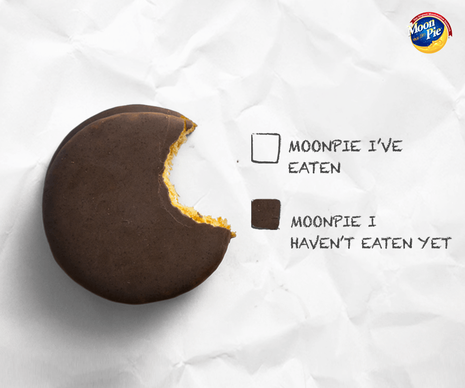
To me, the name "moonpie chart" suggests that it’s used to display part-to-whole relationships in data but in an alternative manner to a traditional pie chart. The chart itself also resembles a moonpie cookie with a bite taken out of it. For those who are not familiar with moonpies, they are a popular American snack enjoyed in many parts of the United States.
Why should you use a moonpie chart?
- Artistic expression. One of the main motivations for using a moon chart instead of a pie chart is mostly an aesthetic choice. In our opinion, it’s more visually appealing than the classic pie chart, while still maintaining good readability.
- It’s different! We believe that the mere fact that something is outside of the norm can spark interest in a user when interacting with the visualization.
- Better readability! Based on Kosara’s study, when using more than two segments, moonpie charts offer better readability compared to pie charts or even treemaps!
Create your own
Open the Tableau workbook on Tableau Public and download it:
The template workbook uses two data sources: an Excel sheet and the Tableau Sample Superstore data source. You can create a moonpie chart from other datasets using measures that can be summed up (for example: Sales, CO2 Emissions, etc).
How to use it with your own data:
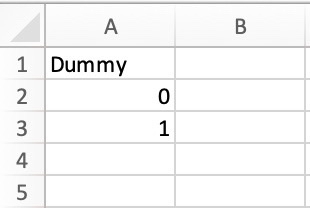
To create the moonpie chart, you will first need to scaffold your dataset. Create the same scaffold Excel sheet with a single column named Dummy and two values: 0 and 1. You can keep the default sheet name (Sheet1). After you’re done, it should look like this:
Find out more
- The Book of Circles - Visualizing Spheres of Knowledge - by Manual Lima
- Why do we find circles so beautiful? - by Manuel Lima
- Ye Olde Pie Chart Debate - by Robert Kosara
- A Pair of Pie Chart Papers - by Robert Kosara
- Circular Part-to-Whole Charts Using the Area Visual Code - by Robert Kosara
- The Impact of Distribution and Chart Type on Part-to-Whole Comparisons - by Robert Kosara
- Moon charts, a pie chart alternative for two groups - by Michael Bramson
- More than Meets the Eye: A Closer Look at Encodings in Visualization - by Robert Kosara
about the authors
Júlia Borsi
István Korompai