The Barbie universe
Written by: Ivett Kovács, Judit Bekker, Júlia Borsi
A team of our dataviz experts created a project analyzing Barbie dolls through data, including Twitter analysis, doll releases, and Barbie’s social network.
Our dataviz team was invited to present at Startup Safary– a 2-days event in Budapest where the whole city turned into a startup exhibition with over 300 programs and 3000 participants. One thing was certain: we wanted to show the world of data visualization to our audience but were not sure how. Then someone came up with the title: „We play with data like we used to play with Barbie” and the idea was born. Once we had our topic, the research began and we were truly surprised by the amount of public data available on the iconic doll. We put together a Barbie saga, with all three of us preparing a piece of the story (and using a different tool). So, without further ado, please see our takes on Barbie:
Barbie on Twitter
Barbie's on Twitter, let's see what the numbers tell us! The tweets were collected with KNIME ((@Barbie on Twitter) starting from 2013 June to present. All the tweets were in UTC. I created a time map visualization because it’s hard to visulize many events (tweets) over a long period of time without losing details. I found a good article about visualizing discrete events across many timescales in a single image. If you are interested, you can check Max Watson’s publication here. Here is the time map of the tweets written between 2013 June and 2018 March. It is a two dimensional scatter plot with x-y coordinates, where x represents the time passed before a tweet and y means the time until the next tweet. In the scatterplot each dot represents one tweet by Barbie. Based on the speed of communication we can divide the chart into 4 quadrants. 2 quadrants represent constant responses. The lower left quadrant is fast because there is little time between the tweets. In the upper-right one there is more time, so it is called ‘slow and steady’. The upper left – ‘slowing down’ – quadrant shows us the tweets where after a quick exchange there is a longer response time until the next tweet. In the lower-right quadrant, after a tweet is posted, there is a long waiting time, then two tweets appear in rapid succession. In this case, the events are ‘speeding up’. If we look at it year after year, we can see that the tweets move to the top-right quadrant.
I used Ben Moss’s Twitter Manipulation Alteryx flow to get the hashtags and mentions from each tweet.
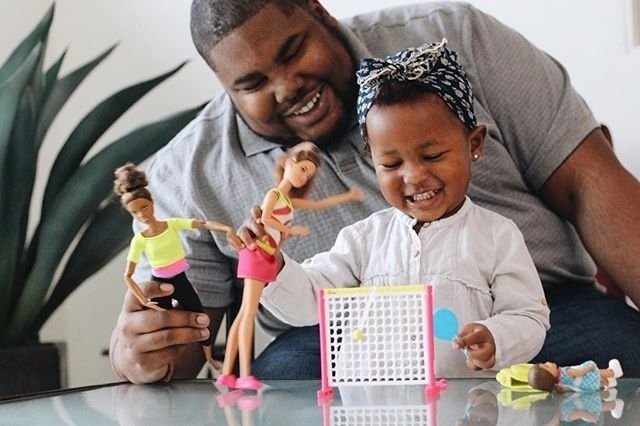
My favourite hashtag is the #DadswhoplaywithBarbie. First, I did not believe it but I looked into those tweets and yes, I found many daddy pictures. 😊
Ivett
The 50 most valuable Barbie dolls
Then I analysed the 50 most valuable Barbie Dolls. The data came from 24/7 Wall St, a a financial news website. They identified the prices from eBay and only considered the most expensive dolls within a given model. Price data was obtained on March 5, 6, and 7.
How much money would you give for a doll? “No one would have predicted such zealous collecting of the toy back in 1959, when Barbie debuted at the New York Toy Fair. That year, the doll cost $3. Today, a mint condition Barbie from 1959, wearing a black and white bathing suit and clutching sunglasses, can garner more than $20,000 on eBay.” Ivett
Barbie's social network
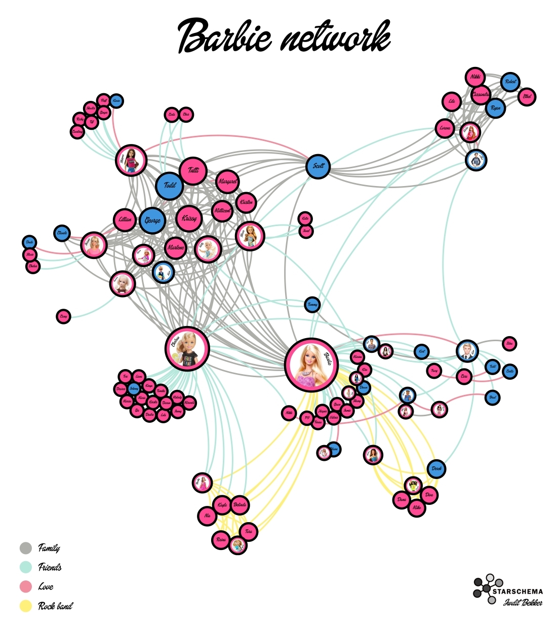
My part of the Barbie saga was exciting in many ways, because I had to put the data set together myself, while both Gephi and Photoshop that I used for the viz were completely new to me. If you've ever wondered, there's a page called Barbie Wiki where you can read the most useless things about Barbie dolls you haven't even heard of. Probably this is the best way to fill your mind with frivolous information, that will never get out of your head. Like the fact, that Barbie had left Ken for an Australian surfer guy called Blaine, but went back to him two years later, when they beefed him up a little. The not so funny part was building the data set, as I had to read the bio of all Barbies - 102 for the sake of precision - to see who's friends with whom in the doll universe. Gephi eats nodes and edges, so after mapping out the network, I created 323 relations in 4 categories among these lovely plastic people: family, friends, love, and rock band. You can see the end result below:
Judit
Doll releases
After I saw Judit’s Barbie network, I wanted to see how long each doll was in stores. I assumed that the more popular the doll was, the longer it stayed on the shelves. I discovered a new PowerBI custom visual that seemed perfect for my idea: the Timeline Storyteller, which is: "... an open-source expressive visual storytelling environment for presenting timelines in the browser or in Microsoft Power BI”. The visual itself is relatively easy to use but offers limited customization options. So instead of visualizing all the dolls from Barbie’s network, I decided to go with the most important ones. You can see my work below:

The colors represent the dolls’ relationship to Barbie: they can be her love, friend, friend of a friend, family, or rock band member. You can see which dolls were sold for what time period. A few facts about the dolls: After Barbie and Ken broke up in 2004, Barbie got together with an Australian surfer, Blaine. However, the doll itself was not really popular as it was only sold for a few years. Barbie eventually got back together with Ken on Valentine’s Day in 2011. In contrast, Ken never lost its popularity and stayed on the shelves ever since its release in 1961. Another interesting doll is Midge, Barbie’s friend which was first released in 1963. Mattel decided to release a new pregnant version in 2002 with a detachable bump containing a baby doll. Parents immediately started complaining, as many of them thought it was inappropriate for young children and that it was promoting teen pregnancy. Despite the controversies, it is still being produced to this day - but without the baby bump.
Julia
about the authors
Ivett Kovács
Judit Bekker
Judit is an ex-Starschema member, and a 2x Tableau Visionary & Tableau Public Ambassador. Her favorite font is Futura, she's dead scared of pigeons, and loves doing data visualization in Illustrator.
Júlia Borsi