Sketchy style in Tableau
Written by: Ivett Kovács, Tristan Guillevin
Discover the beauty of hand-drawn style in data visualization! From Du Bois' unique infographics to Nadieh Bremer's artistic style, learn how Ivett Kovacs and Tristan Guillevin used rough.js to create a sketchy effect in their Tableau visualization.
A quick note: This post was originally published some time ago on DataViz.Love, our old blog. We have moved it here for preservation with the approval of the author(s).
Hand-drawn style has never been so popular
When you think about any digital content, you might be tempted to associate it with some kind of programming skills. The last thing that would come to your mind is a designer/artist that uses old-fashioned pen and paper.
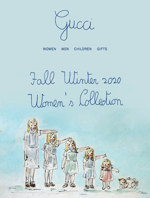
Why would you think that drawing with a pencil is outdated? I am pretty sure this will stand the test of time. Every data visualization designer should make their first prototype on paper. The hand drawn style, with its imperfections, always stands out and gives a personal and custom-made feel. I am conviced, that this is the main reason why this style has gained popularity in recent years and why Gucci changed its logo to the handwritten style.
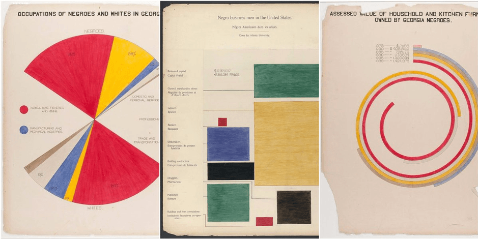
Through history, numerous data visualization masterpieces were born when digital devices were not yet around. One of the examples is Du Bois who told the story of slave descendants living in Georgia through 60 handmade and unique infographics, drawn in ink and watercolored by his students. (If you are interested in seeing more of the old handmade visualizations then follow Jason Forrest.)
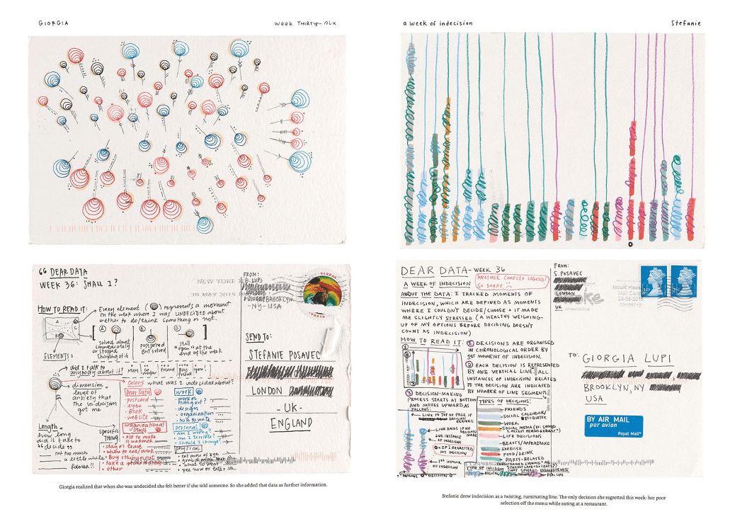
Dear Data is, without a doubt, the best known hand-drawn data visualization project of today’s times.
Last year Nadieh Bremer released her Why Do Cats & Dogs …? project. Its artistic style has swept me off my feet and I’m still amazed when I see this visualization. As a dog owner, this topic is something that is very close to my heart. Nadieh made imperfect sketchy graphs that feel as if they were actually coloured with a pencil.

I came across this project again and was encouraged to make a similar design in Tableau. Who if not Tristan Guillevin was my partner in this crazy crime. This was not the first time when we worked together on a project but the first time when we built a visualization together.
Let's see the progress
The following paragraphs were written by Tristan Guillevin:
For people who know me a little, this is will not surprise them, I love the challenge! So, when Ivett, one of the most brilliant people in the Tableau Community, challenged me to do this, nothing could have stopped me!
Like most people working in the data visualization field, I follow Nadieh’s work, and I saw her Cats and Dogs viz. That’s how I heard about rough.js, a javascript library that can generate SVGs and Canvas with this handwritten style. From my previous work with the Network graph and Voronoi treemap chart, I knew how to convert SVGs into Tableau polygons easily. So 10 hours after Ivett challenged me, the part of the mission was completed, rough style, in Tableau.
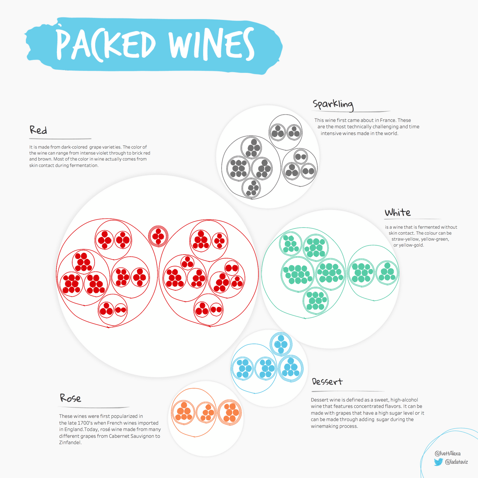
Once I received the data from Ivett, I started to work with d3.js and rough.js to generate that idea of packed wines with different hierarchies. Here are a few pictures of that process, how we started with plotting all the single grapes, then adjusting and playing around with rough.js features:

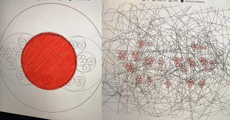
Finally, after many tries, we finally get our first correct result:
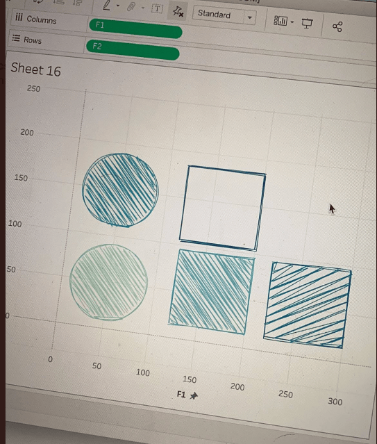
The main idea to convert SVGs to polygons is to use the getTotalLength() function to know the total length of the SVG path, and then getPointAtlenght() to get the x and y coordinates of a specific point.
To get the sketchy effect in Tableau, a lot of points are necessary to create the lines. The main challenge was then to estimate how many points are needed to balance between having a nice sketchy look and good performance. In the need, we decided to have different numbers of points, depending on the level in the wine hierarchy:
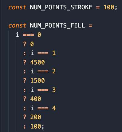
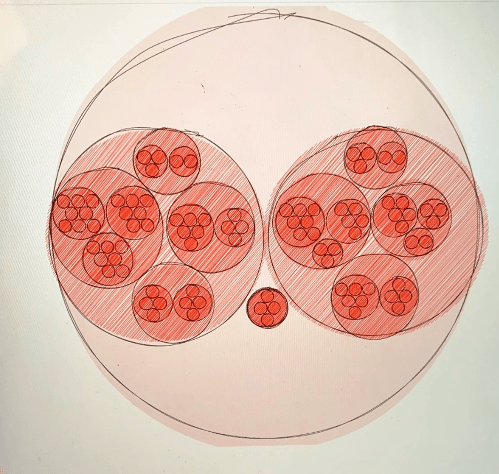
The biggest circles are made of 4500 points, and the smallest, only a hundred. Rough.js allows us to play with the roughness and line weight. In our first attempt to convert the SVGs in Tableau, the sketchy effect was not visible:

In the end, we had to try and retry each configuration, for the different wine hierarchy, until the look was satisfying at every level.
Click here for the interactive version:
Do you want to learn more about this process? See you in London at #TC20. YAAAAY!
about the authors
Ivett Kovács
Tristan Guillevin