Swap different views on a single sheet
Written by: Ivett Kovács

Learn how to reveal and hide different aspects of information on a single sheet using a parameter in Tableau. Follow this step-by-step guide and take your visualization to the next level!
A quick note: This post was originally published some time ago on DataViz.Love, our old blog. We have moved it here for preservation with the approval of the author(s).
I am sure everyone knows and have already used the view/sheet selection trick controlled by a parameter in one of their own Tableau projects. I was wondering if we could reveal/hide different aspects of the information on a single sheet.
Let me show an example.
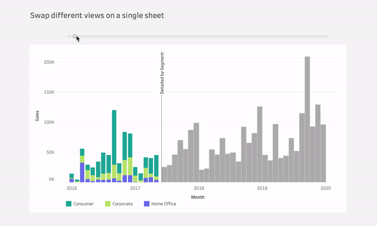
If you swipe the line on this visualization you will be able to change the view. You can reveal/hide the different layouts. You can compare individual data points on a simple bar chart and at the same time, you can simultaneously compare sales totals and notice sharp changes at the segment level on a stacked bar chart.
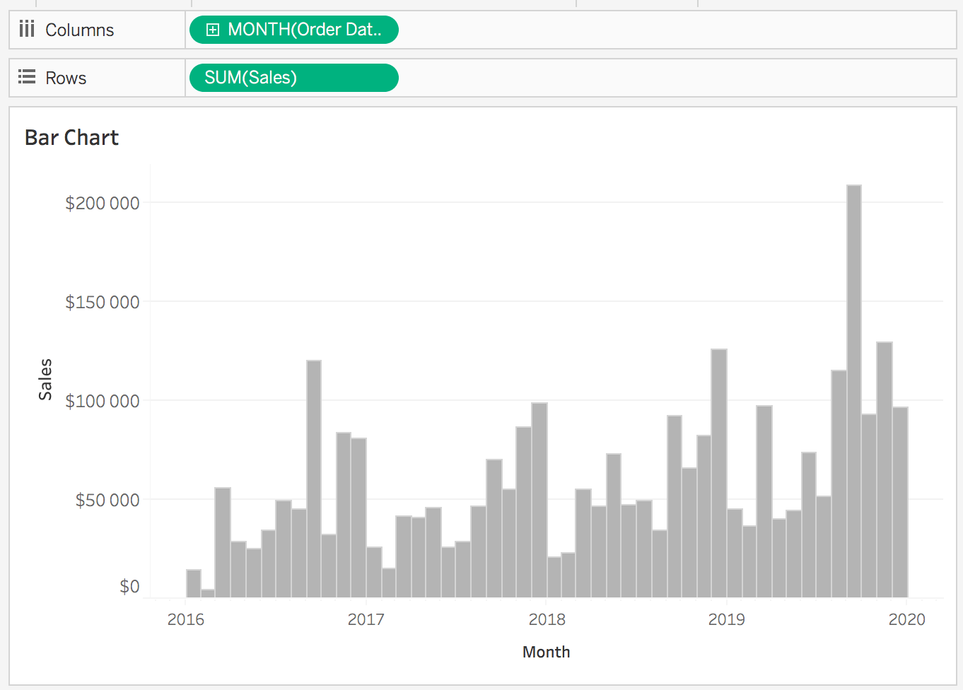
Step #1: Make a Bar Chart
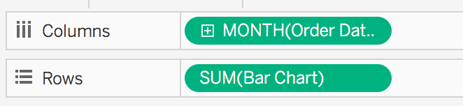
Connect to the Superstore data and build a simple bar chart that displays sales per month.
- Put the Continous Month(Order Date) to Columns
- Put Sales to Rows
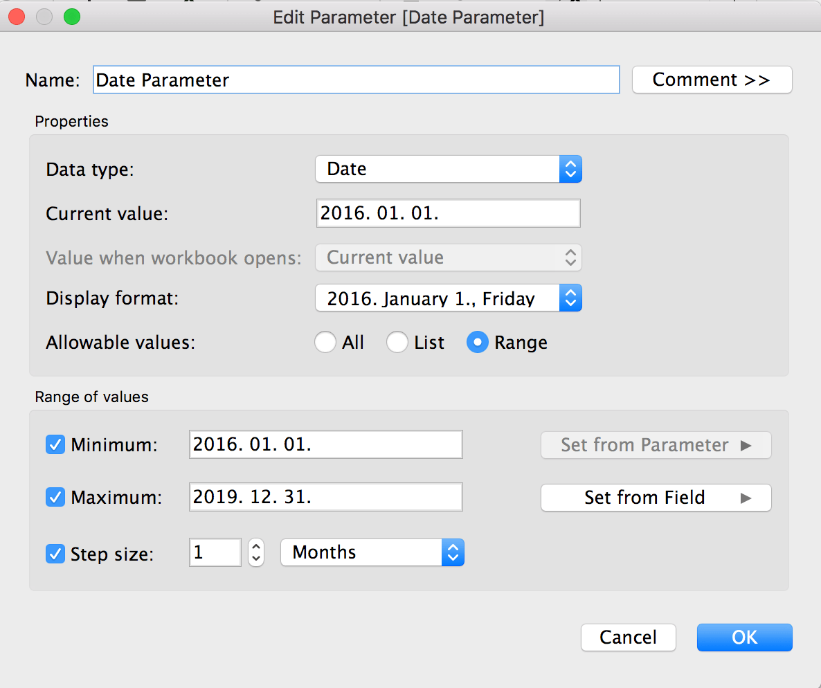
Step #2: Create a parameter based on the x-axis
Let’s create the parameter that will help Tableau to change the two views. This Parameter selection will be based on the x-axis. In this case, I will refer to the Month(Order Date) field.
- Set the Minimum and Maximum range
- Step size = 1 Month
Step #3: Modify the bar chart based on the value of date parameter
Bar Chart
IF DATETRUNC(‘month’, [Order Date])>=[Date Parameter]
THEN [Sales]
ELSE 0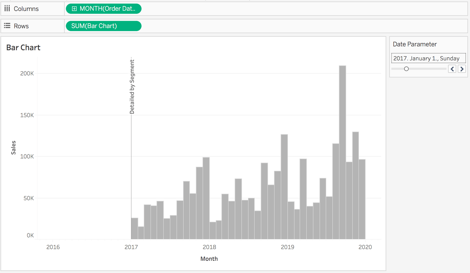
END- Replace the SUM(Sales) field on Rows to this Bar Chart calculation
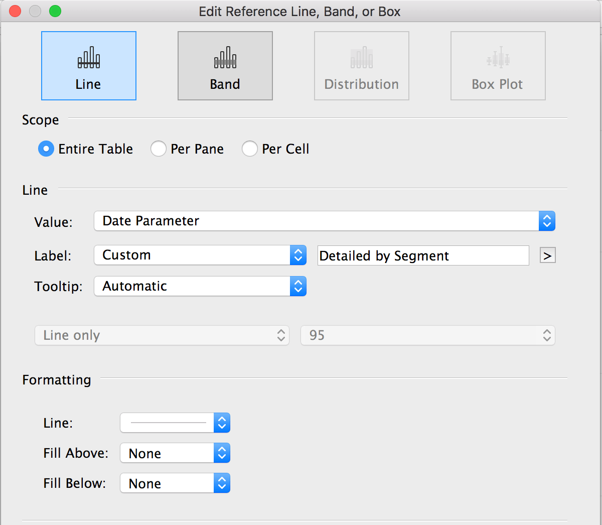
Step #4: Add the date parameter to the chart as a reference line
The result is:
STEP #4: DEFINE THE STACKED VIEW
Stack Bar Chart
IF DATETRUNC(‘month’, [Order Date])<[Date Parameter]
THEN [Sales]
ELSE 0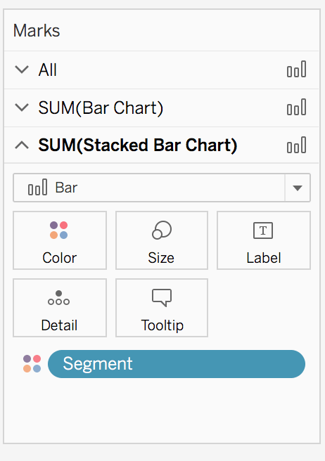
END- Add this Stacked Bar Chart calculation next to the Bar Chart field on Rows
- Make it Dual Axis.

- Syncronize them
- Add Segment to Color Mark
And enjoy your result!
If you have any questions, reach out on Twitter @IvettAlexa