Concerto of Data Points - a personal Iron Viz journey
Written by: Zsófia Nika, András Szepesi
Explore a personal Iron Viz journey from having the 1st draft until the implementation and final touches. This year's topic is to visualize something you love - for me, as a classical music enthusiast, it is about the concerts of one of the most talented musicians of the 20th century: Leonard Bernstein.
Iron Viz is the world’s largest dataviz competition, organized by Tableau. The qualifier is open to everybody and the final will takes place in May 2024 on the next Tableau Conference, in San Diego.
The topic for 2024 is about visualizing something you love. It sounds like a quite broad definition, so the limit could be only your imagination, and of course, the available data.
Link to my Iron Viz entry: Ode to Joy: the Maestro of the New York Philharmonic
Coming up with The Idea
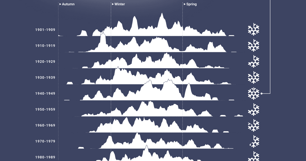
I have been singing in choirs for decades and have a deep connection to classical music. I previously worked on a smaller project using a dataset of one of the world’s most famous symphonic orchestra, the New York Philharmonic (NYP) which provides such valuable insights that many more visualizations could be created from it. The dataset is so detailed and vast that it is easy to lose focus. So this time I decided to narrow it down to one artist and his concerts with NYP: Leonard Bernstein. And why him? He was one of the most remarkable musicians of the 20th century, having an amazing 46-year-long career at the NYP. Also, he is the perfect example to showcase why and how to be passionate about classical music: just watch him joyfully conducting his own composition.
Wireframing
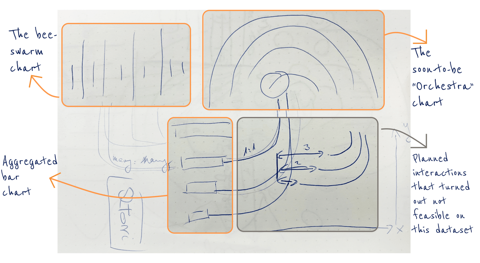
An exciting part of the design process that I would never skip is drawing my ideas on paper. It provides a solid foundation on which I can build my whole work, and acts as a bridge between my imagination and the practical reality, free from technical limitations. In this project, it was quite an iterative part as I occasionally returned to my sketchbook as the whole visualization evolved further.
Data Prep
After drafting my initial ideas on paper, I started working on the backend part. The dataset, originally in JSON format, includes separate tables for concerts, soloists, venues and works that can be easily merged. Since the original data source includes details of every NYP concert from 1842 until today, I filtered it beforehand to include Bernstein's concerts only.
Creating charts I have never done before
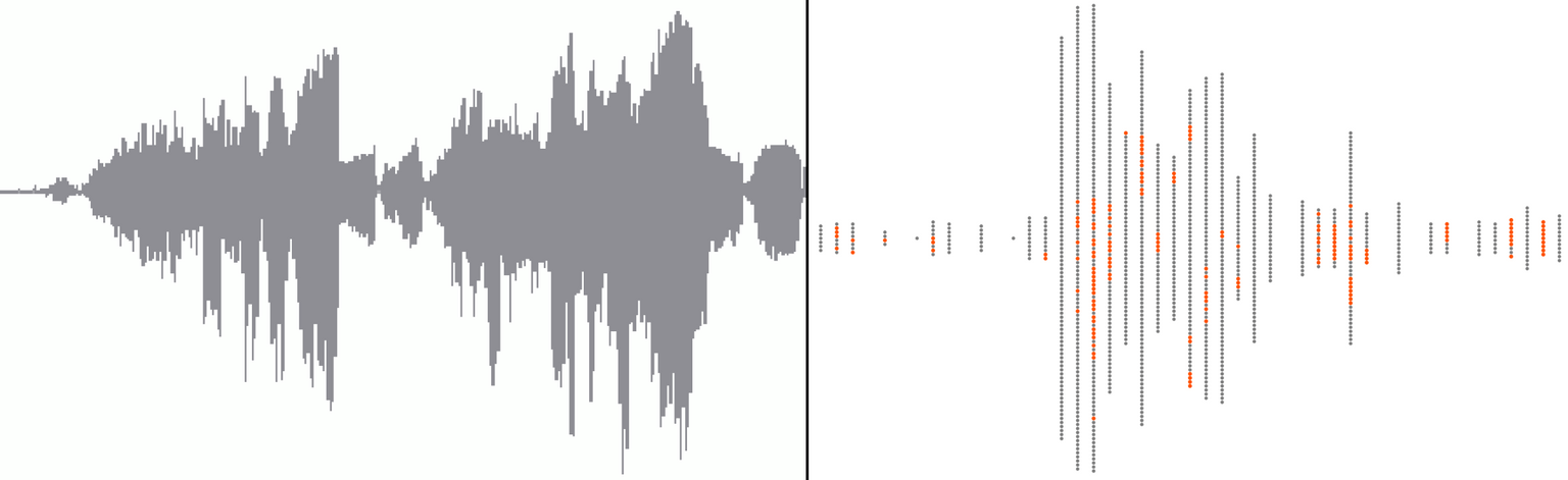
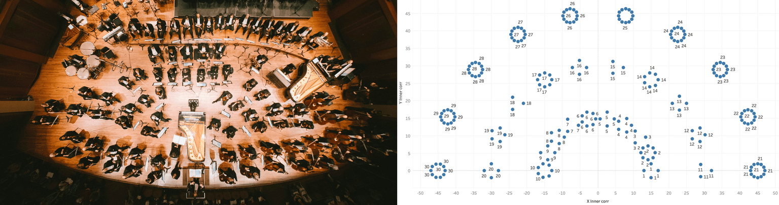
I find it important in my personal visualizations to find the visual language that best suits the topic. As this viz is all about music, I came up with two specific chart ideas: the beeswarm plot which reminds me of sound waveforms, and a half circle that resembles a symphonic orchestra from a bird's-eye view. Additionally, I included the baton as a selector at the top and chose a background colour that resembles old music sheets.
That led to another favorite part of mine: figuring out how to make these ideas work. One of my go-to resources is the fantastic blog of the Flerlage Twins, which has helped me with both of my tricky charts. The beeswarm plot was quite straightforward thanks to this tutorial.
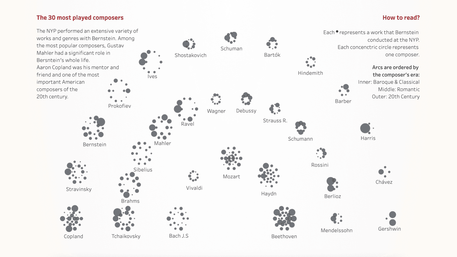
However, the half circle-bubble “orchestra” chart was a bigger challenge. My initial idea was here to visualize all the compositions played by the NYP and Bernstein grouped by composers to see what were trending, which musical eras were the most popular in the concert programs. That means the following hierarchy on the chart: compositions by composers (inner circles), composers by era (outer half circle).
To tackle this challenge, I needed to refresh my memory on trigonometry based on this blogpost (also here, I want to express my gratitude to my beloved math teacher in high school and to send a note to my younger self: it has become useful knowledge after all). So I had to curve those dots in the right way, twice: outer half circle for each composer and inner circles for their works. To reduce complexity, first I created a dummy dataset to test its feasibility - and it worked! So, I then applied the same logic to my real dataset.
Build up the story
I had identified the key elements that needed to be transformed into a data story. Along the way, I conducted extensive research on Bernstein - reading many articles, watching documentaries and concerts, endlessly listening to his compositions and recordings - and decided to focus on the three main parts of his career at NYP which were also supported by data: conductor, composer, and educator. I chose to design a consistent layout for these 3 areas: only one dashboard page with the same chart types but dynamically changing content, driven by the selector on the top by applying Tableau's great feature, Dynamic Zone Visibility.

Feedbacks are welcome
Feedback is always important, but as this is my first Iron Viz entry, I was particularly grateful for Sara Bartlett's Iron Viz Feedback Initiative. This provides the opportunity for relevant, specifically Iron Viz-related feedback sessions to everyone, led by Sarah and other experienced Tableau Community members. Since the criteria for this year are quite specific, I also felt it was essential to complete my entry. In addition to the design-related recommendations, the comment that had the biggest impact on me was about including more text and personal aspects while transforming my entry into a piece of data journalism.
But of course, I also have awesome dataviz colleagues at Starschema, as well as friends inside and outside of the data visualization world who provided valuable feedback to complete my project - thank you all!
Write a story that is supported by analysis
So going back to the comment about data storytelling, this is actually my first data visualization project where I had to provide all the context in written form, as I won't have the chance to present it to everyone in person. Fortunately, I had already completed the viz at this point, so I was already familiar with Bernstein's career and had identified the main and most valuable resources that gave me enough insights to craft the entire story, including my own perspective.
The other motivating factor was the approaching deadline at this point, which gave me the opportunity to embrace Bernstein's famous quote: "To achieve great things, two things are needed: a plan and not quite enough time."
Conclusion: Should you enter Iron Viz?
Well, its slogan says: "Win or learn - you can't lose!" - and it is not just a catchy phrase, it is true.
It requires dedication and more time than you might expect. I was fortunate to have the opportunity to prioritize Iron Viz during this month and shape my free time around it because I spent more time on this dataviz than any other private projects before, however it was a rewarding journey. I not only learned how to organize dots in different circular patterns, but also tapped into my storytelling abilities, which I don't actively use in my current job role. While my business dashboards convey a story, it is not the same as actually writing the story that is supported by data.
All in all, it was an exciting month in this special, focused mindset and I would happily do it again. But until then, I cannot wait to see the top 10 entries, results will be announced on 17th of January 2024!
about the authors
Zsófia Nika
András Szepesi


