Display variances between dates
Written by: Ivett Kovács
Learn how to easily display changes between dates using Tableau in this blog post. With step-by-step instructions and the Superstore dataset, you can replicate this powerful solution quickly. See the surprising results for yourself!
A quick note: This post was originally published some time ago on DataViz.Love, our old blog. We have moved it here for preservation with the approval of the author(s).
In this post, I would like to show how you can display changes between dates.
To be honest, I got the idea from an Excel example but let’s focus on Tableau for now.
I tweeted this gif on my Twitter, but I think the best way is to present the solution on the Superstore dataset so you can easily replicate it too.

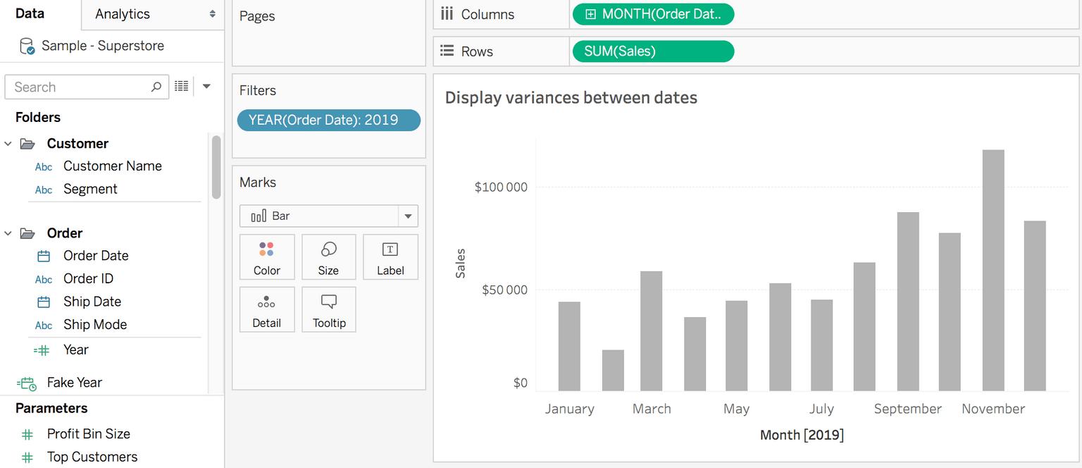
Step #1: Show sales on a bar chart per month
- After you connect to the Superstore data, add Order Date to Columns. Depends on what you want to show, select a Continous Date. I used Month Continous Date.
- Add Sales to Rows
- Add Year(Order Date) to Filter
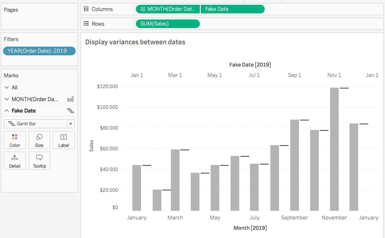
Step #2: Create fake date field
Fake Date
DATETRUNC(‘month’, [Order Date])+15Why did I add 15? On average, 1 month is 30 days long so in order for the variance line to be between 2 months, the fake x-axis must be shifted by 15 days (30/2).
Note:
If you have years:
DATETRUNC(‘year’, [Order Date])+182If your date is an integer data type:
[Date]+0.5- Put this Fake Date next to the Month(Order Date) field in Columns
- Select Dual Axis
- Synchronize it
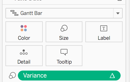
- Set Gantt bar on the second Mark
- Then hide the axis of Fake Date
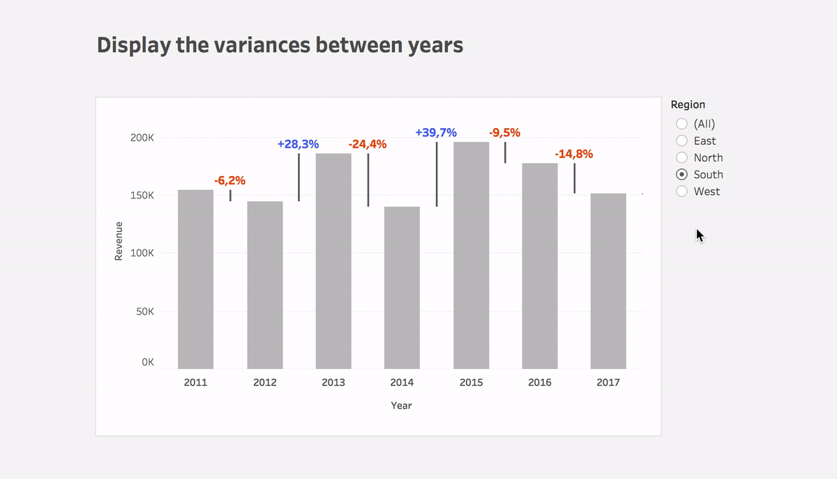
Step #3: Calculate the variance between dates
Variance
(ZN(SUM([Sales])) – LOOKUP(ZN(SUM([Sales])), 1))*(-1)- Put the calculation to Size of the Gantt bar
- You can use this calculation or Variance% calculation on Label
- Plus you can use color to highlight the direction of change
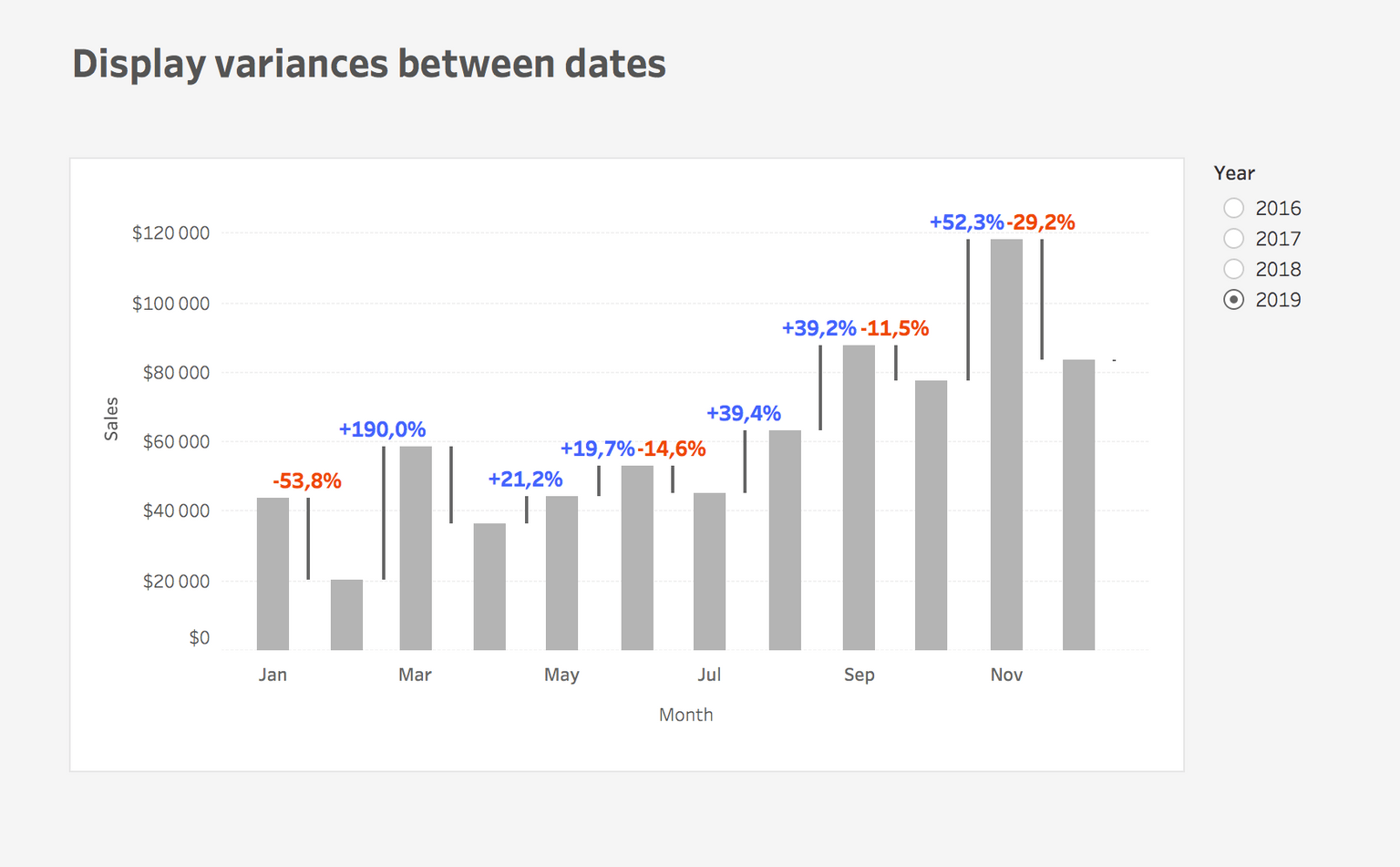
That’s it! I think it’s surprising how quick, simple, and powerful solution it is.
If you have any questions, reach out on Twitter @IvettAlexa